Editorial Serif Anchor

Dreamy Letter + Flowsky Editorial
Anchors Dreamy Letter's fluid strokes with crisp Roman proportions on wedding suites, headers and packaging.
Inspect Flowsky Editorial specimenDisclosure: MakerFileHub may earn a commission from qualifying purchases via paid links on this page. How our links work.
Smooth bold joined script with heavy even strokes and tight counters
Dreamy Letter is a smooth bold joined script in one even weight, with fat rounded strokes, tight counters and letters that connect without thinning, so a phrase reads as a continuous ribbon of ink.
Paid link
Get this fontProject & layout blueprintsAt-a-glance maker compatibility
Weld or Unite overlapping script joins into one continuous vector path before sending to the blade.
Visual anatomy & craft review
The capital D is built as a heavy stem with a looped entry that closes above the cap line, then a bowl that drops nearly to the baseline before the stroke joins the next letter. Every following letter keeps that weight: the r and the e close their counters to narrow openings, the a keeps a small bowl, and the m and the y repeat the same round shapes without any thinning at the turns. The joins stay as thick as the stems, which is the detail that lets a long word hold together as one mass, and the descender of the y returns in a tight curl that sits close under the baseline. Ends are blunt and slightly rounded. The soft fabric and pampas photograph behind and the tracked caption below are presentation; the script is the two words.
Bold · Smooth · Joined
Two-font hierarchy recipes
Tested contrast partners — pairing Dreamy Letter with grounded secondary typography.
Dreamy Letter + Flowsky Editorial
Anchors Dreamy Letter's fluid strokes with crisp Roman proportions on wedding suites, headers and packaging.
Inspect Flowsky Editorial specimen
Dreamy Letter + Swaraga
Keeps small-scale dates, URLs, nutrition facts and care instructions crisp and legible below script titles.
Inspect Swaraga specimenPractical applications
Concrete hierarchy, scale and production guidance tailored to Dreamy Letter’s stroke geometry.
A bold joined script holds its shape at the size of a shop window and on a paper bag, and because the joins stay heavy it prints cleanly in one colour without a supporting line.
Hierarchy & layout recipe
Set the name at 18 pt on a 60 by 90 mm bag stamp, keep the address in a 6 pt sans, and leave 6 mm of clearance so the final curl does not touch the block edge.
Pre-production check
Rubber stamps on kraft absorb unevenly; stamp one bag on the actual paper and open the tightest counter if the e and a start to fill.
The heavy joined strokes read across a room at a size that still looks handwritten, and the tight counters keep a two-word phrase compact enough for a modest board.
Hierarchy & layout recipe
Set the names at 10 cm on a 500 by 700 mm board, keep the date in a 3 cm sans beneath, and hold 8 cm between the two lines so the y curl does not touch the date.
Pre-production check
Painted script needs a second coat on the thick joins or they read as a single blur from a distance; check the board from five paces before finishing.
A bold ribbon-like script stays legible on fabric printed at party scale, and the even weight means the banner reads from the far end of a table without a backing panel.
Hierarchy & layout recipe
Set the greeting at 80 mm tall across a 1.2 m banner, keep the name at 50 mm, and leave 35 mm at each end so the first and last curls stay clear of the hem.
Pre-production check
Printed fabric stretches when it is hemmed; check the proof against the finished size and keep the descender off the seam.
Technical & licence verification
Confirm included OTF/TTF/WOFF formats, full glyph tables and licence coverage on the live store page before batch production.
Closest visual alternatives
Matched across letterform anatomy, stroke behaviour and craft applications.
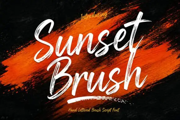
Rough brush script with a dry edge
Sunset Brush is a rough brush script in white over an orange paint smear: heavy strokes with dry, split ends, tall narrow loops and a forward slant that keeps a twelve-letter phrase moving.
Ideas for this font
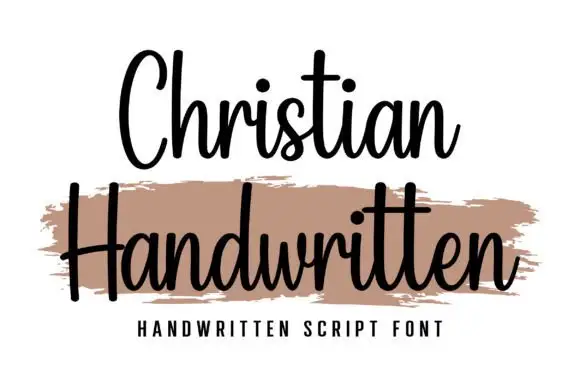
Upright compact connected script
Christian is an upright connected script with a compact rhythm, a heavy-brush companion line beneath it and no forward slant at all across the alphabet.
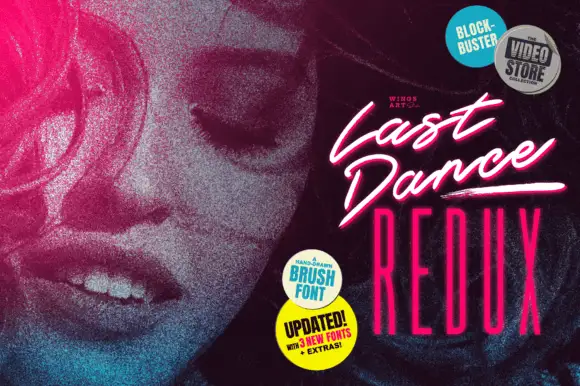
Slanted cinematic brush script
Last Dance Redux is a slanted brush script in white with a pink glow: fast narrow strokes with a dry edge, tight loops and underline swashes, presented as a video-store cover with neon type beneath.
Ideas for this font
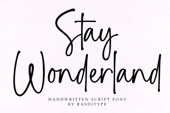
Thin monoline signature script
Stay Wonderland is a thin monoline signature script in black on white: tall narrow loops, a stem on the S that rises above the cap line, a straight-tailed y, and a spacing wide enough that the word reads as a signature written quickly.
Ideas for this font
Same independent foundry
Allow optional Google Analytics to measure visits and catalogue actions. Your search words and notes are not included. Privacy & storage