Editorial Serif Anchor

Cherry Whimsy + Flowsky Editorial
Anchors Cherry Whimsy's fluid strokes with crisp Roman proportions on wedding suites, headers and packaging.
Inspect Flowsky Editorial specimenDisclosure: MakerFileHub may earn a commission from qualifying purchases via paid links on this page. How our links work.
Playful rounded script with a heavy bounce and curled ascenders
Cherry Whimsy is a playful rounded script in a medium weight, with ascenders that curl over at the top, deep bounces in the baseline and terminals that finish in small hooks.
Paid link
Get this fontProject & layout blueprintsAt-a-glance maker compatibility
Weld or Unite overlapping script joins into one continuous vector path before sending to the blade.
Visual anatomy & craft review
The capital C opens as a wide rounded crescent with a curled entry, and the lowercase that follows alternates between x-height letters and tall curled ascenders: the h, the W and the y all rise and then bend over at the top, which gives the word its swinging rhythm. The baseline moves up and down by nearly half the x-height between letters, so the row reads as a hand that wrote quickly, and the joins stay medium weight without thinning. The r keeps a curled arm, the i and the y are dotted and curled respectively, and the final y drops into a hook that turns back toward the word. Nothing tapers to a point; every end is rounded. The cherry illustrations, the small hearts and the stitched badge are presentation; the script is the two words.
Playful · Bouncy · Rounded
Two-font hierarchy recipes
Tested contrast partners — pairing Cherry Whimsy with grounded secondary typography.
Cherry Whimsy + Flowsky Editorial
Anchors Cherry Whimsy's fluid strokes with crisp Roman proportions on wedding suites, headers and packaging.
Inspect Flowsky Editorial specimen
Cherry Whimsy + Helina
Keeps small-scale dates, URLs, nutrition facts and care instructions crisp and legible below script titles.
Inspect Helina specimenPractical applications
Concrete hierarchy, scale and production guidance tailored to Cherry Whimsy’s stroke geometry.
The bounce and the curled ascenders carry a playful tone without the heaviness of a block face, and the medium weight holds up when the card is printed small and handed out.
Hierarchy & layout recipe
Set the greeting at 30 pt at the top of a 105 by 148 mm card, keep the time and address in a plain 9 pt sans, and leave the lower third clear for a hand-drawn map.
Pre-production check
A curled ascender printed close to the card edge can look clipped; check the proof at final size and inset the line by 5 mm if the hook reaches the trim.
The bounce makes a product name feel made in a kitchen rather than a factory, and the rounded terminals stay intact on a small label where a sharp script would clot.
Hierarchy & layout recipe
Set the product name at 13 pt on a 50 by 60 mm label, keep the weight in a 6 pt sans, and leave 5 mm at the top so the curled ascender does not touch the border.
Pre-production check
A curled top on a 6 mm-high label can merge with the border line; check the printed label at actual size and lower the border if they touch.
A playful script gives a thank-you tag warmth at a size where a formal script would look stiff, and the bounce fills a narrow tag without needing extra wording.
Hierarchy & layout recipe
Set the greeting at 15 pt on a 40 by 80 mm tag, punch the hole 8 mm from the top, and keep the date in a 5 pt sans below so the final hook clears the string hole.
Pre-production check
The string hole and a curled final hook compete on a 40 mm tag; check the printed tag with the thread in place and shift the hole outward if they cross.
Technical & licence verification
Confirm included OTF/TTF/WOFF formats, full glyph tables and licence coverage on the live store page before batch production.
Closest visual alternatives
Matched across letterform anatomy, stroke behaviour and craft applications.
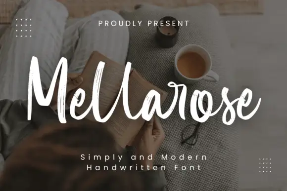
Tall textured brush script
Mellarose is a tall textured brush script in white over a dim photograph: narrow letters, dry broken edges and a light forward lean, with two tracked captions beneath.
Ideas for this font

Light lowercase script with long outer tails and a low even stroke
Abigail is a light lowercase-only script in which the word sits low on the line and both ends run out as long flat tails, so a name reads as a single signed line rather than as a set of letters.
Ideas for this font
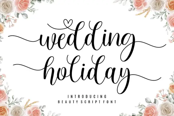
Brush script with a heart flourish
Wedding Holiday is a brush script in black on white: thick connected letters with high contrast at the joins, tall loops on the ascenders and a small heart drawn into the flourish above the first word, framed by peach roses.
Ideas for this font

Fine lowercase script with a heart worked into the central connector
Hello Honey is fine lowercase script in which the two words are joined by a heart drawn into the connector, with long flat tails on both sides and a small even x-height.
Same independent foundry
Allow optional Google Analytics to measure visits and catalogue actions. Your search words and notes are not included. Privacy & storage



