Neutral Sans Workhorse

Cheese + Headline
Lets Cheese own the focal silhouette while handling secondary copy, sizing and subheads cleanly.
Inspect Headline specimenDisclosure: MakerFileHub may earn a commission from qualifying purchases via paid links on this page. How our links work.
Bold slab-like capitals perforated by round holes and semicircular edge bites
Cheese is a fat display face with holes bitten out of every letter, drawn in a pale yellow with a soft extruded side so a word looks pressed from a block of cheese.
Paid link
Get this fontProject & layout blueprintsAt-a-glance maker compatibility
Sturdy stroke walls and open counters weed cleanly on adhesive vinyl, HTV apparel film, and cut cardstock.
Visual anatomy & craft review
CHEESE crosses the middle of the card in a warm cream-yellow on a dark slate board, and the letters are round and heavy with oval holes scattered through them the way a swiss cheese is riddled. The extrusion runs down and to the left in a slightly darker tone, so each letter has a visible depth, and the holes are cut through the face rather than printed on top of it. Around the word the board is dressed with the things that go with it: crackers, a wedge with holes, a piece of orange cheese and a bowl of olives. Under the letters a line names the style in a plain caps face at a third of the size. The face is a joke, and it works because the joke is consistent: the holes follow the shape of each letter instead of sitting behind the word as a pattern, so a short word reads instantly and a long word becomes a puzzle.
Bold slab-like capitals perforated by round holes and semicircular edge bites
Two-font hierarchy recipes
Tested contrast partners — pairing Cheese with grounded secondary typography.
Cheese + Headline
Lets Cheese own the focal silhouette while handling secondary copy, sizing and subheads cleanly.
Inspect Headline specimen
Cheese + Amor Hadena
Grounds bold display lettering with classic typographic authority on posters, badges and apparel.
Inspect Amor Hadena specimenPractical applications
Concrete hierarchy, scale and production guidance tailored to Cheese’s stroke geometry.
The lettering says what the shop sells before a customer reads a word, and the extruded edge gives a paper bag a look of depth with a single ink.
Hierarchy & layout recipe
Print a 60 by 45 mm bag label: set the shop name at 20 pt on one row, keep 6 mm of clear ground beneath before the street at 4.5 pt, and hold 5 mm from the widest hole to the label edge.
Pre-production check
Small holes close up at label size; print one label on the real paper and check that the counters still read as cheese.
The face is the decoration, so a host needs nothing else on the sign, and the round shapes stay friendly at the size of a table card.
Hierarchy & layout recipe
Print a 200 by 150 mm sign: set the greeting at 60 pt across two rows, keep 18 mm of clear ground beneath before the date at 10 pt, and hold 16 mm of border so no hole is cut at the edge.
Pre-production check
The extruded side turns grey on cheap card; print one sign on the intended stock and compare the tone before the set.
The lettering stops a shopper at a distance where plain type would not, and one word does the job of a photograph of the produce.
Hierarchy & layout recipe
Print a 420 by 594 mm poster: set the stall name at 180 pt across one row, keep 34 mm of clear ground beneath before the pitch number at 16 pt, and hold 30 mm of margin around the word.
Pre-production check
Holes in the letters need a clean cut in vinyl; print one poster and inspect the smallest hole before the run.
Technical & licence verification
Confirm included OTF/TTF/WOFF formats, full glyph tables and licence coverage on the live store page before batch production.
Closest visual alternatives
Matched across letterform anatomy, stroke behaviour and craft applications.
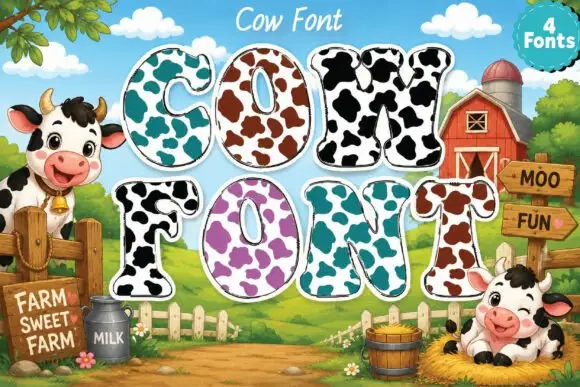
Broad rounded slab capitals carrying contrasting cow-like patches
Cow Font draws heavy rounded capitals and fills each with a cow print: a pale ground spotted with large irregular patches, available in four colourways from turquoise to purple.
Ideas for this font
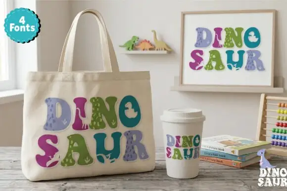
Soft chunky multicolour forms with small dinosaur-like silhouettes
Dinosaur Profonts fills chunky pastel capitals with dinosaur-skin textures, from scales to smooth hide, and sells four versions of the same alphabet so one word can mix four patterns.
Ideas for this font
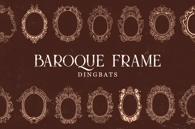
Intricate oval baroque frames with curling crowns and fine inner rings
Baroque Frame Dingbats is a set of oval cartouche frames drawn with acanthus scrolls, shell crests and bead mouldings, each one a typable character that can be dropped around a name.
Ideas for this font
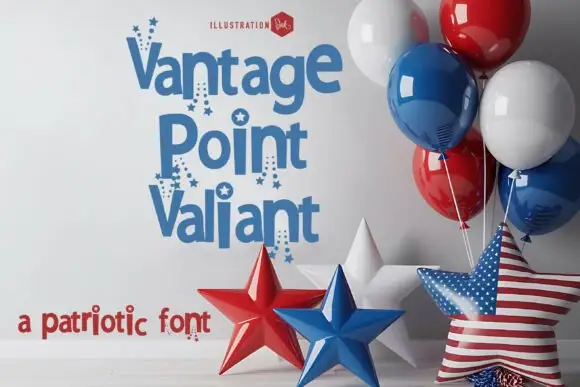
Patriotic starred display
Vantage Point Valiant is a rounded display in blue on white, shown in three stacked lines with star details on the strokes and clusters of small stars falling below selected letters, beside red, white and blue balloons and foil stars, with a red strapline at the foot.
Ideas for this font
Same independent foundry
Allow optional Google Analytics to measure visits and catalogue actions. Your search words and notes are not included. Privacy & storage