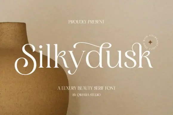
Modern Grotesque Body

Cathezi Slab + Clyne Sans
Creates crisp high-hierarchy contrast beneath Cathezi Slab headlines across menus, websites and labels.
Inspect Clyne Sans specimenDisclosure: MakerFileHub may earn a commission from qualifying purchases via paid links on this page. How our links work.
Playful chunky slabs with curled joins and softened notches
Cathezi Slab presents cream CATHEZI above yellow SLAB on pink. Thick rounded stems bend into unexpected curls with soft inward cuts, the E sweeps a long lower arm, black edging gives the irregular shapes a clear silhouette, and the short A counter stays small inside the heavy fill.
Paid link
Get this fontProject & layout blueprintsAt-a-glance maker compatibility
Sturdy stroke walls and open counters weed cleanly on adhesive vinyl, HTV apparel film, and cut cardstock.
Visual anatomy & craft review
The stems stay thick, the arms curl, the joins cut inward and the outline holds the silhouette together. That playful irregularity is the character: a slab face behaves like a drawn letter without losing its block weight, which is why the sample stacks two coloured rows. The cartoon figures, stars and checker strips are cover artwork, and the alternates caption is a source claim, so verify how the curl forms are selected, keep 34 pt and confirm the outline is yours rather than built into the file.
Playful chunky slabs with curled joins and softened notches
Two-font hierarchy recipes
Tested contrast partners — pairing Cathezi Slab with grounded secondary typography.
Cathezi Slab + Clyne Sans
Creates crisp high-hierarchy contrast beneath Cathezi Slab headlines across menus, websites and labels.
Inspect Clyne Sans specimen
Cathezi Slab + Hello Honey
Adds a warm human signature touch for 1-to-3-word callouts without competing against structured serif capitals.
Inspect Hello Honey specimenPractical applications
Concrete hierarchy, scale and production guidance tailored to Cathezi Slab’s stroke geometry.
The curled slabs suit a young audience, and the heavy bodies hold a name at 34 pt on an A6 card, where the softened notches stay friendly at reading size.
Hierarchy & layout recipe
Print an A6 card: set the name at 34 pt on one row, keep 16 mm of clear ground beneath before the details at 11 pt, and add the outline in layout so the print colour stays flat.
Pre-production check
A black outline printed too thin reads as dirt; check the card proof and keep the stroke at 0.6 mm or heavier.
The chunky letters read across a room, and the curled arms hold a short word at 46 pt on a laminated panel, where the silhouette stays clear at a distance.
Hierarchy & layout recipe
Laminate a 400 by 250 mm panel: set the word at 46 pt on one row, keep 20 mm of clear ground beneath before the smaller line at 14 pt, and keep 20 mm of margin so the curls are not cut.
Pre-production check
Soft notches under 2 mm vanish in a laminate edge; check the trim and keep 18 mm of margin.
The playful slabs give a favour tag character, and the thick stems hold a short name at 24 pt on a 40 by 70 mm tag, where the long E arm fits the narrow width.
Hierarchy & layout recipe
Print a 40 by 70 mm tag: set the name at 24 pt on one row, keep 10 mm of clear ground beneath for the curl, and keep 6 mm to the punch hole so the tag holds.
Pre-production check
Curls may be alternates rather than defaults; check the file before designing a word that depends on them.
Technical & licence verification
Confirm included OTF/TTF/WOFF formats, full glyph tables and licence coverage on the live store page before batch production.
Closest visual alternatives
Matched across letterform anatomy, stroke behaviour and craft applications.
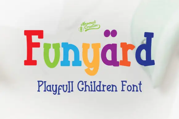
Bouncy mixed-case slabs with rounded bowls and uneven stems
Funyard uses multicoloured mixed-case lettering on a pale blurred field, where a tall red F and a blue d frame shorter soft rounded forms, the y drops into a broad curved descender and two purple dot-like shapes sit above the central letters as a playful accent.
Ideas for this font
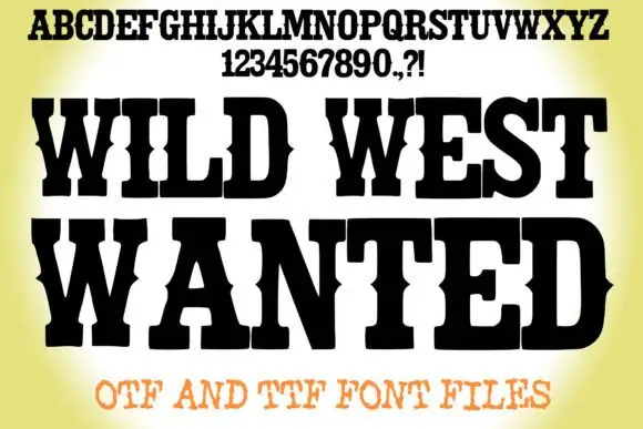
Heavy western wanted slab
Wild West Wanted is a heavy western slab in black on a warm yellow vignette: wide caps with spurred serifs, a swollen waist, heavy strokes and closed counters, shown with a full alphabet and numeral line above and a tracked note beneath announcing the formats.
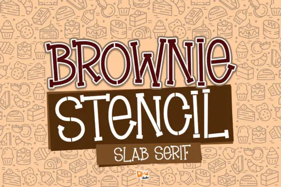
Slender irregular slabs with deliberate stencil-like gaps
Brownie Stencil combines a brown outlined BROWNIE title with a thin white STENCIL row, where the tall letters vary in width, small breaks interrupt strokes at several joins and curves, and a pastry pattern, colour panels and title edging fill the cover around them.
Ideas for this font
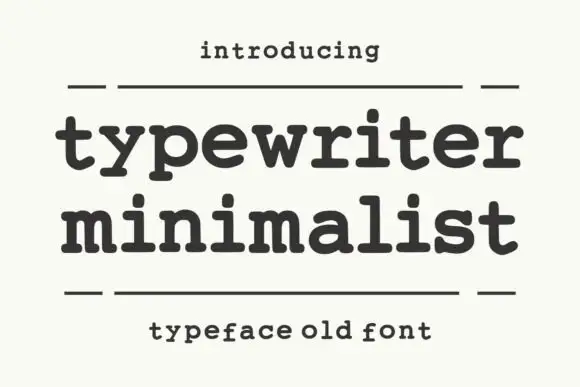
Heavy rounded typewriter slab
Typewriter Minimalist is a heavy rounded typewriter slab in charcoal on cream: thick lowercase with blunt typewriter feet, a large x-height and short ascenders, set over two lines between two rules with a tracked line above and a caption beneath.
Same independent foundry
Allow optional Google Analytics to measure visits and catalogue actions. Your search words and notes are not included. Privacy & storage