High-Contrast Display Serif

Cathalie + Cronelo
Pairs sculptural editorial warmth with Cathalie's clean modern geometry.
Inspect Cronelo specimenDisclosure: MakerFileHub may earn a commission from qualifying purchases via paid links on this page. How our links work.
Fine contrast capitals with sharp A diagonals and a long curved L foot
Cathalie is an elegant sans with high stroke contrast: hairline joins, gently flared stems, and a set of ligatures that let the last letter of a word flow into a long thin swash.
Paid link
Get this fontProject & layout blueprintsAt-a-glance maker compatibility
Sturdy stroke walls and open counters weed cleanly on adhesive vinyl, HTV apparel film, and cut cardstock.
Visual anatomy & craft review
CATHALIE sits across a warm gold ground above a photograph of white lily petals, set in cream capitals with a thin waist and a wide stance. The forms are unusual for a sans: the stems swell slightly at the base, the crossbar of the A is a hairline, and the final E runs out into a swash that curls under the word and finishes in a point. Three sparkle marks are drawn at the corners of the composition, one above the first letter and one below the last. The credits are tiny: a line at the left describes the style and the ligature count, and a line at the right reserves the rights. The face is a luxury titling cut, and its whole character lives in the thin strokes, so it belongs on coated stock at large sizes; on rough paper the hairlines break and the elegance goes with them.
Fine contrast capitals with sharp A diagonals and a long curved L foot
Two-font hierarchy recipes
Tested contrast partners — pairing Cathalie with grounded secondary typography.
Cathalie + Cronelo
Pairs sculptural editorial warmth with Cathalie's clean modern geometry.
Inspect Cronelo specimen
Cathalie + Simple Handwriting
Introduces organic movement on pull-quotes, signatures and gift tags.
Inspect Simple Handwriting specimenPractical applications
Concrete hierarchy, scale and production guidance tailored to Cathalie’s stroke geometry.
The hairline joins give an invitation a couture tone without a script, and the swash lets two names meet in one line instead of needing a divider between them.
Hierarchy & layout recipe
Print a 148 by 210 mm invitation: set the names at 34 pt on one row, keep 24 mm of clear ground beneath before the venue at 9 pt, and hold 18 mm of margin from the swash to the card edge.
Pre-production check
Hairlines under a tenth of a millimetre break in letterpress; print one invitation in the intended process and check the swash tip first.
The thin waist and the flared stems read as metalwork, and one word over a photograph carries a cover that has no drawn graphic on it.
Hierarchy & layout recipe
Print a 230 by 300 mm cover: set the feature word at 140 pt across one row, keep 30 mm of clear ground beneath before the standfirst at 11 pt, and hold 18 mm from the last letter to the right trim.
Pre-production check
Over a bright photograph the hairlines vanish; print one cover and check the thin strokes against the lightest part of the image.
The contrast suggests glass and thin metal, and the swash gives a short product name an ending that reads as a hallmark on a small label.
Hierarchy & layout recipe
Print a 55 by 105 mm label: set the product name at 28 pt on one row, keep 9 mm of clear ground beneath before the volume at 4.5 pt, and hold 6 mm from the swash to the label edge.
Pre-production check
Small labels on curved glass stretch the swash; print one label and roll it onto the bottle before the run.
Technical & licence verification
Confirm included OTF/TTF/WOFF formats, full glyph tables and licence coverage on the live store page before batch production.
Closest visual alternatives
Matched across letterform anatomy, stroke behaviour and craft applications.
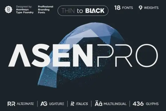
A geometric uppercase name split between heavy ASEN and hairline PRO
Asen Pro shows pale uppercase lettering over a blue faceted object on dark grey, where the first part uses thick geometric strokes with an open triangular A while the second part is much finer and widely spaced, and the cover advertises a large multi-weight family.
Ideas for this font
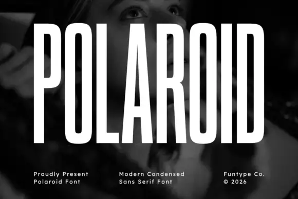
Tall condensed grotesque
Polaroid is a tall condensed grotesque in white over a monochrome portrait: very narrow capitals with flat terminals, a closed counter in the O, a short bar on the R, and a height that runs almost the full frame, so the word reads as a stretched sign rather than a standard alphabet.
Ideas for this font
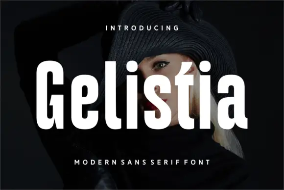
Heavy narrow mixed case with compact counters and a pointed t top
Gelistia sets a very condensed grotesque in white over a dark portrait, the strokes heavy, the spacing tight and the letters narrow enough that a seven-letter word fills the frame.
Ideas for this font
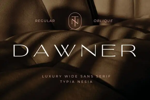
Very wide light capitals with a crossed W and flattened rounded bowls
Dawner sets its capitals very wide and very light, spaced far apart across a warm brown photograph, so a single word reads as a line of quiet marks rather than as a sign.
Ideas for this font
Same independent foundry
Allow optional Google Analytics to measure visits and catalogue actions. Your search words and notes are not included. Privacy & storage