Neutral Sans Workhorse

Broxean + Noar
Lets Broxean own the focal silhouette while handling secondary copy, sizing and subheads cleanly.
Inspect Noar specimenDisclosure: MakerFileHub may earn a commission from qualifying purchases via paid links on this page. How our links work.
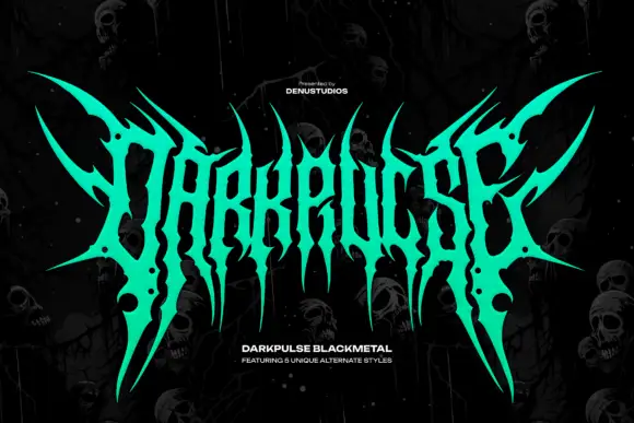
Interlocking thorn-like letters forming a broad pointed crest
Broxean is black metal lettering: thorned spikes radiating from a compressed core, letters fused into a mirrored emblem, and a hot red-to-orange gradient fill.
Paid link
Get this fontProject & layout blueprintsAt-a-glance maker compatibility
Sturdy stroke walls and open counters weed cleanly on adhesive vinyl, HTV apparel film, and cut cardstock.
Visual anatomy & craft review
The emblem fills the middle of a dark card, drawn in a gradient that runs from deep red at the outer points to bright orange in the centre, and it is built as a symmetrical crest: the letters are compressed into a vertical core and every stroke throws a thorn, so the outline looks like a bramble. The spikes reach above the cap height and below the baseline, and the whole shape is mirrored left to right. A caption at the top introduces the release and a line at the foot names the style with a small paragraph underneath. The lettering is designed as a readable extreme: the thorns are thin and the cores of the strokes stay wide, so the word can still be read at poster size, which is the one rule of the genre that most metal faces break.
Interlocking thorn-like letters forming a broad pointed crest
Two-font hierarchy recipes
Tested contrast partners — pairing Broxean with grounded secondary typography.
Broxean + Noar
Lets Broxean own the focal silhouette while handling secondary copy, sizing and subheads cleanly.
Inspect Noar specimen
Broxean + Cervelique
Grounds bold display lettering with classic typographic authority on posters, badges and apparel.
Inspect Cervelique specimenPractical applications
Concrete hierarchy, scale and production guidance tailored to Broxean’s stroke geometry.
The mirrored crest reads as a band emblem from the doorway, and the warm gradient holds against a dark wall where a flat white face would glare.
Hierarchy & layout recipe
Print an A2 poster: set the emblem at 320 mm wide across the upper half, keep 34 mm of clear ground beneath before the line-up at 12 pt, and hold 28 mm of margin from the thorns to the trim.
Pre-production check
Thin thorns break on cheap stock; print one poster at the final size and check the outer points first.
The form is the subject of the book, so a cover can carry the emblem alone and let a plain caption block underneath explain what it covers.
Hierarchy & layout recipe
Print a 210 by 280 mm cover: set the emblem at 170 mm wide at the top, keep 28 mm of clear ground beneath before the title block at 12 pt, and hold 22 mm from the lowest thorn to the trim.
Pre-production check
Gradient fills band in offset; print one cover with the real separations and check the transition before the run.
A one-colour silhouette of the emblem still reads as the band mark, and the mirrored shape sits well on a chest print of any size.
Hierarchy & layout recipe
Print a 260 by 360 mm chest print: set the emblem at 240 mm wide, keep 32 mm of clear ground beneath before the tour line at 9 pt, and hold 26 mm from the thorns to the print edge.
Pre-production check
Coarse mesh closes the thin thorns; print one pull on the actual shirt and check the outline before the run.
Technical & licence verification
Confirm included OTF/TTF/WOFF formats, full glyph tables and licence coverage on the live store page before batch production.
Closest visual alternatives
Matched across letterform anatomy, stroke behaviour and craft applications.
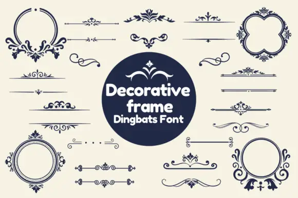
Dark ornamental dividers and round frames with leaf-like scrolls
Decorative Frame combines slender horizontal rules, mirrored flourishes and circular or four-lobed frames in navy on cream. Small diamond centres and curled leaf-like endings punctuate the lines, and the display mixes open-topped round forms with closed borders, some much denser at the base or crown than at their sides.
Ideas for this font
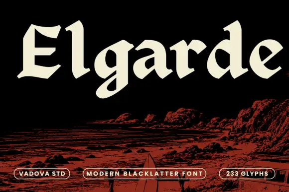
Heavy open blackletter with sloping cuts and a rounded g tail
Elgarde uses broad cream letters above a red coastal scene, where the E has sharply clipped horizontal ends, the lowercase a and d enclose large sloping counters and a rounded low g tail interrupts an otherwise firm baseline, with relatively open interiors for such heavy strokes.
Ideas for this font
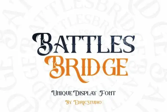
Contrasting display serifs with curled capitals and extended legs
Battlesbridge pairs dark BATTLES with orange BRIDGE in a compact two-row composition, where large curled B forms, pointed serif ends and a long sweeping R leg make the title ornamental without becoming a connected script, while fine lines cross parts of the letters and add a second detail scale.
Ideas for this font
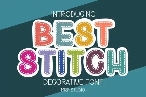
Rounded outlined capitals with a dashed inner stitch-like border
Best Stitch draws fat rounded letters in pastel colour and runs a dashed stitch line inside every outline, so a word looks like a row of applique patches sewn onto fabric.
Ideas for this font
Same independent foundry
Allow optional Google Analytics to measure visits and catalogue actions. Your search words and notes are not included. Privacy & storage