High-Contrast Display Serif

Cornelia Font Duo + Orvelia
Pairs sculptural editorial warmth with Cornelia Font Duo's clean modern geometry.
Inspect Orvelia specimenDisclosure: MakerFileHub may earn a commission from qualifying purchases via paid links on this page. How our links work.
Upright fine serif capitals paired with a thin sweeping signature line
Cornelia pairs a gold serif capital line with a thin signature script, and sets the two on charcoal inside a rule so the pair reads as an engraved card rather than a poster.
Paid link
Get this fontProject & layout blueprintsAt-a-glance maker compatibility
Set Cricut or Silhouette operation to Pen, Foil Quill, or Laser Score — not Basic Blade Cut.
Visual anatomy & craft review
CORNELIA stands in wide high-contrast capitals with fine serifs, while the handwritten line beneath overlaps the baseline in a light, flowing script whose capitals lean and whose joins stay thin. The gold and the white separate the two voices without a size jump, which is the trick of a workable duo: one colour, two hands. A tracked caption below names the pairing and the designer, and a thin gold frame holds the whole composition. Because the script is light, it needs a clean ground, and because the serif is fine, it needs size: printed small, the gold capitals lose their hairlines first.
Upright fine serif capitals paired with a thin sweeping signature line
Two-font hierarchy recipes
Tested contrast partners — pairing Cornelia Font Duo with grounded secondary typography.
Cornelia Font Duo + Orvelia
Pairs sculptural editorial warmth with Cornelia Font Duo's clean modern geometry.
Inspect Orvelia specimen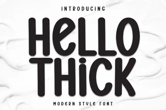
Cornelia Font Duo + Hello Thick
Introduces organic movement on pull-quotes, signatures and gift tags.
Inspect Hello Thick specimenPractical applications
Concrete hierarchy, scale and production guidance tailored to Cornelia Font Duo’s stroke geometry.
The serif carries the formality and the script carries the personal name, which is the standard hierarchy of a wedding invitation in one pair.
Hierarchy & layout recipe
Print a 130 by 180 mm invitation: set the names at 26 pt in the script with the family line at 18 pt in the serif above, keep 18 mm of clear ground beneath before the venue at 9 pt, and keep 16 mm of margin on each side.
Pre-production check
Fine hairlines need coated card; check a printed proof on the actual stock before the suite.
The pair gives a small perfume a mark and a signature at once, and the one-colour treatment prints cleanly on a narrow bottle label.
Hierarchy & layout recipe
Print a 40 by 90 mm label: set the house name at 15 pt in the serif and the perfumer line at 12 pt in the script, keep 7 mm of clear ground beneath before the volume at 5 pt, and keep 5 mm to the die edge.
Pre-production check
Thin scripts break in hot foil; check a stamp test before the label run. Request a proof on the actual stock before signing off.
The signature script does the personal part of the message, and the serif keeps the card from looking like a note torn from a book.
Hierarchy & layout recipe
Print a 105 by 148 mm card: set the greeting at 22 pt in the script, keep 14 mm of clear ground beneath before the date at 9 pt in the serif, and keep 12 mm of margin on all four sides of the card.
Pre-production check
Light scripts print grey on uncoated card; check a sample before the batch. Order one sample before committing to the run.
Technical & licence verification
Confirm included OTF/TTF/WOFF formats, full glyph tables and licence coverage on the live store page before batch production.
Closest visual alternatives
Matched across letterform anatomy, stroke behaviour and craft applications.
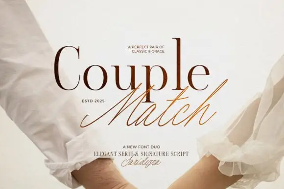
Duo pairing a high-contrast serif with a quick signature script
Couple Match is a two-cut family in which a high-contrast serif sets a formal word and a quick signature script writes the second, so a design gets a staged and a handwritten line from one purchase.
Ideas for this font
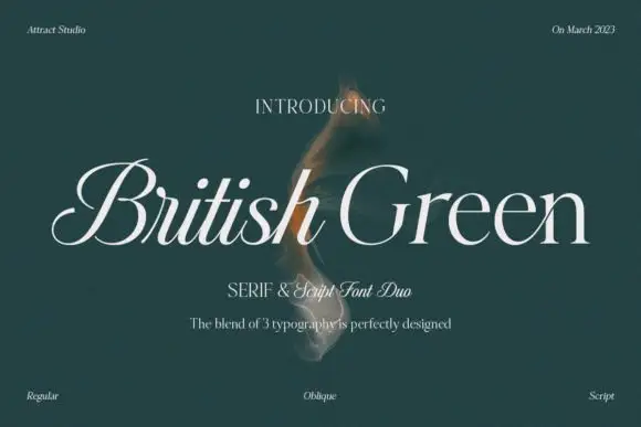
Slanted fine serif forms with a looped initial and restrained lower text
British Green shows a pale slanted name on a deep green field, where British begins with a large looped B and fine connecting-looking entries while Green has a more open capital and broad rounded lowercase bowls, with a restrained line of smaller supporting text beneath.
Ideas for this font
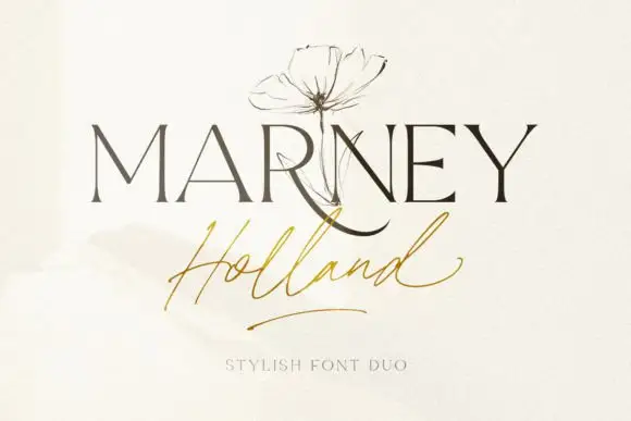
Fine serif and loose signature duo
Marney Holland pairs a tall high-contrast serif capital cut with a loose thin script: the R curls its leg below the serif line, the script runs light through its joins and a long low exit stroke closes the written line.
Ideas for this font
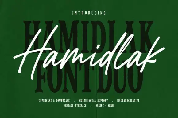
Brush signature script layered over a heavy vintage serif
Hamidlak layers a loose brush signature over a heavy vintage serif, so the same word appears twice in the sample — once as a signature and once as a stamped plate.
Ideas for this font
Allow optional Google Analytics to measure visits and catalogue actions. Your search words and notes are not included. Privacy & storage