Editorial Serif Anchor

Anna Audrey + Bulgary
Anchors Anna Audrey's fluid strokes with crisp Roman proportions on wedding suites, headers and packaging.
Inspect Bulgary specimenDisclosure: MakerFileHub may earn a commission from qualifying purchases via paid links on this page. How our links work.
Formal calligraphy with tall looped capitals
Anna Audrey is a formal calligraphy script with tall looped capitals, a moderate slant and fine joins, set here across two words that share one even baseline.
Paid link
Get this fontProject & layout blueprintsAt-a-glance maker compatibility
Weld or Unite overlapping script joins into one continuous vector path before sending to the blade.
Visual anatomy & craft review
Both capitals are drawn at a size well above the lowercase: the A lifts a slim looped stem that rises and falls in a single gesture, and the second A repeats it at the start of the surname with a lighter touch. The lowercase letters keep a small x-height with long entry and exit strokes, so the middle of each word is quiet and the letters connect at a consistent angle. Weight splits evenly between solid downstrokes and fine joins, and the r, d and y finish in short tapered points rather than curls. The pampas grass photograph behind the card is the ground, the tracked label above and the two-line credit beneath are a second and third face, and the thin rule under the script is a drawn rule rather than part of the lettering.
Formal · Looped · Flowing
Two-font hierarchy recipes
Tested contrast partners — pairing Anna Audrey with grounded secondary typography.
Anna Audrey + Bulgary
Anchors Anna Audrey's fluid strokes with crisp Roman proportions on wedding suites, headers and packaging.
Inspect Bulgary specimen
Anna Audrey + Saltriver Grotesk
Keeps small-scale dates, URLs, nutrition facts and care instructions crisp and legible below script titles.
Inspect Saltriver Grotesk specimenPractical applications
Concrete hierarchy, scale and production guidance tailored to Anna Audrey’s stroke geometry.
Formal looped calligraphy reads as traditional without being ornate, and the quiet lowercase lets a long pair of names sit on one line where a decorative script would have to break.
Hierarchy & layout recipe
Set the names at 28 pt on a 120 by 80 mm card, keep the date block in a light serif at 8 pt, and hold 12 mm between the lowest loop and the details so the two zones never touch.
Pre-production check
Looped capitals are the tallest element; measure the card's optical centre from the top of the loops, or the names will look low on the card.
A formal script gives a studio a letterhead that looks written rather than typeset, and the even baseline keeps a short note from looking like an invitation when the studio is writing about work.
Hierarchy & layout recipe
Set the studio name at 20 pt at the head of an A4 sheet, keep the address and contact in a plain serif at 8 pt at the foot, and hold the text block 30 mm below the looped capitals.
Pre-production check
The script's fine joins on cream stock read as a watermark at letter size; check the print at 100 percent before the run, since a copy-shop printer may thin it further.
A formal looped script sets a bridal opener apart from the body pages while the moderate slant keeps the layout from looking tilted, which a heavier calligraphic face would do.
Hierarchy & layout recipe
Run the title at 50 pt on the first spread, set the standfirst at 10 pt starting two lines below the lowest loop, and align the body column to the text measure rather than to the script's widest point.
Pre-production check
The capital loops extend past the word's optical edge; align the measure to the lowercase, or the first line of body copy will look indented on one side.
Technical & licence verification
Confirm included OTF/TTF/WOFF formats, full glyph tables and licence coverage on the live store page before batch production.
Closest visual alternatives
Matched across letterform anatomy, stroke behaviour and craft applications.
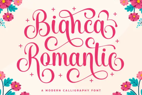
High-contrast looping calligraphy with heavy swash caps and stacked words
Bianca Romantic is high-contrast looping calligraphy in which each word opens with a heavy swashed capital and the two lines stack so their flourishes interlock.
Ideas for this font
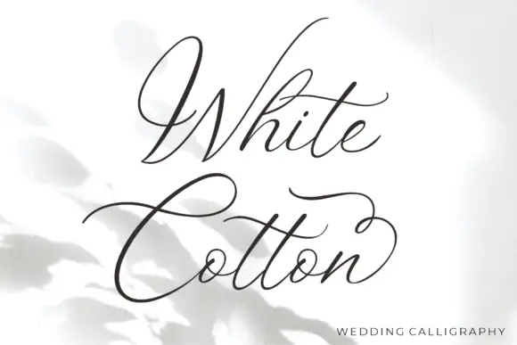
Fine sweeping wedding calligraphy
White Cotton is a fine wedding calligraphy in charcoal on white: hairline letters with heavy shades on the downstrokes, a capital W drawn as a wide sweep and a C whose crossbar runs the width of the word.
Ideas for this font
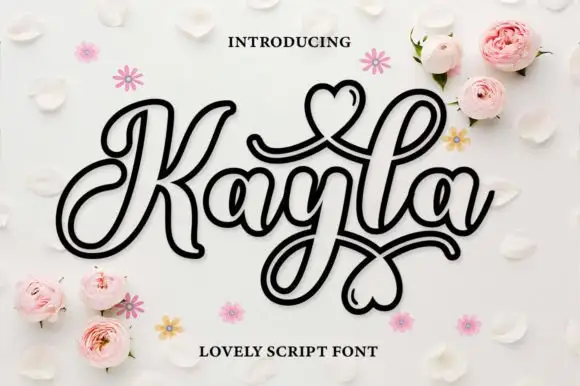
Outlined decorative script with hearts drawn inside the loops
Kayla is an outlined decorative script in which every stroke is drawn as a double line and the loops close into hearts, so a name reads as a paper cut-out rather than as a written word.
Ideas for this font

Modern copperplate calligraphy with overhead swash loops and thick-thin contrast
Bunglon is a modern copperplate script in which the downstrokes carry weight, the hairlines stay fine and generous swashes arch above the x-height and below the baseline, so a single name reads as formal calligraphy.
Ideas for this font
Same independent foundry
Allow optional Google Analytics to measure visits and catalogue actions. Your search words and notes are not included. Privacy & storage