Editorial Serif Anchor

Bingsu + Bulgary
Anchors Bingsu's fluid strokes with crisp Roman proportions on wedding suites, headers and packaging.
Inspect Bulgary specimenDisclosure: MakerFileHub may earn a commission from qualifying purchases via paid links on this page. How our links work.
Bold rounded script with heart tittles and short ascenders
Bingsu is a bold rounded script in one weight, with short ascenders, tight rounded bowls and small hearts in place of dots, so a single word reads as a soft, dense shape rather than a written line.
Paid link
Get this fontProject & layout blueprintsAt-a-glance maker compatibility
Weld or Unite overlapping script joins into one continuous vector path before sending to the blade.
Visual anatomy & craft review
The capital B opens with a rounded loop that folds back over a heavy stem, then two bowls that close almost to the stem, which gives the word its compact start. The following letters keep that density: the i and the n have short ascenders and narrow counters, the g drops a tight loop that returns under the x-height, the s closes into a rounded double curve, and the u ends with a blunt terminal. Both dots in the word are drawn as small solid hearts rather than circles, and they sit just above the x-height, so they read as decorative marks rather than as punctuation. Weight never varies and nothing tapers, which keeps the word legible at small sizes. The plain cream ground, the pale flower motifs and the tracked label are presentation; the script is the word.
Bold · Rounded · Cute
Two-font hierarchy recipes
Tested contrast partners — pairing Bingsu with grounded secondary typography.
Bingsu + Bulgary
Anchors Bingsu's fluid strokes with crisp Roman proportions on wedding suites, headers and packaging.
Inspect Bulgary specimen
Bingsu + Memoir Slang
Keeps small-scale dates, URLs, nutrition facts and care instructions crisp and legible below script titles.
Inspect Memoir Slang specimenPractical applications
Concrete hierarchy, scale and production guidance tailored to Bingsu’s stroke geometry.
The bold rounded strokes survive being cut small from card or acrylic, and the tight bowls mean the name stays readable even when a child's name is long.
Hierarchy & layout recipe
Set the name at 45 mm tall on a 120 mm topper, keep the age in the same face at 25 mm, and leave 6 mm of material around the heart tittle so it does not snap off in the cutter.
Pre-production check
A heart tittle smaller than 4 mm will fail in acrylic; check the vector at full size and thicken the heart before the file is sent to the cutter.
A dense rounded script reads as dessert before the flavour is read, and because the weight is even it prints cleanly on a small label where a contrasted script would clot.
Hierarchy & layout recipe
Set the shop name at 14 pt on a 50 by 50 mm label, keep the flavour in a bold 7 pt sans, and leave 5 mm between the script and the label edge so the heart tittle is not clipped.
Pre-production check
Small square labels are usually printed on a roll with tight registration; check the second impression in the run and confirm the hearts stay solid.
Soft rounded letters with hearts make a label welcoming without being hard to read, and the short ascenders keep a name within a small sticker at a size a child can recognise.
Hierarchy & layout recipe
Set the child's name at 18 pt on a 60 by 30 mm label, keep the class in a 7 pt sans, and leave 4 mm at the right so the final bowl does not touch the border.
Pre-production check
Sticker labels on plastic folders lift at the corner; print a sheet, apply one to a real folder and check the heart tittle survives the edge trim.
Technical & licence verification
Confirm included OTF/TTF/WOFF formats, full glyph tables and licence coverage on the live store page before batch production.
Closest visual alternatives
Matched across letterform anatomy, stroke behaviour and craft applications.
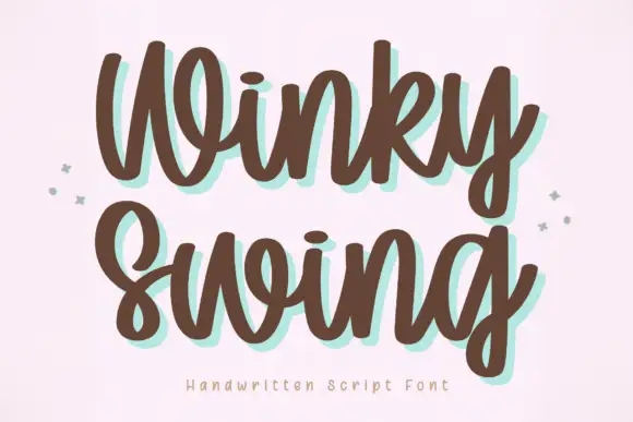
Bold handwriting with a coloured drop shadow
Winky Swing is a bold handwritten script in brown on cream: fat rounded letters with open loops, a tilted baseline and a mint shadow offset behind them, with two small sparkles either side and a tracked caption below.
Ideas for this font
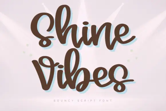
Heavy rounded bouncing script
Shine Vibes is a heavy rounded script in warm brown: fat even strokes, short ascenders, a strong bounce across the line and a pale blue shadow that sits behind the lettering.
Ideas for this font

Heavy calligraphy with large curled terminals
Thick Black combines heavy rounded stems with large looping T, B and k forms, where two stacked words sit with tight middle counters and sweeping outer terminals, and a faint landscape runs behind the lettering as separate artwork.
Ideas for this font
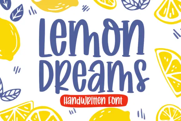
Quirky handwritten display
Lemon Dreams is a quirky handwritten display in navy on cream, surrounded by drawn lemons: a tall irregular hand with a straight-legged a, an open e and a hooked y, set in two lines with a small caps line above and a red banner beneath naming the category.
Ideas for this font
Same independent foundry
Allow optional Google Analytics to measure visits and catalogue actions. Your search words and notes are not included. Privacy & storage