Editorial Serif Anchor

Better Together + Auretha
Anchors Better Together's fluid strokes with crisp Roman proportions on wedding suites, headers and packaging.
Inspect Auretha specimenDisclosure: MakerFileHub may earn a commission from qualifying purchases via paid links on this page. How our links work.
Heavy joined looping handwriting with a long entry swash on each line
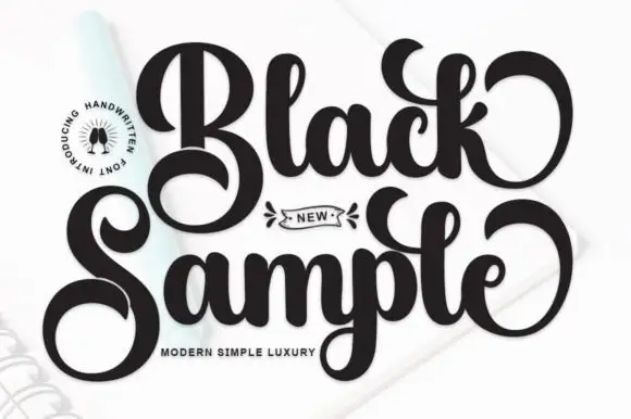
Better Together is heavy joined handwriting in one loaded weight, with broad looping forms and a long entry swash that runs in under the first capital of each line, so two stacked words lock together as one mark.
Paid link
Get this fontProject & layout blueprintsAt-a-glance maker compatibility
Weld or Unite overlapping script joins into one continuous vector path before sending to the blade.
Visual anatomy & craft review
The capital B is drawn as a tall stem with a wide entry swash that begins to the left and below it, then two lobes that close nearly to the stem, which gives the letter its width. The lowercase letters that follow are broad: the e and the t keep open counters, the double t repeats a matched pair of crossbars, and the joins stay as thick as the stems so the word never breaks into separate parts. The second line starts with the same entry swash, turned to tuck under the first line's final r, so the two words interlock rather than stack mechanically. Nothing tapers, and the ends are blunt and rounded. The faint photographic background and the small tracked caption below are presentation; the handwriting is the two words.
Heavy · Looped · Joined
Two-font hierarchy recipes
Tested contrast partners — pairing Better Together with grounded secondary typography.
Better Together + Auretha
Anchors Better Together's fluid strokes with crisp Roman proportions on wedding suites, headers and packaging.
Inspect Auretha specimen
Better Together + Hermano
Keeps small-scale dates, URLs, nutrition facts and care instructions crisp and legible below script titles.
Inspect Hermano specimenPractical applications
Concrete hierarchy, scale and production guidance tailored to Better Together’s stroke geometry.
A heavy joined hand holds up on kraft board and in one-colour stamping, where a fine script would lose its joins, and the interlocking lines give a two-word name a compact square footprint.
Hierarchy & layout recipe
Set the mark at 18 pt inside a 45 by 45 mm stamp, keep the descriptor in a 6 pt sans beneath, and leave 4 mm of clearance so the entry swash does not run to the edge of the block.
Pre-production check
Rubber stamps swell at the corners; check a stamped impression on the actual kraft and open the tightest join rather than pressing harder.
The heavy stroke reads across a courtyard where guests arrive after dark, and the interlocking lines make a two-line phrase look designed rather than stacked.
Hierarchy & layout recipe
Set the phrase at 12 cm on a 600 by 800 mm board, keep the venue name in a 4 cm sans at the foot, and hold 10 cm of margin so the entry swash stays inside the painted area.
Pre-production check
Painted boards under evening light lose definition at 12 cm if the paint is thin; check the board at the venue's lighting and apply a second coat to the stems only.
The interlocking lines let two names share a single small sticker without a divider, and the heavy weight stays legible at the size of a favour seal.
Hierarchy & layout recipe
Set both names at 14 pt on a 50 mm round sticker, keep the date in a 6 pt sans, and leave 5 mm of clearance inside the circle so the swash does not follow the die edge.
Pre-production check
A round die cuts through descenders; check the artwork against the die and raise the baseline if the descender crosses the cut line.
Technical & licence verification
Confirm included OTF/TTF/WOFF formats, full glyph tables and licence coverage on the live store page before batch production.
Closest visual alternatives
Matched across letterform anatomy, stroke behaviour and craft applications.
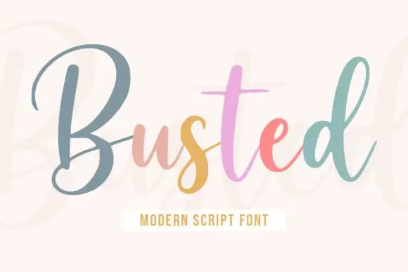
Upright monoline script with tall narrow capitals and long entry stroke
Busted is an upright monoline script in which the capital rises far above the x-height and enters from a long straight lead, while the lowercase stays narrow and evenly spaced on a level baseline.
Ideas for this font
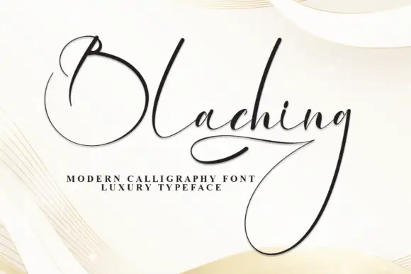
Fine dramatic looped calligraphy with an oversized capital and a deep descender
Blaching is fine calligraphy in which the capital opens into a full circle that sits far to the left of the word, and the descenders drop into huge loops that hang below the baseline.
Ideas for this font
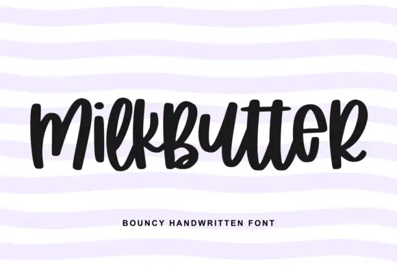
Bouncy fat handwriting with a tall waist
Milkbutter is a bouncy handwritten face in black on white: fat rounded letters with a tall waist, stems that lean and lift, and a baseline that rises and falls across the word, shown over soft lilac wavy bands.
Ideas for this font
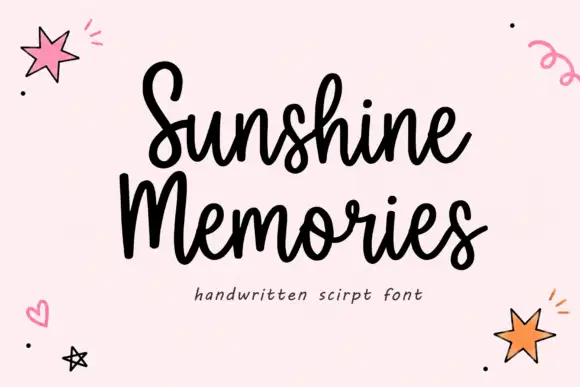
Rounded connected handwritten script
Sunshine Memories is a rounded connected script in black on pale pink: fat even strokes, a moderate bounce and small drawn hearts, dots and stars scattered around the two words.
Same independent foundry
Allow optional Google Analytics to measure visits and catalogue actions. Your search words and notes are not included. Privacy & storage