Modern Grotesque Body

Becki + Saltriver Grotesk
Creates crisp high-hierarchy contrast beneath Becki headlines across menus, websites and labels.
Inspect Saltriver Grotesk specimenDisclosure: MakerFileHub may earn a commission from qualifying purchases via paid links on this page. How our links work.
Fine mixed case with an extended k top and a deep curled leg
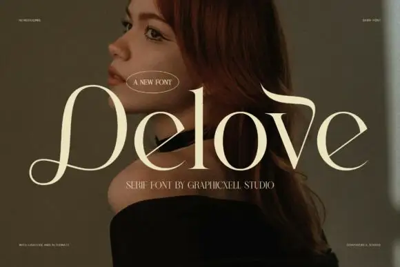
Becki shows pale cream lettering over a dark orange portrait. The capital B has a broad open lower bowl, the e carries a thin horizontal crossbar and the c ends in a rounded inward terminal, while the k rises into a long leftward top stroke and drops into a broad curling leg beneath the final i.
Paid link
Get this fontProject & layout blueprintsAt-a-glance maker compatibility
Crisp hairline serifs shine on stationery, foil stamping, and packaging; add slight offset for small decals.
Visual anatomy & craft review
The strokes stay fine, the bowls open wide, the terminals round inward and one letter stretches in both directions. That extended k is the character: a quiet contrast serif gains a single dramatic letter, which is why the sample lets the leg curl under the last syllable. Only a short word is shown on a low-contrast field, so check the rest of the alphabet, keep 30 pt for the fine strokes and allow 20 mm beneath the curled leg. The curled leg is the piece that needs room: it draws under the syllable, so 20 mm beneath it keeps it clear, and the fine strokes silt below about 30 pt.
Fine mixed case with an extended k top and a deep curled leg
Two-font hierarchy recipes
Tested contrast partners — pairing Becki with grounded secondary typography.
Becki + Saltriver Grotesk
Creates crisp high-hierarchy contrast beneath Becki headlines across menus, websites and labels.
Inspect Saltriver Grotesk specimen
Becki + Bunglon
Adds a warm human signature touch for 1-to-3-word callouts without competing against structured serif capitals.
Inspect Bunglon specimenPractical applications
Concrete hierarchy, scale and production guidance tailored to Becki’s stroke geometry.
The fine serif suits a small ceremony, and the open bowls hold a pair of names at 28 pt on heavy cream stock, where the curled leg stays inside the card.
Hierarchy & layout recipe
Print a 105 by 148 mm card: set the names at 28 pt on one row, keep 20 mm of clear ground beneath for the curled leg, and keep the date at 9 pt in the same face but without the ornament.
Pre-production check
Fine strokes thin out on textured card; check the wet proof under raking light and choose a smooth 300 gsm cotton stock.
The rounded terminals give a studio warmth, and the mixed case holds a two-word name at 24 pt on a 60 mm square label, where the thin crossbar stays visible at small size.
Hierarchy & layout recipe
Print a 60 by 60 mm label: set the name at 24 pt on one row, keep 10 mm of clear ground beneath for the k leg, and keep the clay body note at 6 pt in a plain sans.
Pre-production check
A hairline crossbar fills in at 16 pt; check the plate proof and hold the name at 22 pt or above.
The fine contrast sets a calm heading, and the open bowls hold a three-word title at 48 pt on a magazine page, where the curled leg adds a hand-finished note.
Hierarchy & layout recipe
Print a 210 mm page: set the heading at 48 pt on one row, keep 22 mm of clear ground beneath before the standfirst at 10 pt, and keep the photograph clear of the descender area.
Pre-production check
A pale cream heading over an orange field loses contrast; check the page and print the title in near-black.
Technical & licence verification
Confirm included OTF/TTF/WOFF formats, full glyph tables and licence coverage on the live store page before batch production.
Closest visual alternatives
Matched across letterform anatomy, stroke behaviour and craft applications.
Rounded retro serif with loops
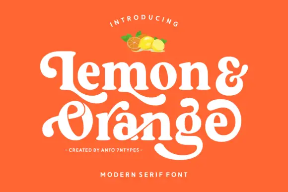
Lemon and Orange is a heavy rounded serif in cream on orange: fat stems with curled terminals, a looping O whose stroke escapes the bowl, a drawn ampersand and a swash that runs under the second word, with a small illustration of fruit above and two tracked lines beneath.
Ideas for this font
Substantial serif with wavy upper bars and curled lower terminals
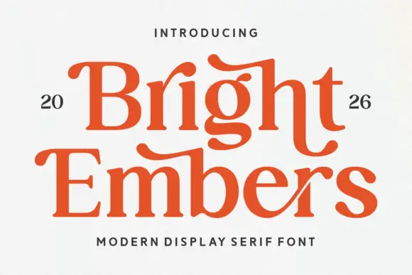
Bright Embers is a substantial serif in which the bowls stay broad, the stems hold firm, selected upper bars wave and the t and final s turn into low outward curves, so a two-row heading reads as warm editorial lettering.
Ideas for this font
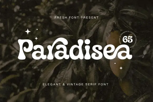
Soft heavy serif with curled entries
Paradisea is a soft heavy serif in cream over dark foliage: fat stems with round terminals, curled entries on the P and the d and a high waist, set as one word with two tracked notes above and beneath and a round badge at the right naming the alternates.
Ideas for this font
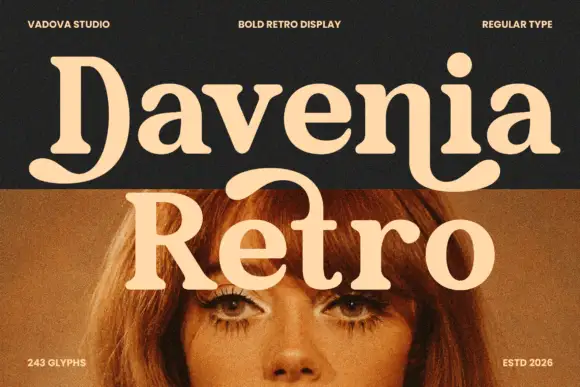
Heavy soft serif lettering with a broad D tail and hooked n ending
Davenia Retro sets a bold serif with high-waisted bowls, a round shoulder and a D that opens into a swash, so a two-word title looks like a printed poster from the early seventies.
Ideas for this font
Same independent foundry
Allow optional Google Analytics to measure visits and catalogue actions. Your search words and notes are not included. Privacy & storage