Editorial Serif Anchor

Bagtrue + Marquis - Elegant Modern Serif
Anchors Bagtrue's fluid strokes with crisp Roman proportions on wedding suites, headers and packaging.
Inspect Marquis - Elegant Modern Serif specimenDisclosure: MakerFileHub may earn a commission from qualifying purchases via paid links on this page. How our links work.
Fat retro script with a swash underline and a heavy slant
Bagtrue is a fat retro script in which the letters lean hard, the joins swell and a single swash underline runs beneath the word, so a name reads as a 1970s shopfront sign.
Paid link
Get this fontProject & layout blueprintsAt-a-glance maker compatibility
Weld or Unite overlapping script joins into one continuous vector path before sending to the blade.
Visual anatomy & craft review
The B opens a heavy loop, the a closes a fat bowl, the g drops a wide tail, the t crosses a high bar, the r swells its shoulder and the u keeps two thick stems, all at a brush weight with an even slant and a continuous underline that joins the first and last letters. The underline is the character: it turns the word into one object, which is why the sample sets a single name with no other type at that size. Because the strokes are heavy, the face holds from 26 pt and prints in one colour, but it needs space under the baseline for the swash. The warm photograph, the backpack, the small script line and the caption are presentation; the yellow-green name is the face.
Retro · Fat script · Swash
Two-font hierarchy recipes
Tested contrast partners — pairing Bagtrue with grounded secondary typography.
Bagtrue + Marquis - Elegant Modern Serif
Anchors Bagtrue's fluid strokes with crisp Roman proportions on wedding suites, headers and packaging.
Inspect Marquis - Elegant Modern Serif specimen
Bagtrue + Bargain Condensed
Keeps small-scale dates, URLs, nutrition facts and care instructions crisp and legible below script titles.
Inspect Bargain Condensed specimenPractical applications
Concrete hierarchy, scale and production guidance tailored to Bagtrue’s stroke geometry.
The heavy script gives a shopfront a period voice, and the swash underline turns a short name into one solid mark at 100 mm.
Hierarchy & layout recipe
Cut a 700 by 250 mm sign: set the name at 100 mm, keep the underline 12 mm below the baseline, and leave 30 mm of border so the swash tail finishes inside the panel.
Pre-production check
A swash underline cut too close to the edge breaks at the fixing holes; check the panel and move the holes above the underline rather than through it.
The fat script cuts as one connected shape, and the swash underline gives the cake topper a built-in mounting base at 45 mm.
Hierarchy & layout recipe
Cut a 180 mm topper: set the name at 45 mm, keep every stroke at 6 mm of material, and use the swash underline itself as the mounting strip that carries the two side supports.
Pre-production check
A script with thin joins snaps when handled; check the vector and thicken the joins under 3 mm before cutting.
The retro script reads from the back of a food truck queue, and the heavy slant gives a short dish name some movement at 70 mm.
Hierarchy & layout recipe
Print a 600 by 400 mm board: set the truck name at 70 mm, set the dishes in a 20 pt sans beneath, and keep 20 mm between the swash underline and the first dish line.
Pre-production check
A swash underline run into a dish list reads as an accidental rule; check the board and open the gap rather than shortening the swash.
Technical & licence verification
Confirm included OTF/TTF/WOFF formats, full glyph tables and licence coverage on the live store page before batch production.
Closest visual alternatives
Matched across letterform anatomy, stroke behaviour and craft applications.
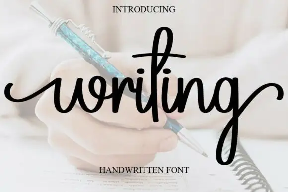
Looped handwriting with a tall ascender
Writing is a looped handwriting in black over a pale photograph of a hand with a pen: tall loops on the ascenders, small open bowls and a light even stroke, with a deep descender on the g.
Ideas for this font
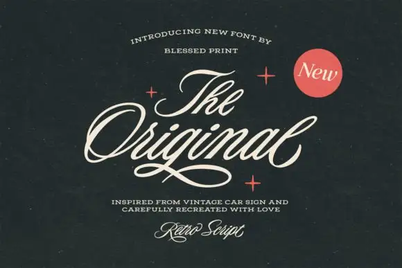
Slanted retro car-sign script
The Original Script is a slanted retro script in cream on near-black: fat even strokes, a strong forward lean, wide open loops on the O and the g, and a long thin underline that runs beneath the whole word.
Ideas for this font
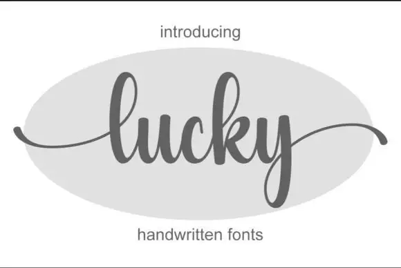
Fine connected script with sweeping exits
Lucky is a fine connected script in grey on a pale oval: tall loops, a level baseline, and entry and exit strokes that sweep out well beyond the word on both sides.
Ideas for this font
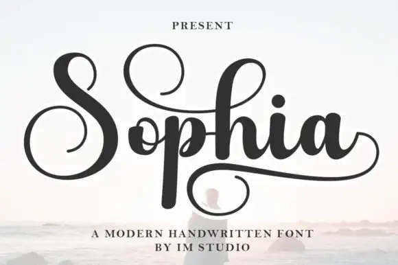
Looped modern script with a returning swash
Sophia is a looped modern script in black over a pale seascape: wide open bowls, tall capitals with full loops, and a swash that returns beneath the word from the final letter.
Ideas for this font
Same independent foundry
Allow optional Google Analytics to measure visits and catalogue actions. Your search words and notes are not included. Privacy & storage