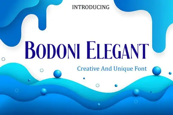
High-Contrast Display Serif

Helvetica + Amor Hadena
Pairs sculptural editorial warmth with Helvetica's clean modern geometry.
Inspect Amor Hadena specimenDisclosure: MakerFileHub may earn a commission from qualifying purchases via paid links on this page. How our links work.
Heavy neutral grotesque
Helvetica is a heavy neutral grotesque in black on a pale lavender pattern: mixed case with compact bowls, horizontal terminals, a short broad t bar and a closed a, set as one large word between a small line above and a plain caption beneath on an abstract ground.
Saved retailer link checked 2026-10-19: it opened the general Fonts catalogue, not this product. Availability is not confirmed. This profile preserves the original artwork and editorial ideas; it is not a current offer.
Paid link
Open saved retailer link ↗Project & layout blueprintsAt-a-glance maker compatibility
Sturdy stroke walls and open counters weed cleanly on adhesive vinyl, HTV apparel film, and cut cardstock.
Visual anatomy & craft review
The word spans the plate and the drawing is a neutral grotesque at a heavy weight: the bowls are compact, the terminals are horizontal, the t carries a short broad bar and the a stays closed, which is the construction that makes a grotesque read as neutral rather than as expressive. The lavender pattern behind it is staging, and it is a useful test, because the heavy strokes stay legible over a busy ground while a lighter weight would not. The small line above and the caption beneath are plain and set in the same family at lighter weights or in a light neutral, which shows the range rather than a single cut. Because the forms are neutral and heavy, the face works for signage, packaging and headlines, and the plate sets it large enough that the terminals can be judged.
Sans serif, grotesque, heavy, neutral
Two-font hierarchy recipes
Tested contrast partners — pairing Helvetica with grounded secondary typography.
Helvetica + Amor Hadena
Pairs sculptural editorial warmth with Helvetica's clean modern geometry.
Inspect Amor Hadena specimen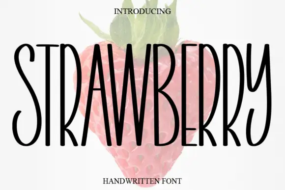
Helvetica + Strawberry
Introduces organic movement on pull-quotes, signatures and gift tags.
Inspect Strawberry specimenPractical applications
Concrete hierarchy, scale and production guidance tailored to Helvetica’s stroke geometry.
A neutral grotesque reads as institutional confidence, and the compact bowls keep a long name legible on a narrow fascia.
Hierarchy & layout recipe
Fabricate a 900 by 300 mm panel: the clinic at 100 mm cap height, the hours in a 24 mm sans, and a 4 mm rule. Keep 25 mm margins and specify a matte finish.
Pre-production check
Check the panel at 100 mm, where a compact bowl can fill in metal; keep the counters above 8 mm. Confirm the 24 mm hours read at three metres and that the rule clears the fixings.
A heavy grotesque gives a report cover authority, and the horizontal terminals hold against a patterned ground. The neutrality is the asset on a patterned cover.
Hierarchy & layout recipe
Set the title at 90 mm cap height across 200 mm, the subtitle in a 9 pt sans, and the date at 8 pt. Print two colours on a matte stock and keep the title clear of the pattern's busiest area.
Pre-production check
Check the title at 90 mm, where a horizontal terminal can look blunt; keep it consistent. Confirm the 8 pt date survives lamination and that the title clears the trim.
A neutral grotesque reads at distance without personality, which is right for a lecture where the subject should carry the poster.
Hierarchy & layout recipe
A2 poster: the title at 85 mm cap height, the speaker in a 26 mm sans, and the room at 11 mm. Keep 28 mm margins and print two colours on a light stock.
Pre-production check
Check the poster at five metres, where a heavy stroke can look solid at the expense of the counters; keep them open. Confirm the 11 mm room reads at two metres and that the speaker's name has priority.
Technical & licence verification
Saved retailer link checked 2026-10-19: it opened the general Fonts catalogue, not this product. Availability is not confirmed. This profile preserves the original artwork and editorial ideas; it is not a current offer.
Open saved retailer link ↗Confirm included OTF/TTF/WOFF formats, full glyph tables and licence coverage on the live store page before batch production.
Closest visual alternatives
Matched across letterform anatomy, stroke behaviour and craft applications.
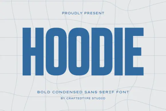
Condensed block capitals with rounded rectangular O counters
Hoodie shows a large blue uppercase word on a pale warped-grid field, where heavy straight uprights and flat horizontal endings form a dense block, the O and D hold rounded rectangular counters, the H crossbar sits near the middle and the E keeps three squared arms.
Ideas for this font
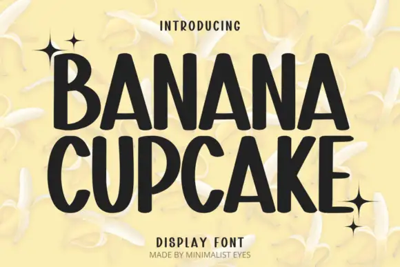
Tall playful display sans
Banana Cupcake stacks two large words in dark letters on a pale banana photograph, where tall narrow capitals fill the width, the counters squeeze into thin slots, the corners soften slightly and the letter widths shift row by row so the second word runs wider than the first.
Ideas for this font

Geometric cut-out display sans
Borsen sets a wide geometric wordmark in white over a dark car photograph, where the letters run broad and even, horizontal cuts open parts of the E and N while broad strokes hold the line together, and the whole name sits as one long block above a small credit line.

Heavy geometric sans family
Montreal is a heavy geometric sans in white on black: mixed case with a deep M notch, circular bowls, a broad open e and flat terminals, set as one word with a small tracked count of fonts beneath.
Ideas for this font
Same independent foundry
Allow optional Google Analytics to measure visits and catalogue actions. Your search words and notes are not included. Privacy & storage