Art Deco Handwriting + Papillon Serif – Elegant Modern Luxury
Anchors Art Deco Handwriting's fluid strokes with crisp Roman proportions on wedding suites, headers and packaging.
Inspect Papillon Serif – Elegant Modern Luxury specimenDisclosure: MakerFileHub may earn a commission from qualifying purchases via paid links on this page. How our links work.

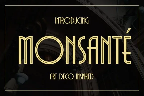
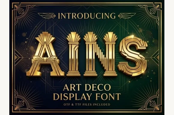
Gatsby-inspired double-line Art Deco handwritten capitals
Art Deco Handwriting blends 1920s double-stemmed Broadway/Gatsby geometry with relaxed, slender fine-liner hand lettering.
Paid link
Get this fontProject & layout blueprintsAt-a-glance maker compatibility
Weld or Unite overlapping script joins into one continuous vector path before sending to the blade.
Visual anatomy & craft review
Art Deco Handwriting is Gatsby-inspired handwritten capitals built from double lines: each stroke is drawn twice, an outer line and a parallel inner line, with sharp mitred corners and a tall geometric skeleton that reads as a hotel facade lettered by hand. The inner line is the design and it merges with the outer one when the face shrinks. It needs roughly 28 mm for the double line to read, and it is best in one fine metallic on a dark ground, or one ink on a pale ground where the gap between the lines stays open.
Gatsby-casual · Airy · Architectural
Two-font hierarchy recipes
Tested contrast partners — pairing Art Deco Handwriting with grounded secondary typography.

Art Deco Handwriting + Papillon Serif – Elegant Modern Luxury
Anchors Art Deco Handwriting's fluid strokes with crisp Roman proportions on wedding suites, headers and packaging.
Inspect Papillon Serif – Elegant Modern Luxury specimen
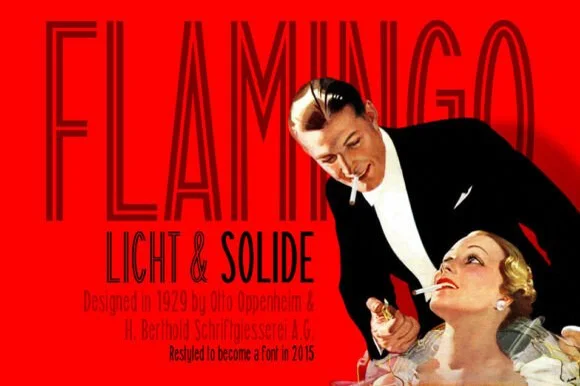
Art Deco Handwriting + Saltriver Grotesk
Keeps small-scale dates, URLs, nutrition facts and care instructions crisp and legible below script titles.
Inspect Saltriver Grotesk specimenPractical applications
Concrete hierarchy, scale and production guidance tailored to Art Deco Handwriting’s stroke geometry.
A double-line Deco face announces a Gatsby-themed birthday through the lettering alone. The double line holds at 44 mm on a topper, and one metallic prints the invite and the banner as one set.
Hierarchy & layout recipe
Invite A6, word 44 mm with 10 mm line clearance, details 8/11 pt, 12 mm margins. Topper 130 x 110 mm, word 48 mm with a 6 mm stick slot and 12 mm clear. Banner 1500 x 400 mm, word 150 mm, 30 mm safe edge.
Pre-production check
A 130 mm topper cut at the inner line leaves a hairline outline that tears on the stick. Weld the inner line to the outer, and test one before the party.
A double-line Deco face reads as a lettered hotel facade rather than a corporate logo. The inner line holds at 26 mm on a card, and one metallic prints the card and the plate in one order.
Hierarchy & layout recipe
Card 85 x 55 mm, word 26 mm with 8 mm line clearance, details 7/9 pt, 6 mm margins. Directory plate 300 x 80 mm, word 40 mm, 10 mm margins. Letterhead 210 x 297 mm, word 30 mm, 20 mm margins.
Pre-production check
A 300 x 80 mm plate at 40 mm closes the double line into one stroke. Raise the plate to 50 mm or keep the gap at 1.5 mm, and check one plate before the run.
A handwritten Deco capital gives a formal wedding a lettered plate rather than a script. The double line holds at 30 pt on an invitation, and one fine ink keeps the gap open on smooth card.
Hierarchy & layout recipe
Invitation 130 x 180 mm, names 30 pt with 10 mm line clearance, details 9/13 pt, 18 mm margins. Menu 120 x 210 mm, header 18 pt, courses 9/12 pt. Table card 90 x 50 mm, name 12 pt, 4 mm margins.
Pre-production check
At 12 pt on a table card the double line merges into one and the name reads as a plain stroke. Raise table cards to 18 pt, and proof one card before the set.
Technical & licence verification
Confirm included OTF/TTF/WOFF formats, full glyph tables and licence coverage on the live store page before batch production.
Same independent foundry
Allow optional Google Analytics to measure visits and catalogue actions. Your search words and notes are not included. Privacy & storage