Editorial Serif Anchor

Aulora Script + Flowsky Editorial
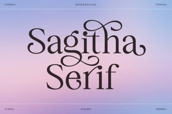
Anchors Aulora Script's fluid strokes with crisp Roman proportions on wedding suites, headers and packaging.
Inspect Flowsky Editorial specimenDisclosure: MakerFileHub may earn a commission from qualifying purchases via paid links on this page. How our links work.
Bold curled script with heavy swash capitals and multiple widths
Aulora Script is a bold curled script whose capitals carry heavy swashes and whose letters are drawn in several widths, so a title can be set expanded or condensed without losing its character.
Paid link
Get this fontProject & layout blueprintsAt-a-glance maker compatibility
Weld or Unite overlapping script joins into one continuous vector path before sending to the blade.
Visual anatomy & craft review
The capital A opens with a wide curled swash that rises above the cap line and folds back into a heavy stem, and the following letters keep that weight with generous rounded bowls and short ascenders. The swashes are the signature: the capital S of the second word curls out on both sides and its terminal rolls into a small spiral, and the exits of the l and the r curl upward rather than tapering. Because the family is drawn in several widths, the same word can be set tight for a narrow label or expanded for a full title, and the heaviness stays constant. The dark ground, the gold ink and the small caps notes below are presentation; the script is the two words.
Bold · Curled · Swashed
Two-font hierarchy recipes
Tested contrast partners — pairing Aulora Script with grounded secondary typography.
Aulora Script + Flowsky Editorial
Anchors Aulora Script's fluid strokes with crisp Roman proportions on wedding suites, headers and packaging.
Inspect Flowsky Editorial specimen
Aulora Script + Mansory
Keeps small-scale dates, URLs, nutrition facts and care instructions crisp and legible below script titles.
Inspect Mansory specimenPractical applications
Concrete hierarchy, scale and production guidance tailored to Aulora Script’s stroke geometry.
The swashed capitals give a hotel a mark that reads as engraved signage, and the width variants let the same word sit on a small key card and a wide fascia without redrawing it.
Hierarchy & layout recipe
Set the hotel name at 20 cm on the entrance fascia, keep the address in a tracked caps serif at 5 cm, and hold 15 cm of margin so the capital swash finishes inside the panel.
Pre-production check
Gold on dark ground loses the thin joins at distance; check the sign in the actual lighting and keep the swash on the wider style so the joins stay open.
The curled capitals let two names read as a single engraved mark, and the width options keep a long pair of names inside a narrow card.
Hierarchy & layout recipe
Set both names at 26 pt on a 120 by 180 mm card, set the details in a small caps serif at 8 pt, and hold 14 mm under the swashes so the date block has its own space.
Pre-production check
Swash terminals close to the trim look cut; check the proof at final size and inset the line by 5 mm before approving the run.
A bold curled script with swash capitals carries a book title that has to look historical rather than trendy, and the width variants let the title fill a cover measure exactly.
Hierarchy & layout recipe
Set the title at 72 pt on the upper third of the cover, set the author in a small caps serif at 12 pt, and leave the lower half plain so the swashes are the only ornament.
Pre-production check
A heavy swash on a matte laminated cover can show roller marks; check a laminated proof and reduce the swash weight if the surface starts to streak.
Technical & licence verification
Confirm included OTF/TTF/WOFF formats, full glyph tables and licence coverage on the live store page before batch production.
Closest visual alternatives
Matched across letterform anatomy, stroke behaviour and craft applications.
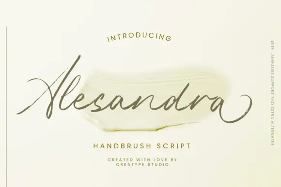
Fine textured slanted brush script with a long exit loop
Alesandra is a fine slanted brush script drawn with a dry texture, where the letters lean forward together and the final letter exits in a wide loop that swings under the word.
Ideas for this font

Very slanted calligraphy with broad lower sweeps and fine hairlines
Silken Luxe is a formal calligraphy script with a steep slant, broad lower sweeps and hairlines that thin almost to nothing, drawn so two words build an ornamental diagonal across the plate.
Ideas for this font
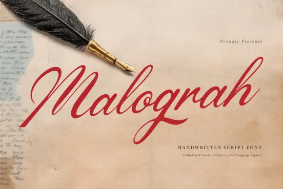
Fine italic script with a broad capital
Malograh is a fine italic script in red on aged paper: a broad capital M with a long entry swash, a light slanted body, and a final h whose exit stroke lifts above the line and curls back.
Ideas for this font
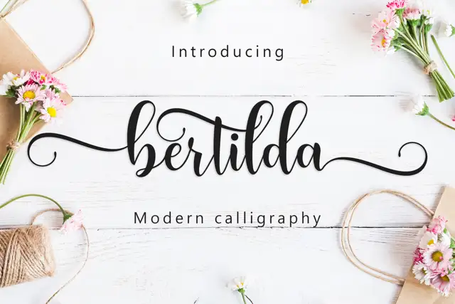
Broad swashed lowercase calligraphy
Bertilda Script is a broad lowercase calligraphy whose entry and exit swashes travel further than the letters themselves, so a seven-letter word occupies the width of a full line.
Ideas for this font
Same independent foundry
Allow optional Google Analytics to measure visits and catalogue actions. Your search words and notes are not included. Privacy & storage