Neutral Sans Workhorse

Your Easter + Monure
Lets Your Easter own the focal silhouette while handling secondary copy, sizing and subheads cleanly.
Inspect Monure specimenDisclosure: MakerFileHub may earn a commission from qualifying purchases via paid links on this page. How our links work.
Playful Easter display with illustrated counters
Your Easter is a playful display in brown on peach: fat rounded letters with uneven widths, several of them replaced by decorated Easter eggs, bunny ears and paw marks, so the word reads as a children's illustration rather than as a line of type.
Paid link
Get this fontProject & layout blueprintsAt-a-glance maker compatibility
Sturdy stroke walls and open counters weed cleanly on adhesive vinyl, HTV apparel film, and cut cardstock.
Visual anatomy & craft review
The specimen mixes letters and pictures inside a single word: the O becomes a painted egg, the U carries a bunny ear, the R sprouts paw prints, and the E and the S keep their letter forms but gain a stitched pattern, so the line reads as a decorated banner. Beneath it the second word uses the same drawing with a different set of illustrated substitutions, which shows the face ships multiple alternates for the same letter. The stroke weight is heavy and even, the shapes are rounded, and the baseline drifts, so the whole word bounces like a hand-drawn sign. The ground is a peach panel with dots, small flowers and a sitting bunny at the corner, and the caption at the top is set in a thin matching hand.
Easter, playful, illustrated, seasonal
Two-font hierarchy recipes
Tested contrast partners — pairing Your Easter with grounded secondary typography.
Your Easter + Monure
Lets Your Easter own the focal silhouette while handling secondary copy, sizing and subheads cleanly.
Inspect Monure specimen
Your Easter + Kernova
Grounds bold display lettering with classic typographic authority on posters, badges and apparel.
Inspect Kernova specimenPractical applications
Concrete hierarchy, scale and production guidance tailored to Your Easter’s stroke geometry.
An illustrated seasonal face sets the occasion with pictures built into the letters, so a small card needs no additional artwork to look finished.
Hierarchy & layout recipe
A6 card: the word at 34 pt, the details in a 9 pt rounded sans, and one bunny illustration at the corner. Keep the alternates to two illustrated letters so the word stays readable, and leave 12 mm margins.
Pre-production check
Check the illustrated counters at 34 pt, where a pattern inside an egg can fill in; keep the pattern lines at 0.4 mm. Confirm the 9 pt details read at arm's length and that the word is still parseable with two substitutions.
A playful illustrated face makes a seasonal banner read as decoration rather than as signage, which is what a family celebration wants.
Hierarchy & layout recipe
Print 900 by 400 mm: the phrase at 150 mm cap height, the details in a 20 mm rounded sans, and the illustrated alternates kept to three letters. Keep 30 mm margins so the bunny ears never reach the edge.
Pre-production check
Check the banner at five metres, where an illustrated letter can look like a printing error; keep substitutions to letters whose shape stays legible. Confirm the 20 mm details read at arm's length and that the pattern inside the eggs is visible at that size.
A seasonal illustrated face attracts attention in a corridor while staying appropriate for children, and the same letters can be reused for a second notice.
Hierarchy & layout recipe
A4 print: the headline at 60 mm, the details in a 12 mm sans, and one illustrated alternate in the headline. Keep the palette to two colours so a school copier reproduces the patterns without turning them into grey patches.
Pre-production check
Check the A4 on a copier, where a fine pattern inside an egg turns into a smudge; simplify the pattern for that output. Confirm the 12 mm details read from two metres and that the illustrated letter still parses as its letter.
Technical & licence verification
Confirm included OTF/TTF/WOFF formats, full glyph tables and licence coverage on the live store page before batch production.
Closest visual alternatives
Matched across letterform anatomy, stroke behaviour and craft applications.
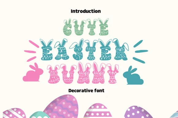
Patterned Easter-egg & bunny-ear decorative display
Cute Easter Bunny is a joyful spring novelty font crowning chunky polka-dot, chevron, and floral-patterned letters with cute bunny ears!
Ideas for this font
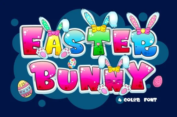
4-color illustrated Easter bunny-ears & paws cartoon font
Easter Bunny is a playful 4-color cartoon display font sprouting floppy bunny ears, fuzzy paws, and colorful bows directly from bubbly capitals.
Ideas for this font
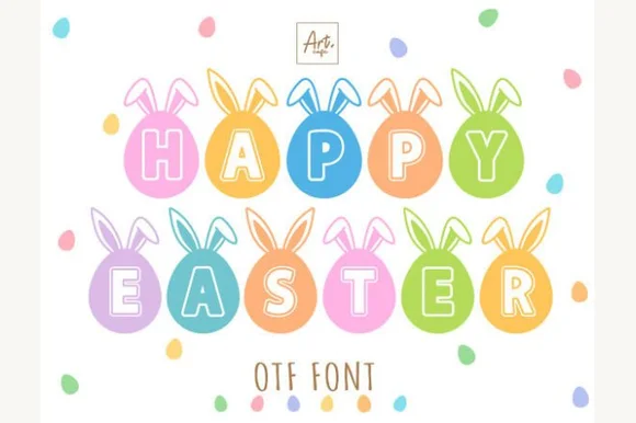
Pastel Easter-egg medallions topped with bunny ears (OTF)
Happy Easter is an adorable novelty alphabet placing solid letters inside bunny-eared Easter-egg medallions (OTF).
Ideas for this font
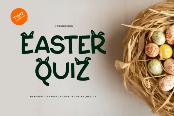
Clean solid bunny-eared spring display font (2 alternates)
Easter Quiz is a clever, Cricut-friendly spring display font pairing clean solid hand-lettered capitals with cute floppy bunny-ear alternates!
Ideas for this font
Same independent foundry
Allow optional Google Analytics to measure visits and catalogue actions. Your search words and notes are not included. Privacy & storage