Editorial Serif Anchor

Penthouse + Svara
Anchors Penthouse's fluid strokes with crisp Roman proportions on wedding suites, headers and packaging.
Inspect Svara specimenDisclosure: MakerFileHub may earn a commission from qualifying purchases via paid links on this page. How our links work.
Display
Penthouse is a modern bouncy calligraphy script: tall loops, thick downstrokes and a baseline that rises and falls, with a swash tail and a heart drawn between the words.
Paid link
Get this fontProject & layout blueprintsAt-a-glance maker compatibility
Weld or Unite overlapping script joins into one continuous vector path before sending to the blade.
Visual anatomy & craft review
Penthouse spans the card in black on a pale flat-lay with a gold watch, a dotted notebook, a fern and a pink flower at the edges. The script has a pronounced bounce — every letter sits at a slightly different height — and the ascenders loop well above the x-height while the descenders swing below, one of them ending in a long flourish. A pink line beneath reads with a heart drawn between the words, and a letter-spaced small caps line closes the composition. The face is the modern brush-calligraphy style that pairs with lifestyle photography, and its practical constraint is line length: because each letter bounces, a long phrase starts to look like a wave, so it is best used for two or three words at a generous size.
A bouncy calligraphy script with a heart between words
Two-font hierarchy recipes
Tested contrast partners — pairing Penthouse with grounded secondary typography.
Penthouse + Svara
Anchors Penthouse's fluid strokes with crisp Roman proportions on wedding suites, headers and packaging.
Inspect Svara specimen
Penthouse + One More
Keeps small-scale dates, URLs, nutrition facts and care instructions crisp and legible below script titles.
Inspect One More specimenPractical applications
Concrete hierarchy, scale and production guidance tailored to Penthouse’s stroke geometry.
The bounce gives a couple's names a hand-written rhythm rather than a printed one, and the swash tail can be used to balance a wide card.
Hierarchy & layout recipe
Print a 130 by 180 mm invitation: set the names at 30 pt on one row, keep 20 mm of clear ground beneath before the venue at 9 pt, and hold 15 mm from the swash to the card edge.
Pre-production check
The bounce fights a centred rule below; print one invitation at the finished size and check the baseline before the suite.
The script reads as a hand-written signature, which suits a brand that sells itself on being made in small quantities and wants the label to look filled in by hand.
Hierarchy & layout recipe
Print a 45 by 80 mm bottle label: set the house name at 15 pt on one row, keep 6 mm of clear ground beneath before the volume at 4.5 pt, and hold 4 mm from the lowest loop to the die line.
Pre-production check
Thin joins fill on a small label; print one at the real size and check the h before the order.
One line in this script separates a quote from the surrounding serif without a box, and the bounce makes a short sentence feel spoken.
Hierarchy & layout recipe
Print a 230 by 300 mm spread: set the pull quote at 40 pt across two rows, keep 18 mm of clear ground beneath before the body text at 10.5 pt, and hold 20 mm of margin at the outer edge.
Pre-production check
Two bouncing rows can read as decoration; print one spread and check the quote reads as words before the issue.
Technical & licence verification
Confirm included OTF/TTF/WOFF formats, full glyph tables and licence coverage on the live store page before batch production.
Closest visual alternatives
Matched across letterform anatomy, stroke behaviour and craft applications.
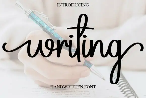
Looped handwriting with a tall ascender
Writing is a looped handwriting in black over a pale photograph of a hand with a pen: tall loops on the ascenders, small open bowls and a light even stroke, with a deep descender on the g.
Ideas for this font
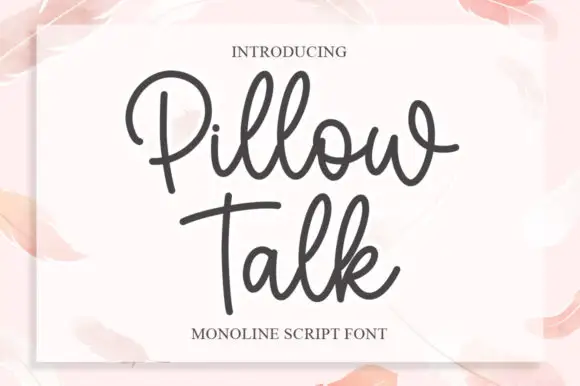
Monoline script with plump rounded bowls
Pillow Talk is a monoline script in charcoal on a soft pink page: plump rounded bowls, a single even stroke, looped ascenders and a tight fit, printed on a white card that sits on a watercolour ground.
Ideas for this font

Loose script with a looped capital and low tails across the baseline
Easy Handwriting is a loose script in which the capital loops high, the body stays low and the tails run flat along the baseline, so a phrase reads as something written quickly on a card rather than as calligraphy.
Ideas for this font
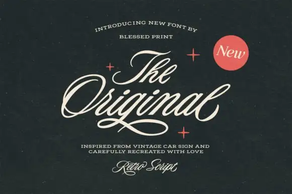
Slanted retro car-sign script
The Original Script is a slanted retro script in cream on near-black: fat even strokes, a strong forward lean, wide open loops on the O and the g, and a long thin underline that runs beneath the whole word.
Ideas for this font
Same independent foundry
Allow optional Google Analytics to measure visits and catalogue actions. Your search words and notes are not included. Privacy & storage