Neutral Sans Workhorse

Wooden Log + Headline
Lets Wooden Log own the focal silhouette while handling secondary copy, sizing and subheads cleanly.
Inspect Headline specimenDisclosure: MakerFileHub may earn a commission from qualifying purchases via paid links on this page. How our links work.
Wood-grain hatch display
Wooden Log is a rustic display on a photographic plank ground: irregular narrow capitals in white with short inward hatch marks along the strokes and occasional knot-like interruptions, set in two stacked words with a small maker line beneath, framed by four rivets.
Paid link
Get this fontProject & layout blueprintsAt-a-glance maker compatibility
Sturdy stroke walls and open counters weed cleanly on adhesive vinyl, HTV apparel film, and cut cardstock.
Visual anatomy & craft review
The plate is a sign mock-up, and the construction suits it: the letters are narrow and irregular with short hatches cut inward from the edges, so each stroke reads as a carved or routed groove in wood rather than as a printed letter, and the knots interrupt the strokes at irregular points, which stops the pattern from looking mechanical. That construction sets a large size floor, because the hatches close into a solid stroke first. The plank ground and the four rivets are staging, and the maker line at the foot is product copy. Because the letters are narrow and hand-cut in feel, the face suits a sign, a label and a shirt for a rustic or an outdoor subject, and it is best used as two stacked words rather than a long line.
Decorative, wood, rustic, narrow
Two-font hierarchy recipes
Tested contrast partners — pairing Wooden Log with grounded secondary typography.
Wooden Log + Headline
Lets Wooden Log own the focal silhouette while handling secondary copy, sizing and subheads cleanly.
Inspect Headline specimen
Wooden Log + The Avenue Editorial
Grounds bold display lettering with classic typographic authority on posters, badges and apparel.
Inspect The Avenue Editorial specimenPractical applications
Concrete hierarchy, scale and production guidance tailored to Wooden Log’s stroke geometry.
A carved display reads as a sign rather than a sticker, and the hatches give the letters the look of routed grooves. It reads as routed timber.
Hierarchy & layout recipe
Paint a 900 by 320 mm board: the cabin at 100 mm cap height, the line in a 22 mm sans, and two colours on a primed board. Keep 24 mm margins and keep the hatches above 4 mm.
Pre-production check
Check the board at 100 mm, where a hatch can fill with paint; keep it above 4 mm. Confirm the 22 mm line reads at three metres and that the board survives the weather.
A rustic label names a hand-made product, and the irregular letters hold on a small die better than a fine serif. It suits a hand-made product.
Hierarchy & layout recipe
Print a 55 by 80 mm label: the product at 12 pt, the detail at 8 pt, and the weight at 7 pt. Keep 5 mm inside the die and simplify the hatches below 16 pt.
Pre-production check
Check the 12 pt product on a small die, where the hatches fill; use the plain cut there. Confirm the 8 pt detail reads at arm's length and that the label takes a fold.
A carved display prints as camp kit, and the white strokes read on a coloured shirt where a fine face would look weak. It reads as camp kit.
Hierarchy & layout recipe
Print a 250 mm chest graphic: the camp at 55 mm cap height, the year at 24 mm, and one ink on a coloured shirt. Keep the smallest hatch at 4 mm and place the graphic 80 mm below the collar.
Pre-production check
Check the screen at actual mesh, where a 4 mm hatch can fill; enlarge it. Wash-test one shirt and confirm the strokes stay even after five cycles.
Technical & licence verification
Confirm included OTF/TTF/WOFF formats, full glyph tables and licence coverage on the live store page before batch production.
Closest visual alternatives
Matched across letterform anatomy, stroke behaviour and craft applications.
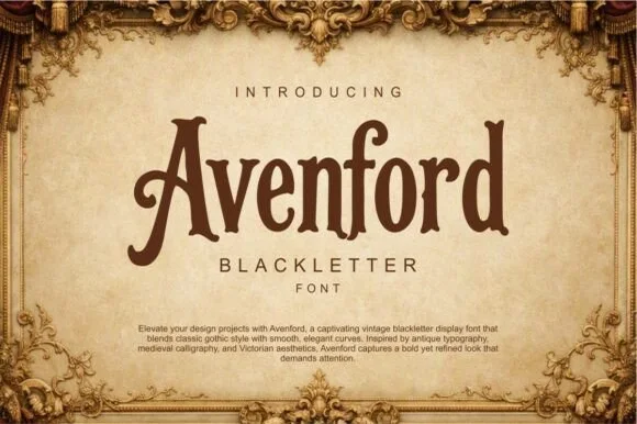
Smooth vintage Victorian blackletter
Avenford softens traditional gothic blackletter with smooth Victorian curves and open counters, presented for heritage labels, coffee roasters and book covers, where rounded arch transitions and a graceful sweeping crossbar on the A replace the spiked angles of a stricter gothic.
Ideas for this font
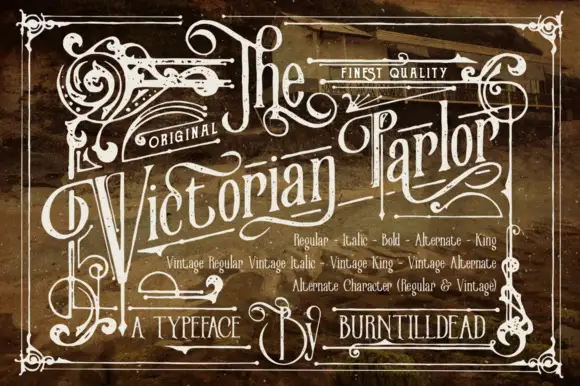
Victorian ornamental lettering
Victorian Parlor is a dense Victorian display in white on a sepia engraved ground: letters built from thin inner lines, curls and spurs, with swashes on the capitals, an inline running the length of each stroke and a frame of scrollwork around the whole plate.
Ideas for this font
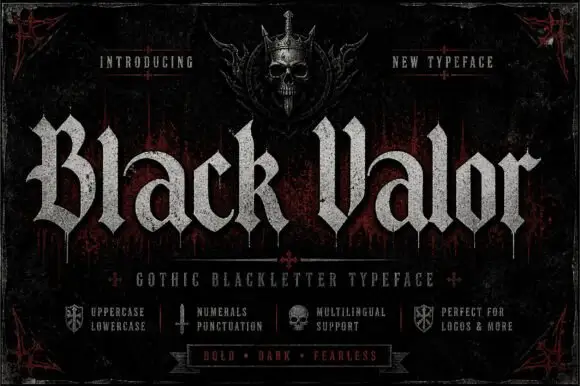
Broad blackletter with curved a shoulders and hooked capitals
Black Valor sets a gothic blackletter in distressed white on a black ground, with broad strokes, curled lowercase shoulders and hooked capitals whose ends finish in fine diamond points.
Ideas for this font
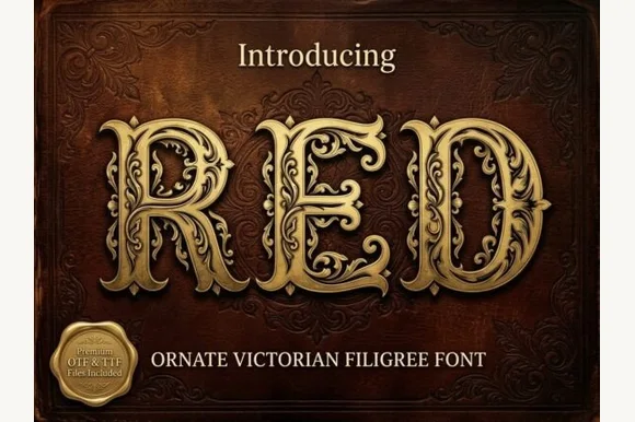
Ornate Victorian capitals with filigree
Red is an ornate Victorian display face in gold on a dark red damask ground: capitals built from heavy stems wrapped in filigree scrollwork, with small leaves and curls growing out of every curve, and a drop shadow that lifts them off the leather.
Ideas for this font
Allow optional Google Analytics to measure visits and catalogue actions. Your search words and notes are not included. Privacy & storage