Neutral Sans Workhorse

Western Cowboy + Cenura
Lets Western Cowboy own the focal silhouette while handling secondary copy, sizing and subheads cleanly.
Inspect Cenura specimenDisclosure: MakerFileHub may earn a commission from qualifying purchases via paid links on this page. How our links work.
Illustrated cartoon alphabet
Western Cowboy is an illustrated cartoon display in a soft peach and brown on a dusty pink ground: fat rounded letters with cream shadows, a cowboy hat for the W, a star cut into the second O, a smiling face in the G and a boot in the last letter, with stars scattered across the ground.
Paid link
Get this fontProject & layout blueprintsAt-a-glance maker compatibility
Sturdy stroke walls and open counters weed cleanly on adhesive vinyl, HTV apparel film, and cut cardstock.
Visual anatomy & craft review
This is a novelty alphabet in which the letters are characters: the hat sits on the W, the O carries a smile, the star replaces a counter, and the boot closes the word, so the phrase is read as a picture rather than as a line of type. The cream shadow is drawn on every letter, which keeps the shapes separate on a mid-toned ground and gives the block a cut-paper look. Because the drawing is detailed, the face works at large sizes and on a shirt or a card, and the plate sets it across two lines on a coloured ground with stars. The line beneath is set in a small hand-lettered face, which is the only plain text on the sheet. The palette is warm and limited, which keeps a busy alphabet from becoming noise.
Decorative, playful, cartoon, novelty
Two-font hierarchy recipes
Tested contrast partners — pairing Western Cowboy with grounded secondary typography.
Western Cowboy + Cenura
Lets Western Cowboy own the focal silhouette while handling secondary copy, sizing and subheads cleanly.
Inspect Cenura specimen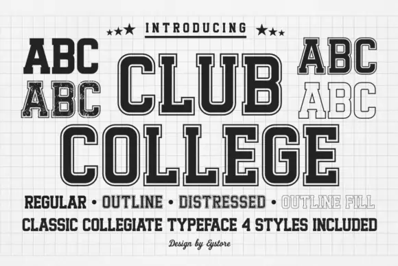
Western Cowboy + Club College
Grounds bold display lettering with classic typographic authority on posters, badges and apparel.
Inspect Club College specimenPractical applications
Concrete hierarchy, scale and production guidance tailored to Western Cowboy’s stroke geometry.
An illustrated face sets the theme in the lettering itself, which saves a parent from matching artwork to type on a home-printed card.
Hierarchy & layout recipe
A6 card: the greeting at 26 pt, the details in a 9 pt sans, and two colours on a cream card. Keep 14 mm margins so the hats and boots never reach the trim, and keep the shadow at 1 mm.
Pre-production check
Check the 26 pt greeting at home-print resolution, where a 1 mm shadow can fill; keep it above 0.8 mm. Confirm the 9 pt details keep a 4.5:1 contrast and that the graphics clear the trim.
An illustrated alphabet reads at a distance as a picture, which works for a party sign that will be photographed more than read.
Hierarchy & layout recipe
Print 600 by 400 mm: the greeting at 90 mm cap height, the time in a 20 mm sans, and a 5 mm border. Keep 25 mm margins and print three colours on a light board.
Pre-production check
Check the board at four metres, where the small faces can close into dots; keep them above 8 mm. Confirm the 20 mm time reads at two metres and that the border is level.
A cartoon face draws children to a notice, and the bold shapes survive a school copier where a fine illustration would disappear.
Hierarchy & layout recipe
A3 print: the headline at 70 mm cap height, the dates in a 14 mm sans, and the rooms at 9 mm. Keep 25 mm margins and print one colour on a light sheet with a bold rule beneath.
Pre-production check
Check the A3 at three metres, where the fine interiors can fill on a copier; keep the detail above 1 mm. Confirm the 9 mm rooms read at arm's length and that the headline fits.
Technical & licence verification
Confirm included OTF/TTF/WOFF formats, full glyph tables and licence coverage on the live store page before batch production.
Closest visual alternatives
Matched across letterform anatomy, stroke behaviour and craft applications.
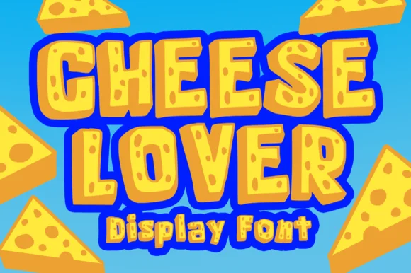
Chunky cartoon Swiss-cheese-hole novelty display!
Cheese Lover Outline sculpts chunky cartoon block capitals packed with playful Swiss-cheese holes and bubbly outlined wedges!
Ideas for this font
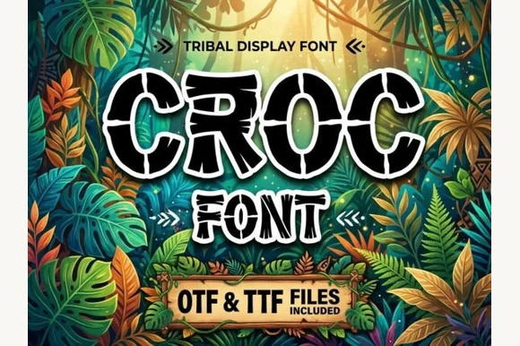
Cracked crocodile-scale & prehistoric jungle block font (OTF & TTF)
Croc is a bold jungle decorative font etching reptile/crocodile scale cracks across chunky cartoon-outlined capitals (OTF & TTF).
Ideas for this font
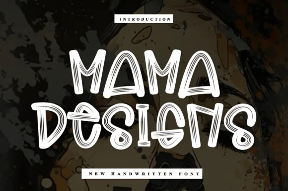
Sketch-stroke handwritten display
Mama Designs is a handwritten display in white on a painted dark backdrop: fat rounded letters drawn as open outlines with thin sketch lines running inside each stroke, so the word reads as a marker sketch rather than as filled type.
Ideas for this font
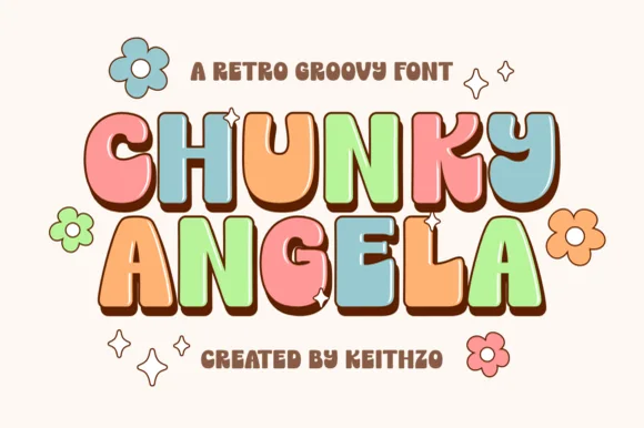
90s-meets-70s comic-outlined retro uppercase bubble font
Chunky Angela is a punchy 90s/70s uppercase retro bubble font pairing groovy waist curves with crisp dark cartoon outlines!
Ideas for this font
Same independent foundry
Allow optional Google Analytics to measure visits and catalogue actions. Your search words and notes are not included. Privacy & storage