Neutral Sans Workhorse

Twinkle Magic + Prime Nordic
Lets Twinkle Magic own the focal silhouette while handling secondary copy, sizing and subheads cleanly.
Inspect Prime Nordic specimenDisclosure: MakerFileHub may earn a commission from qualifying purchases via paid links on this page. How our links work.
Playful geometric seasonal caps
Twinkle Magic is a playful geometric display in a warm multicolour palette on white: clean caps with even strokes and flat terminals, a single line of letters with generous spacing, four-point sparkles and small dots around the block, and a two-line caption in a condensed sans beneath.
Paid link
Get this fontProject & layout blueprintsAt-a-glance maker compatibility
Sturdy stroke walls and open counters weed cleanly on adhesive vinyl, HTV apparel film, and cut cardstock.
Visual anatomy & craft review
The word is set once across the width and the drawing is a geometric caps face: the strokes are even, the terminals are flat, the O is a true circle and the G carries a straight crossbar, which keeps the letters simple enough to colour individually. That simplicity is the point of a seasonal face sold to makers, because each letter can take a different colour without the word falling apart. The spacing is generous, so the sparkles can sit between the letters without touching them. The palette is four warm colours, and the caption beneath is set in a condensed sans with one line in caps and one in a smaller weight, which is how a product sheet credits its designer and publisher.
Playful, geometric, seasonal, cheerful
Two-font hierarchy recipes
Tested contrast partners — pairing Twinkle Magic with grounded secondary typography.
Twinkle Magic + Prime Nordic
Lets Twinkle Magic own the focal silhouette while handling secondary copy, sizing and subheads cleanly.
Inspect Prime Nordic specimen
Twinkle Magic + Vanielst Elegant Serif Display Stylistic
Grounds bold display lettering with classic typographic authority on posters, badges and apparel.
Inspect Vanielst Elegant Serif Display Stylistic specimenPractical applications
Concrete hierarchy, scale and production guidance tailored to Twinkle Magic’s stroke geometry.
A geometric face in seasonal colours reads from across a hall, and the flat terminals photocopy cleanly for a school's own print run.
Hierarchy & layout recipe
A2 print: the fair at 130 mm cap height, the times in a 20 mm sans, and a 5 mm rule. Keep 30 mm margins and print four flat colours on a white ground so the sparkles stay separate from the letters.
Pre-production check
Check the A2 at five metres, where the sparkles can read as specks of dirt; keep them above 8 mm. Confirm the 20 mm times read at three metres and that the rule clears the sparkles.
A playful geometric face suits a friendly greeting, and the generous spacing leaves room for a short message on the same card.
Hierarchy & layout recipe
A6 card: the greeting at 26 pt, the message in a 9 pt sans at 13 pt leading, and three sparkles. Keep 12 mm margins and print two colours on a white card so the letters stay crisp at home-print size.
Pre-production check
Check the 26 pt greeting, where a sparkle can crowd the letters; keep 4 mm clear. Confirm the 9 pt message keeps a 4.5:1 contrast and that the card folds without cracking.
A simple geometric face colours evenly, which matters when a small shop prints labels in batches with different accent colours.
Hierarchy & layout recipe
Print a 50 mm round label: the shop at 12 pt, the product in a 6 pt sans, and a sparkle. Keep 4 mm inside the die and print three colours on a white stock so the letters stay distinct.
Pre-production check
Check the 12 pt shop name at the die edge, where a letter can be cut; keep 5 mm clear. Confirm the 6 pt product reads on the shelf and that the label adheres to a wrapped box.
Technical & licence verification
Confirm included OTF/TTF/WOFF formats, full glyph tables and licence coverage on the live store page before batch production.
Closest visual alternatives
Matched across letterform anatomy, stroke behaviour and craft applications.
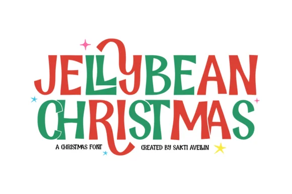
Chunky hand-drawn Christmas capitals with one letter dropping below the line
Jellybean Christmas is a heavy hand-drawn capital alphabet in which the strokes stay fat and slightly uneven, the corners soften and one letter in each line is allowed to fall out of the baseline, so a greeting reads as cut paper.
Ideas for this font
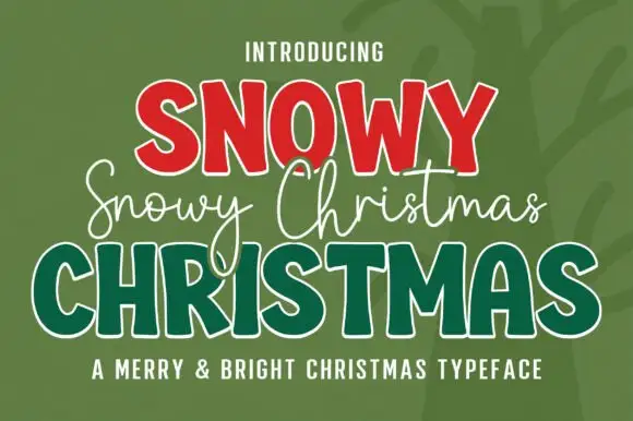
Three-layer Christmas set in red, white and green
Snowy Christmas is a three-part set in red, white and green on a dark ground: fat slab capitals in red with a white inline, a white monoline script written across the middle, and outlined green capitals underneath, sold as one Christmas typeface.
Ideas for this font
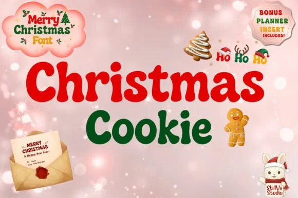
Chubby retro holiday bubble face with rounded bowls and playful counters
Christmas Cookie is a chubby retro mixed-case face in which the bowls are round, the strokes are fat and some letters carry a curl, so a greeting reads as a holiday cookie tin label.
Ideas for this font
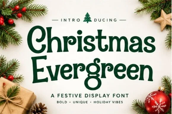
Soft vintage holiday serif with rounded bowls and curled terminals
Christmas Evergreen is a soft vintage serif in which the bowls are rounded, the terminals curl gently and the contrast is moderate, so a greeting reads as mid-century packaging lettering rather than as a formal serif.
Ideas for this font
Same independent foundry
Allow optional Google Analytics to measure visits and catalogue actions. Your search words and notes are not included. Privacy & storage



