High-Contrast Display Serif

Swag Teacher + Cronelo
Pairs sculptural editorial warmth with Swag Teacher's clean modern geometry.
Inspect Cronelo specimenDisclosure: MakerFileHub may earn a commission from qualifying purchases via paid links on this page. How our links work.
Chunky capitals and fine swash script
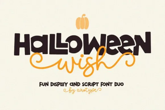
Swag Teacher is a duo on cream: chunky slab-edged capitals with small irregular details, and a fine swash script beneath that runs out to both edges with a light underline.
Paid link
Get this fontProject & layout blueprintsAt-a-glance maker compatibility
Weld or Unite overlapping script joins into one continuous vector path before sending to the blade.
Visual anatomy & craft review
SWAG fills the upper half in heavy capitals, and each letter is a chunky block with a small quirk: the S carries a pointed terminal, the W has uneven vertices, the A closes with a flat crossbar and the G is cut square, so the word reads as hand-cut rather than set. teacher follows beneath in a fine swash script whose letters connect with light threads and whose exit stroke runs out to the right and back, giving the pair a bottom edge without a rule. The two weights are far apart on purpose: the capitals shout a single word, the script whispers a second, and the combination is what the bundle is selling. The ground is cream with a few drawn sparkles, and two captions at the foot name the pair and the studio. The bundle suits school material, party goods and children's brands.
A chunky capital paired with a thin swash
Two-font hierarchy recipes
Tested contrast partners — pairing Swag Teacher with grounded secondary typography.
Swag Teacher + Cronelo
Pairs sculptural editorial warmth with Swag Teacher's clean modern geometry.
Inspect Cronelo specimen
Swag Teacher + Honey
Introduces organic movement on pull-quotes, signatures and gift tags.
Inspect Honey specimenPractical applications
Concrete hierarchy, scale and production guidance tailored to Swag Teacher’s stroke geometry.
One chunky word plus a fine script line is all a classroom door needs, and the pair gives the sign a hierarchy without a third element.
Hierarchy & layout recipe
Print a 300 by 200 mm sign: set the room word at 70 pt in the capitals, set the teacher name at 24 pt in the script, keep 18 mm of clear ground beneath, and hold 16 mm of border.
Pre-production check
A thin swash under a heavy block can look like a printing rule; print one sign at the final size and check the two weights read separately before the set.
The bundle covers a loud word and a name line in one purchase, and the chunky capitals read right across a school playground.
Hierarchy & layout recipe
Print a 900 by 400 mm banner: set the greeting at 150 pt in the capitals, set the name at 60 pt in the script with 30 mm of clear ground, and hold 26 mm of border on all sides.
Pre-production check
The script tails can disappear on a wide banner; print one at the final size and check the ends before the order.
A chunky capital plus a swash script gives a yearbook a cover that students will keep, and the pair covers the title and the year in one purchase.
Hierarchy & layout recipe
Print a 148 by 210 mm cover: set the title at 54 pt in the capitals, set the year at 26 pt in the script with 18 mm of clear ground, and hold 14 mm of margin on all sides.
Pre-production check
Heavy capitals at 54 pt can look like a poster on a small cover; print one at the finished size and check the proportion before the run.
Technical & licence verification
Confirm included OTF/TTF/WOFF formats, full glyph tables and licence coverage on the live store page before batch production.
Closest visual alternatives
Matched across letterform anatomy, stroke behaviour and craft applications.

Duo pairing heart-substituted bold caps with a looping script
Classroom Memories is a two-cut family in which bold rounded capitals carry hearts in place of some counters and a thin looping script writes a second line, so a short phrase reads as a decorated classroom poster.
Ideas for this font
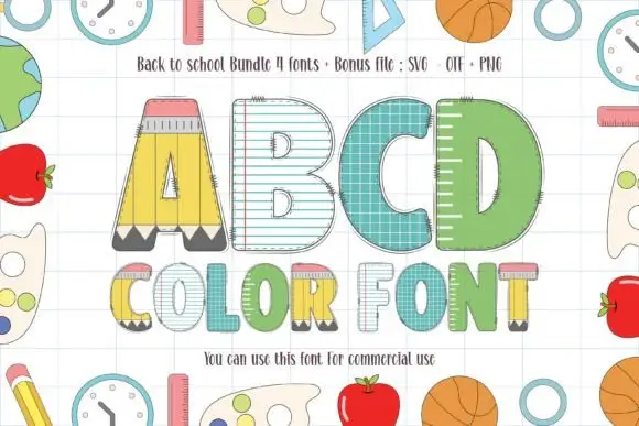
School-themed block letters with pencil, ruled-paper and ruler fills
Back to School Bundle packs four colour fonts in which the letters are classroom supplies — a pencil A, a lined notebook B, a teal composition-book C, a green letter with a ruler pattern — plus a bonus clipart file.
Ideas for this font
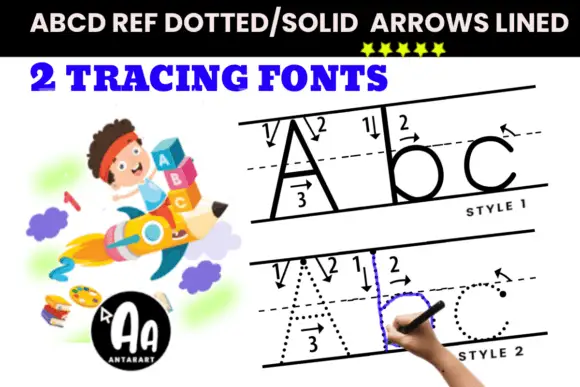
Lined directional tracing print
Arrows Lined Letter Tracing shows solid and dotted A b c samples on guide lines, where numbered arrows indicate stroke directions beside the tall A and the rounded b and c.
Ideas for this font
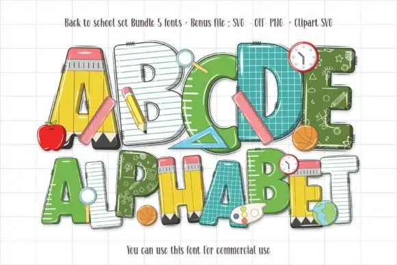
School-material block letters with pencils, rulers and chalkboard fills
Back to School Set gathers five colour fonts in which the letters are classroom supplies — a pencil A, a notebook C, a ruler D, a green alphabet with a chalkboard pattern — plus clipart of apples, balls and clocks.
Ideas for this font
Same independent foundry
Allow optional Google Analytics to measure visits and catalogue actions. Your search words and notes are not included. Privacy & storage