High-Contrast Display Serif

Arrows Lined Letter Tracing + Aureline
Pairs sculptural editorial warmth with Arrows Lined Letter Tracing's clean modern geometry.
Inspect Aureline specimenDisclosure: MakerFileHub may earn a commission from qualifying purchases via paid links on this page. How our links work.
Lined directional tracing print
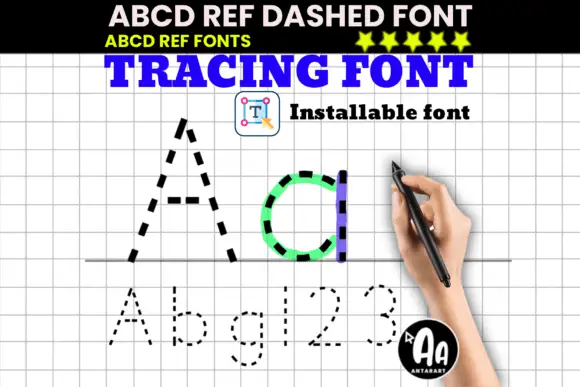
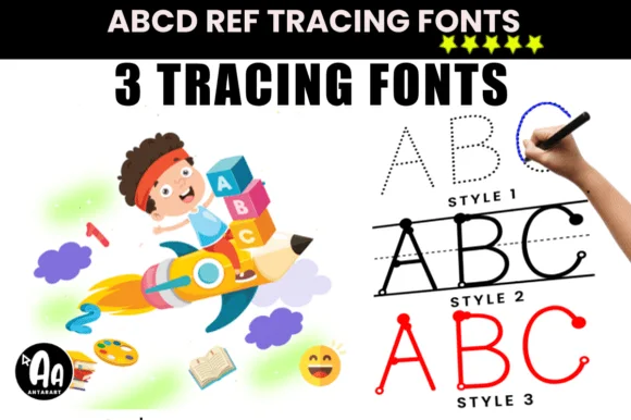
Arrows Lined Letter Tracing shows solid and dotted A b c samples on guide lines, where numbered arrows indicate stroke directions beside the tall A and the rounded b and c.
Paid link
Get this fontProject & layout blueprintsAt-a-glance maker compatibility
Sturdy stroke walls and open counters weed cleanly on adhesive vinyl, HTV apparel film, and cut cardstock.
Visual anatomy & craft review
The letters sit on ruled guides, the dotted versions repeat the outline, the solid forms stay simple and small numbered arrows mark where each stroke starts. That direction cue is the character: the sheet teaches order rather than showing a style, which is why the sample pairs solid and dotted versions. It is a practice bundle rather than a display face, so use it for worksheets at a real child's size and check that every letter your sheet needs exists in both forms.
Tracing · Guided · Practice sheets
Two-font hierarchy recipes
Tested contrast partners — pairing Arrows Lined Letter Tracing with grounded secondary typography.
Arrows Lined Letter Tracing + Aureline
Pairs sculptural editorial warmth with Arrows Lined Letter Tracing's clean modern geometry.
Inspect Aureline specimen
Arrows Lined Letter Tracing + Simple Alphabet
Introduces organic movement on pull-quotes, signatures and gift tags.
Inspect Simple Alphabet specimenPractical applications
Concrete hierarchy, scale and production guidance tailored to Arrows Lined Letter Tracing’s stroke geometry.
The tracing sheets suit a classroom worksheet, and the guided lines keep letters even at 40 pt on an A4 page, where the dotted row models the shape first.
Hierarchy & layout recipe
Print an A4 worksheet: set the solid letter at 40 pt on the top guide line, place the dotted copy 14 mm beneath on the next line, and keep 20 mm of margin for pencil grip.
Pre-production check
Guides printed too light vanish under a pencil; check the worksheet and keep the line at 30 percent grey.
The lined letters suit a name card, and the guided forms stay clear at 36 pt on a 100 mm card, where the arrows show the starting point.
Hierarchy & layout recipe
Print a 100 by 60 mm card: set the name at 36 pt on the guide line, keep 12 mm of clear ground beneath for descenders, and laminate the card for repeated tracing.
Pre-production check
A laminated card needs a dry-wipe pen that will not smear; check the sample before the class set.
The guided alphabet suits a wall chart, and the solid forms read at 54 pt across an A2 sheet, where the dotted row shows the pattern beside it.
Hierarchy & layout recipe
Print an A2 poster: set the alphabet at 54 pt on two rows, keep 30 mm of clear ground between them, and keep 26 mm of margin so the guides stay visible.
Pre-production check
Small arrows disappear at wall distance; check the mounted poster from three metres and keep them at 4 mm or larger.
Technical & licence verification
Confirm included OTF/TTF/WOFF formats, full glyph tables and licence coverage on the live store page before batch production.
Closest visual alternatives
Matched across letterform anatomy, stroke behaviour and craft applications.
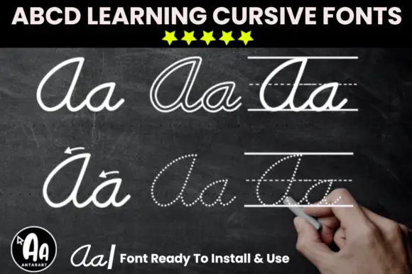
Cursive model cuts with outline and dotted tracing variants
Abcd Cursive Handwriting Tracing Bundle is a teaching set in which a solid cursive model, an outline cut and a dotted cut share one skeleton, so a worksheet can show a letter, invite tracing over it, and then ask for the letter unaided.
Ideas for this font

Duo pairing heart-substituted bold caps with a looping script
Classroom Memories is a two-cut family in which bold rounded capitals carry hearts in place of some counters and a thin looping script writes a second line, so a short phrase reads as a decorated classroom poster.
Ideas for this font
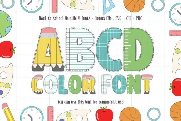
School-themed block letters with pencil, ruled-paper and ruler fills
Back to School Bundle packs four colour fonts in which the letters are classroom supplies — a pencil A, a lined notebook B, a teal composition-book C, a green letter with a ruler pattern — plus a bonus clipart file.
Ideas for this font
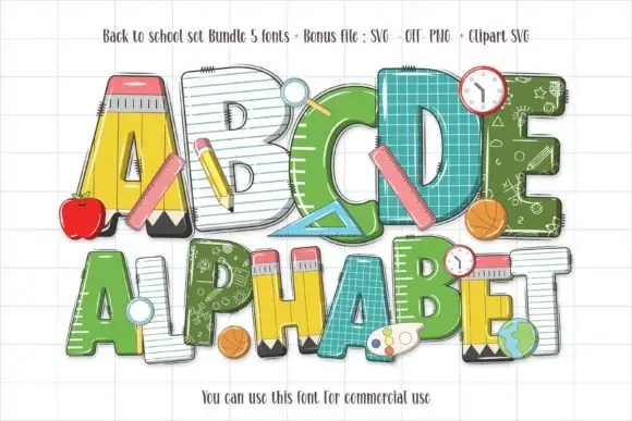
School-material block letters with pencils, rulers and chalkboard fills
Back to School Set gathers five colour fonts in which the letters are classroom supplies — a pencil A, a notebook C, a ruler D, a green alphabet with a chalkboard pattern — plus clipart of apples, balls and clocks.
Ideas for this font
Same independent foundry
Allow optional Google Analytics to measure visits and catalogue actions. Your search words and notes are not included. Privacy & storage