Modern Grotesque Body

Sugari + Monure
Creates crisp high-hierarchy contrast beneath Sugari headlines across menus, websites and labels.
Inspect Monure specimenDisclosure: MakerFileHub may earn a commission from qualifying purchases via paid links on this page. How our links work.
Tall high-contrast display serif
Sugari is a tall high-contrast display serif in cream on a low-lit portrait: very narrow stems, hairline joins, tall ascenders that overshoot the cap line, and letters set with almost no tracking so the word reads as a row of vertical strokes.
Paid link
Get this fontProject & layout blueprintsAt-a-glance maker compatibility
Sturdy stroke walls and open counters weed cleanly on adhesive vinyl, HTV apparel film, and cut cardstock.
Visual anatomy & craft review
The name runs across the middle of the frame, and the design is built on extreme verticality: the C and the S are narrow, the G carries a fine spur, the A is pointed, and the R has a straight leg that tapers into a hairline, so each letter reads as a stem with delicate crossbars attached. Contrast is pushed close to the limit, which means the word only works at display size, and the tracking is tight enough that the letters nearly touch, forming a continuous band of hairlines and thick strokes across the image. The ground is a warm, dimly lit portrait, and the cream type sits on the darker parts of the photograph so the hairlines remain visible. Corner labels in a light serif name the studio and the language support, and the subtitle beneath the word is set in the same family at a much smaller size.
Tall, contrasted, cinematic, editorial
Two-font hierarchy recipes
Tested contrast partners — pairing Sugari with grounded secondary typography.
Sugari + Monure
Creates crisp high-hierarchy contrast beneath Sugari headlines across menus, websites and labels.
Inspect Monure specimen
Sugari + Esmeralda
Adds a warm human signature touch for 1-to-3-word callouts without competing against structured serif capitals.
Inspect Esmeralda specimenPractical applications
Concrete hierarchy, scale and production guidance tailored to Sugari’s stroke geometry.
A tall contrasted serif gives a film poster the look of a period title card, and the vertical rhythm reads from across a foyer where a wider face would blur.
Hierarchy & layout recipe
A2 portrait: the title at 150 mm cap height in one line, the season dates in a 12 mm sans beneath, and the venue at 8 mm. Keep the title on the darkest band of the image and leave 25 mm margins so the tight tracking has air around the word.
Pre-production check
Check the hairlines at 150 mm on the poster stock, where they will print cleanly only on coated paper; specify the stock or thicken the joins. Confirm the 12 mm dates read at four metres and that the title's outermost letters stay inside the trim.
A tall serif reads as a fragrance bottle's etched name, and the narrow proportions let a long word fit on a small label without shrinking the cap height.
Hierarchy & layout recipe
Print a 40 by 90 mm label: the name at 18 pt, the concentration in a 6.5 pt sans caps, and the volume in 6 pt. Keep 4 mm of clear space on both sides so the tight tracking does not press against the label edge.
Pre-production check
Check the 18 pt name at actual size, where the narrow stems can fall below 0.15 pt and disappear; thicken slightly for the label. Confirm the 6 pt volume stays legible on the curved bottle and that the hairlines hold on the chosen label stock.
A tall serif gives a menu cover a formal, almost engraved quality, and because the word is narrow it can be set large on a small card without crowding.
Hierarchy & layout recipe
Set the word at 40 pt on a 105 by 210 mm menu, the course list in a 9.5 pt roman beneath, and a 0.5 pt rule under the title. Keep 20 mm margins and use a single ink on a heavy uncoated card so the hairlines take a slight impression.
Pre-production check
Check the hairlines at 40 pt on uncoated card, where a 0.15 pt join can break up under letterpress; consider digital printing instead. Confirm the 9.5 pt course list stays legible in dim reception lighting and that the rule does not touch the title's descenders.
Technical & licence verification
Confirm included OTF/TTF/WOFF formats, full glyph tables and licence coverage on the live store page before batch production.
Closest visual alternatives
Matched across letterform anatomy, stroke behaviour and craft applications.
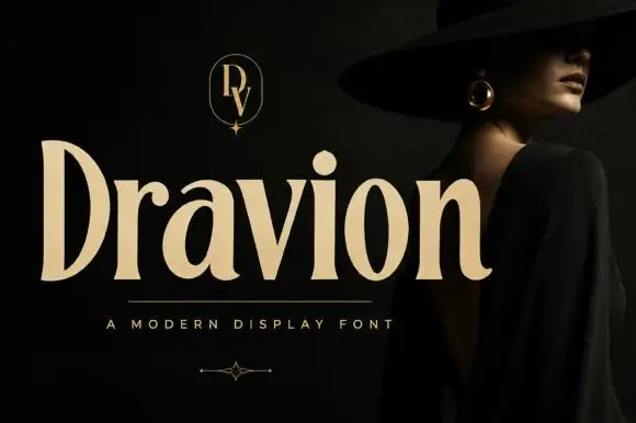
Tall high-contrast serif letters with tapered strokes and rounded counters
Dravion sets a large cream word against a dark photograph, where narrow hairlines meet thick upright strokes, the capital D stands tall and bowed, the a keeps a rounded bowl and the r ends in a soft curved terminal.
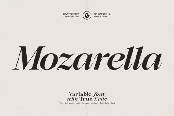
Variable serif with a true italic
Mozarella is a variable serif set in a true italic: high contrast, sharp wedge serifs, a compressed and slanted drawing that keeps its letterforms rather than obliquing them, and a weight axis from thin to bold named on the specimen.
Ideas for this font
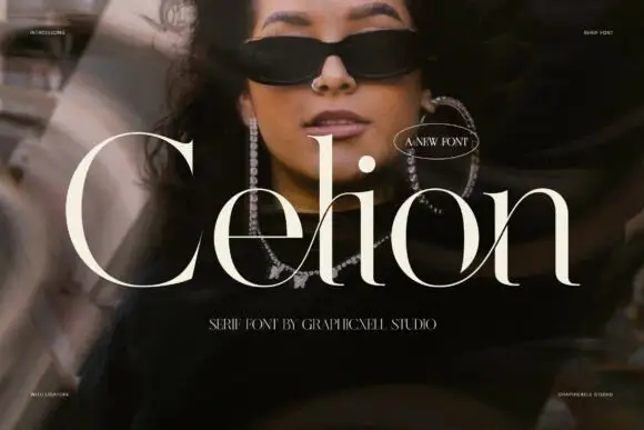
Fine serif with crossing diagonals that interlace the lowercase
Celion is a fine high-contrast serif in which a long diagonal travels through the lower half of the word and the ligature joins pairs so the stroke appears to interlace beside the tall ascenders, giving a fashion portrait its title.
Ideas for this font
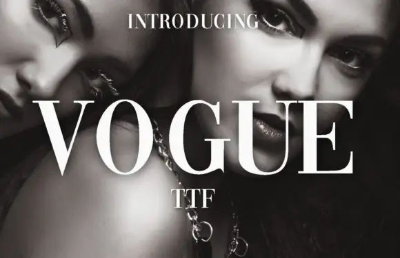
High-contrast didone with hairline serifs
Vogue is a high-contrast didone serif in white over a black-and-white beauty photograph: hairline serifs, a very thin crossbar on the A, a round O and a G with a fine spur, set in capitals as a magazine masthead.
Ideas for this font
Same independent foundry
Allow optional Google Analytics to measure visits and catalogue actions. Your search words and notes are not included. Privacy & storage