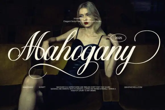
Modern Grotesque Body

Celion + Modern Heritage
Creates crisp high-hierarchy contrast beneath Celion headlines across menus, websites and labels.
Inspect Modern Heritage specimenDisclosure: MakerFileHub may earn a commission from qualifying purchases via paid links on this page. How our links work.
Fine serif with crossing diagonals that interlace the lowercase
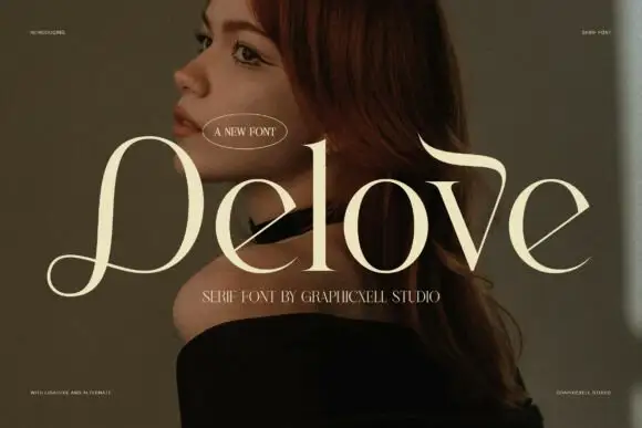
Celion is a fine high-contrast serif in which a long diagonal travels through the lower half of the word and the ligature joins pairs so the stroke appears to interlace beside the tall ascenders, giving a fashion portrait its title.
Paid link
Get this fontProject & layout blueprintsAt-a-glance maker compatibility
Crisp hairline serifs shine on stationery, foil stamping, and packaging; add slight offset for small decals.
Visual anatomy & craft review
The C opens a broad crescent, the e carries a fine crossbar, the l rises as a tall stem and the diagonal runs from one bowl into the next so the letters share a single stroke. The interlacing is the character: it only works where the ligature is used, which is why the sample sets one word with the join working through it. Because the joins are delicate, the face wants 18 pt on coated stock and the ligature needs 40 pt before the shared stroke stays open. The portrait, the highlights and the small credit are presentation; the pale serif word is the face.
Fashion · Ligature · Interlaced
Two-font hierarchy recipes
Tested contrast partners — pairing Celion with grounded secondary typography.
Celion + Modern Heritage
Creates crisp high-hierarchy contrast beneath Celion headlines across menus, websites and labels.
Inspect Modern Heritage specimen
Celion + Welcome
Adds a warm human signature touch for 1-to-3-word callouts without competing against structured serif capitals.
Inspect Welcome specimenPractical applications
Concrete hierarchy, scale and production guidance tailored to Celion’s stroke geometry.
The interlaced diagonal sets a cover line apart, and the fine contrast holds a single word at 60 pt over a lit portrait.
Hierarchy & layout recipe
Print an A4 cover: set the title at 60 pt on the calm band of the photograph, keep 18 mm of clear ground beneath for the standfirst, and set the standfirst at 10 pt in a light serif.
Pre-production check
A shared diagonal printed over a highlight disappears; check the cover proof and move the title to a shadowed band.
The ligature gives a pair of names one shared stroke, and the fine serif keeps a long line readable at 26 pt on heavy card.
Hierarchy & layout recipe
Print a 130 by 180 mm card: set the names at 26 pt, keep 16 mm at each end for the ascenders, and set the date and venue at 9 pt in a caps beneath with 14 mm of air.
Pre-production check
Two names set in a ligature cut at 20 pt lose the shared stroke; check the proof and keep the line at 24 pt or above.
The fine serif gives a small label its tone, and the interlaced stroke survives at 18 pt on a 36 mm panel stamped in hot foil.
Hierarchy & layout recipe
Print a 36 by 60 mm label: set the house name at 18 pt, keep 5 mm from each die edge so the shared stroke stays whole, and set the volume in a 6 pt caps at the foot.
Pre-production check
A foil label printed at 14 pt closes the fine crossbar; check the plate proof and keep the name at 16 pt or above.
Technical & licence verification
Confirm included OTF/TTF/WOFF formats, full glyph tables and licence coverage on the live store page before batch production.
Closest visual alternatives
Matched across letterform anatomy, stroke behaviour and craft applications.
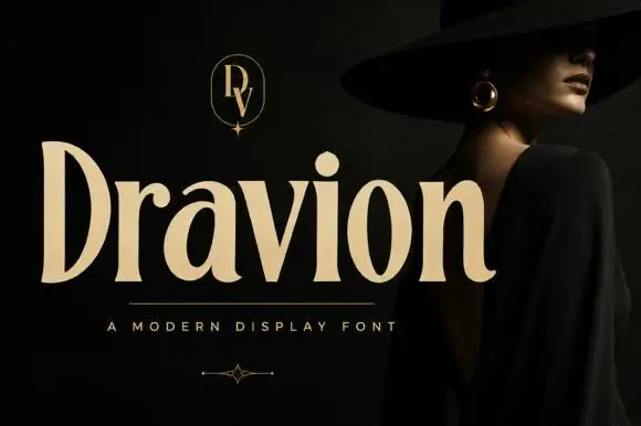
Tall high-contrast serif letters with tapered strokes and rounded counters
Dravion sets a large cream word against a dark photograph, where narrow hairlines meet thick upright strokes, the capital D stands tall and bowed, the a keeps a rounded bowl and the r ends in a soft curved terminal.
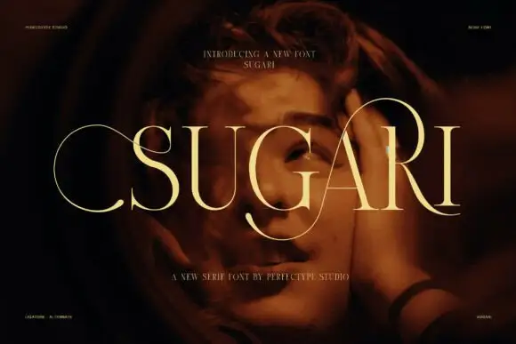
Tall high-contrast display serif
Sugari is a tall high-contrast display serif in cream on a low-lit portrait: very narrow stems, hairline joins, tall ascenders that overshoot the cap line, and letters set with almost no tracking so the word reads as a row of vertical strokes.
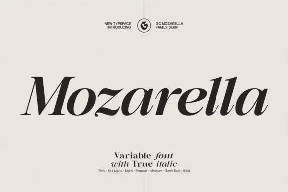
Variable serif with a true italic
Mozarella is a variable serif set in a true italic: high contrast, sharp wedge serifs, a compressed and slanted drawing that keeps its letterforms rather than obliquing them, and a weight axis from thin to bold named on the specimen.
Ideas for this font
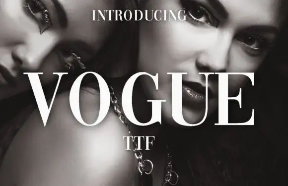
High-contrast didone with hairline serifs
Vogue is a high-contrast didone serif in white over a black-and-white beauty photograph: hairline serifs, a very thin crossbar on the A, a round O and a G with a fine spur, set in capitals as a magazine masthead.
Ideas for this font
Same independent foundry
Allow optional Google Analytics to measure visits and catalogue actions. Your search words and notes are not included. Privacy & storage