Modern Grotesque Body

Mozarella + Base Edge
Creates crisp high-hierarchy contrast beneath Mozarella headlines across menus, websites and labels.
Inspect Base Edge specimenDisclosure: MakerFileHub may earn a commission from qualifying purchases via paid links on this page. How our links work.
Variable serif with a true italic
Mozarella is a variable serif set in a true italic: high contrast, sharp wedge serifs, a compressed and slanted drawing that keeps its letterforms rather than obliquing them, and a weight axis from thin to bold named on the specimen.
Paid link
Get this fontProject & layout blueprintsAt-a-glance maker compatibility
Sturdy stroke walls and open counters weed cleanly on adhesive vinyl, HTV apparel film, and cut cardstock.
Visual anatomy & craft review
The name is shown in the italic across the middle of the page, and the drawing is a genuine italic rather than a slanted roman: the bowls of the o and the a are narrower, the joins between stem and arch are cut rather than curved, and the terminals of the f and the l curl into small wedge tails. Contrast is high but not extreme, which is what makes the face usable as body text as well as display, and the weight list printed beneath the specimen confirms the design is built as one variable file rather than a set of separate cuts. The page is plain cream with a thin vertical rule through the centre and a small round badge at the top, so the only ornament is the typography itself. The left and right captions name the typeface and the family, and the whole composition reads as a type-specimen sheet rather than a product mockup.
Variable, contrasted, editorial, flexible
Two-font hierarchy recipes
Tested contrast partners — pairing Mozarella with grounded secondary typography.
Mozarella + Base Edge
Creates crisp high-hierarchy contrast beneath Mozarella headlines across menus, websites and labels.
Inspect Base Edge specimen
Mozarella + Farmhouse
Adds a warm human signature touch for 1-to-3-word callouts without competing against structured serif capitals.
Inspect Farmhouse specimenPractical applications
Concrete hierarchy, scale and production guidance tailored to Mozarella’s stroke geometry.
A variable serif with a true italic lets one file handle captions, body text and headings across a long catalogue, which keeps the page rhythm consistent without loading four families.
Hierarchy & layout recipe
Set the body at 9.5 pt on a 13.5 pt leading in regular, the captions at 8 pt in the italic, and the section headings at 28 pt in semibold. Keep italic strictly for captions and emphasis so the reader learns the pattern early in the book.
Pre-production check
Check the variable instances in the print PDF, where an unembedded custom weight can fall back to regular; outline or embed the instance. Confirm the 8 pt italic captions keep a 4.5:1 contrast and that the 9.5 pt body does not hyphenate badly at the chosen measure.
A serif with a real italic gives a publisher a mark and a text face in one family, which is exactly what a book imprint needs for spines and title pages.
Hierarchy & layout recipe
Set the imprint name at 24 pt in the semibold, the italic descriptor at 10 pt, and the colophon at 7.5 pt. Build the spine version at 12 pt on one line and keep the whole system to one weight pair so the spines line up on a shelf.
Pre-production check
Check the 12 pt spine lockup at the printed width, where the wedge serifs can merge between letters; add 20 units of tracking for that size. Confirm the 7.5 pt colophon stays legible on a matte paperback cover and that the italic descriptor aligns optically with the roman.
The italic of a true serif is warmer than a slanted roman and more restrained than a script, which suits a winter suite that wants elegance without flourish.
Hierarchy & layout recipe
A5 portrait: the names at 26 pt in the italic, the details at 9 pt in the roman, and the reply card at 8.5 pt with a 0.5 pt rule at the head. Keep 22 mm margins and print in one ink on a heavy stock so the wedge serifs hold their shape.
Pre-production check
Check the wedge serifs at 26 pt on the cotton stock, where a sharp serif can look blunt under too much ink; ask for a light film. Confirm the 8.5 pt reply details survive the card's small format and that the rule does not crowd the first line.
Technical & licence verification
Confirm included OTF/TTF/WOFF formats, full glyph tables and licence coverage on the live store page before batch production.
Closest visual alternatives
Matched across letterform anatomy, stroke behaviour and craft applications.
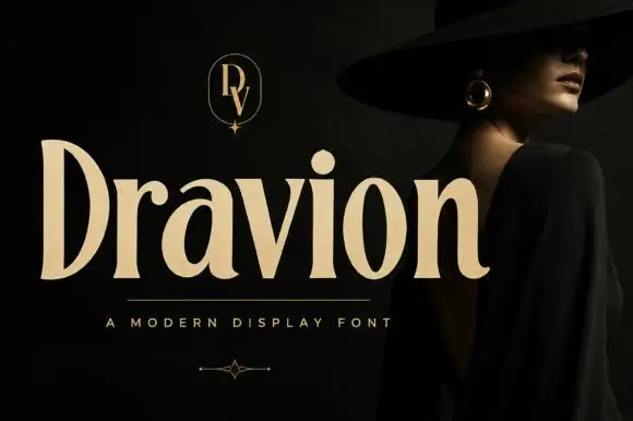
Tall high-contrast serif letters with tapered strokes and rounded counters
Dravion sets a large cream word against a dark photograph, where narrow hairlines meet thick upright strokes, the capital D stands tall and bowed, the a keeps a rounded bowl and the r ends in a soft curved terminal.
High-contrast didone with hairline serifs
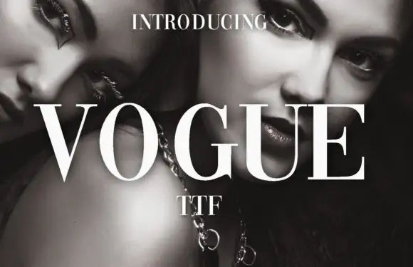
Vogue is a high-contrast didone serif in white over a black-and-white beauty photograph: hairline serifs, a very thin crossbar on the A, a round O and a G with a fine spur, set in capitals as a magazine masthead.
Ideas for this font
Serif with long swashes
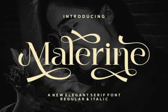
Malerine is an elegant serif in cream over a dark portrait: high contrast, ball terminals and long drawn swashes that leave the first and last letters and loop across the whole word, with a small line beneath noting the regular and italic cuts.
Ideas for this font
Fine slanted mixed case with a tight spiral capital entry
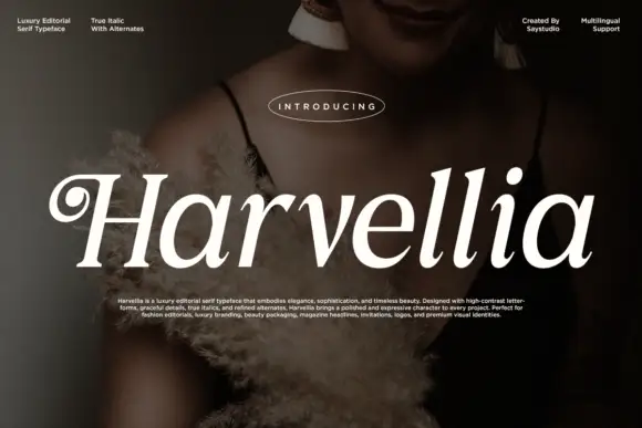
Harvellia shows white right-leaning serif letters over a dark portrait: a tight spiral enters the H at the upper left, the long stems lean consistently and the round bowls connect through fine tapered joins.
Ideas for this font
Same independent foundry
Allow optional Google Analytics to measure visits and catalogue actions. Your search words and notes are not included. Privacy & storage