Editorial Serif Anchor

Sparkling Lemonade + The Lumina Awesome
Anchors Sparkling Lemonade's fluid strokes with crisp Roman proportions on wedding suites, headers and packaging.
Inspect The Lumina Awesome specimenDisclosure: MakerFileHub may earn a commission from qualifying purchases via paid links on this page. How our links work.
Irregular tall hand capitals
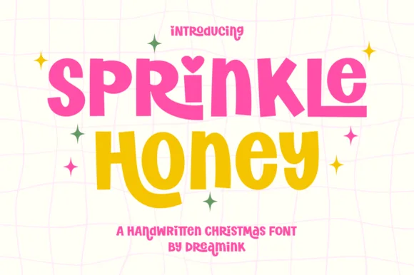
Sparkling Lemonade is a tall irregular handwritten face on cream: capitals with a rising G stem, a deep curved M middle and slightly uneven weights, the first word in bright blue and the second in yellow, with star doodles and lemon illustrations scattered around and a plain line beneath.
Paid link
Get this fontProject & layout blueprintsAt-a-glance maker compatibility
Weld or Unite overlapping script joins into one continuous vector path before sending to the blade.
Visual anatomy & craft review
The plate pairs two colours of the same hand with drawn lemons and stars, so the sheet reads as a juice label rather than as a specimen. The drawing is a tall handwritten capital set with deliberate irregularities, a curled G and a dipped M, so the face reads as lettered by hand rather than as a comic sans, and the looseness means a layout should not depend on a precise fit. That construction sets a moderate size floor, because the thin joins close first. The lemons and stars are staging that name the subject, and the line beneath is product copy. Because the letters are tall and casual, the face suits a drinks label, a card and a market sign.
Handwritten, tall, playful, bright
Two-font hierarchy recipes
Tested contrast partners — pairing Sparkling Lemonade with grounded secondary typography.
Sparkling Lemonade + The Lumina Awesome
Anchors Sparkling Lemonade's fluid strokes with crisp Roman proportions on wedding suites, headers and packaging.
Inspect The Lumina Awesome specimen
Sparkling Lemonade + Hermano
Keeps small-scale dates, URLs, nutrition facts and care instructions crisp and legible below script titles.
Inspect Hermano specimenPractical applications
Concrete hierarchy, scale and production guidance tailored to Sparkling Lemonade’s stroke geometry.
A handwritten label reads as a small batch, and the tall letters fit a flavour name on a slim bottle. It reads as a small batch label.
Hierarchy & layout recipe
Print a 40 by 90 mm label: the brand at 13 pt, the flavour at 8 pt, and the volume at 7 pt. Keep 4 mm inside the die and keep the uneven stems above 0.5 mm on the curve.
Pre-production check
Check the 13 pt brand on a curved bottle, where a thin join can fill; keep it above 0.5 mm. Confirm the 7 pt volume reads on the shelf and that the label holds in a cooler.
A handwritten sign reads as a stall rather than as a shop, and the tall letters read across a lane of tables. It reads across a lane of tables.
Hierarchy & layout recipe
A3 board: the stall at 70 mm cap height, the prices in a 24 mm hand, and two colours on a white board. Keep 25 mm margins and finish with a matte lacquer.
Pre-production check
Check the board at three metres, where a thin join can break; keep it above 1.5 mm. Confirm the prices read at two metres and that the lacquer does not yellow the yellow.
A handwritten card reads as an invitation rather than an announcement, and the two colours give a small format movement.
Hierarchy & layout recipe
A6 card: the greeting at 26 pt, the details in a 9.5 pt sans, and the date at 8.5 pt. Keep 15 mm margins, print two colours on a cream card and leave 12 mm at the foot for the address.
Pre-production check
Check the 26 pt greeting at home-print resolution, where a join can close; keep the counters open. Confirm the 9.5 pt details keep a 4.5:1 contrast and that the card folds flat.
Technical & licence verification
Confirm included OTF/TTF/WOFF formats, full glyph tables and licence coverage on the live store page before batch production.
Closest visual alternatives
Matched across letterform anatomy, stroke behaviour and craft applications.
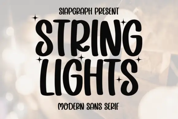
Heavy irregular handwritten caps
String Lights is a heavy irregular handwritten face in black over a blurred warm background: tall caps with soft hooked ends, narrow bowls and uneven heights, set on two lines with small four-point stars scattered between the words and a tracked line beneath.
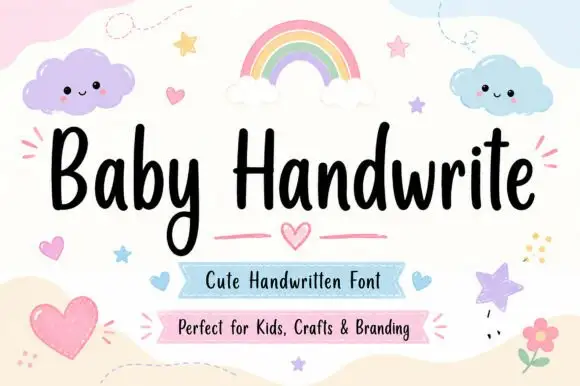
Friendly upright handwriting with a tall x-height
Baby Handwrite is a friendly handwriting face in which the letters stand upright, the x-height stays tall and the strokes round off, so a two-word title reads as something written on a nursery card with a marker.
Ideas for this font
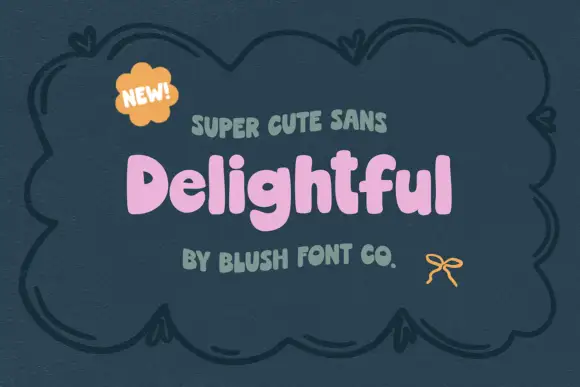
Chunky soft mixed case with uneven shoulders and a rounded g descender
Delightful shows a small pink mixed-case title inside a dark drawn frame, where broad irregular strokes form soft rounded bowls, the e opens compactly and a curved g drops below a lowercase row whose h and l rise above it.
Ideas for this font
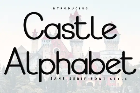
Light rounded mixed case with long ascenders and a rising diagonal e bar
Castle Alphabet places black mixed-case words over a very pale castle photograph: near-even strokes form broad circular a bowls and long t and l ascenders, the e carries an angled rising bar and the capital C stands much taller than the letters after it.
Ideas for this font
Same independent foundry
Allow optional Google Analytics to measure visits and catalogue actions. Your search words and notes are not included. Privacy & storage