High-Contrast Display Serif

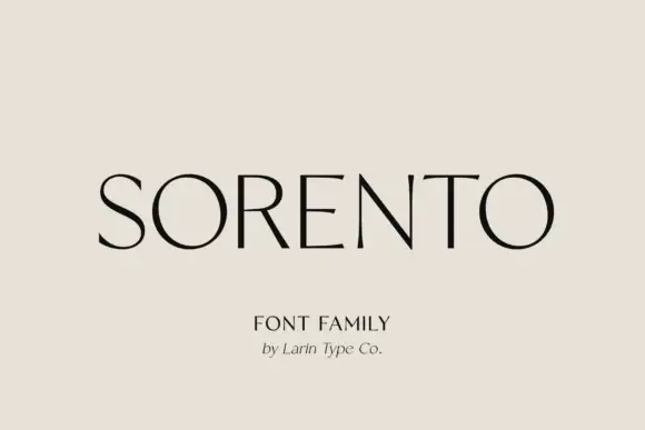
Sogo + The Simple Editorial
Pairs sculptural editorial warmth with Sogo's clean modern geometry.
Inspect The Simple Editorial specimenDisclosure: MakerFileHub may earn a commission from qualifying purchases via paid links on this page. How our links work.
Fine contrast display sans
Sogo is a fine contrast sans in near-black on warm cream: wide capitals with very thin uprights and heavy round bowls, a short G spur and even spacing, with a small serif line beneath and a credit under that.
Paid link
Get this fontProject & layout blueprintsAt-a-glance maker compatibility
Sturdy stroke walls and open counters weed cleanly on adhesive vinyl, HTV apparel film, and cut cardstock.
Visual anatomy & craft review
The word spans the plate and the drawing is a display sans with strong contrast: the bowls are broad and heavy, the uprights are hairlines, and the G keeps a short spur, so the face reads as a fashion mark rather than as a neutral grotesque. That construction sets both a size floor and a stock requirement, and the plate sets the word large enough that the thin uprights hold. The warm cream ground keeps the black from looking harsh, and the two lines beneath are set in a serif at a fraction of the size, which shows the family pairing rather than a single cut. Because the contrast is high, the face is a display cut for coated stock or screen, and it is meant for a name rather than a paragraph.
Sans serif, contrast, elegant, display
Two-font hierarchy recipes
Tested contrast partners — pairing Sogo with grounded secondary typography.
Sogo + The Simple Editorial
Pairs sculptural editorial warmth with Sogo's clean modern geometry.
Inspect The Simple Editorial specimen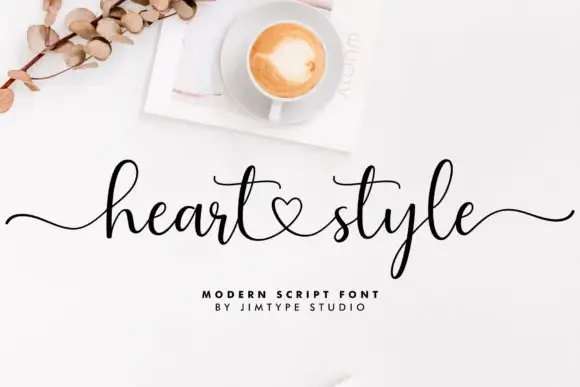
Sogo + Heart Style
Introduces organic movement on pull-quotes, signatures and gift tags.
Inspect Heart Style specimenPractical applications
Concrete hierarchy, scale and production guidance tailored to Sogo’s stroke geometry.
A contrast sans reads as luxury without the ornament of a serif, and the broad bowls give a short name presence on a box.
Hierarchy & layout recipe
Set the mark at 18 pt on a box, 95 mm on a panel and 12 pt on a card, keeping the hairlines uncut. Keep one colour and clear space equal to the cap height.
Pre-production check
Check the 12 pt panel mark, where a hairline can fill; keep the size above 13 pt. Confirm the box mark reads at four metres and that the mark etches cleanly in metal.
A contrast sans makes a masthead that reads as couture, and the wide bowls let four letters fill a cover width, which is the point of a short title.
Hierarchy & layout recipe
Set the masthead at 110 mm cap height across 205 mm, the cover lines in an 8 pt sans, and the issue at 7 pt. Print one ink on a coated stock and keep the masthead off the model's face.
Pre-production check
Check the masthead at 110 mm, where a thin upright can break; keep it above 0.25 mm. Confirm the 7 pt issue survives lamination and that the masthead holds at thumbnail size.
A contrast sans gives a contemporary invitation restraint, and the fine uprights read as engraved on a smooth card rather than merely printed.
Hierarchy & layout recipe
A5 invitation: the names at 26 pt, the request in a 9.5 pt serif, and the date at 8.5 pt caps. Keep 24 mm margins and letterpress one ink on a heavy card.
Pre-production check
Check the 26 pt names in letterpress, where a thin upright can sink; proof the plate first. Confirm the 9.5 pt request reads at arm's length and that the names clear the trim.
Technical & licence verification
Confirm included OTF/TTF/WOFF formats, full glyph tables and licence coverage on the live store page before batch production.
Closest visual alternatives
Matched across letterform anatomy, stroke behaviour and craft applications.
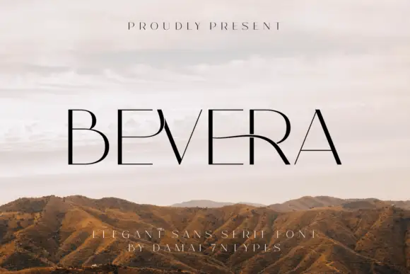
Fine high-contrast capitals with a sweeping E-R connection and a sharp narrow V
Bevera places thin black capitals over a pale landscape photograph, where fine horizontal arms meet stronger vertical strokes, the E near the middle extends into a long curved connection toward the R and the V narrows to a sharp point.

Light geometric lowercase with circular bowls and single-storey a and g
Mango Dream sets a black lowercase name on a pale paper-like ground, where thin nearly even strokes form wide circular bowls, the a stays single storey, the m arches stay low and the g opens its lower curve into a short rounded descender while the d rises above the word.
Ideas for this font
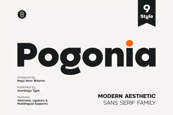
Modern heavy geometric sans
Pogonia is a modern geometric sans in near-black on off-white: heavy even strokes, circular counters, a raised dot on the i, and a set of ligatures, presented with a small badge, a ribbon label and two blocks of technical notes, so the plate reads as a contemporary type release.
Ideas for this font
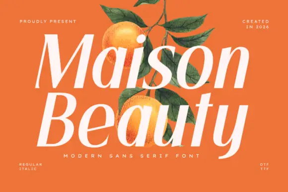
Sloping high-contrast display sans
Maison Beauty is a sloping high-contrast sans in cream over a flat orange ground: mixed case with deep oval bowls, a curved y tail, fine joins and a forward lean, set in two stacked lines with a tracked line beneath and small notes in the corners that name the cuts and the formats.
Ideas for this font
Same independent foundry
Allow optional Google Analytics to measure visits and catalogue actions. Your search words and notes are not included. Privacy & storage