Modern Grotesque Body

Searly + Godthem
Creates crisp high-hierarchy contrast beneath Searly headlines across menus, websites and labels.
Inspect Godthem specimenDisclosure: MakerFileHub may earn a commission from qualifying purchases via paid links on this page. How our links work.
Fine contrast display serif
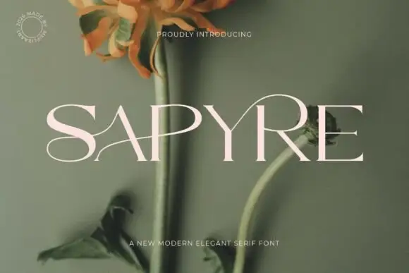
Searly is a fine high contrast serif in oxblood on a pale cream ground: wide capitals with heavy verticals, hairline horizontals, a bent A diagonal and a raised Y tip, set as one word that fills the sheet, with a small arced line above and two plain lines beneath.
Paid link
Get this fontProject & layout blueprintsAt-a-glance maker compatibility
Crisp hairline serifs shine on stationery, foil stamping, and packaging; add slight offset for small decals.
Visual anatomy & craft review
The word spans the plate and the drawing is a display serif with strong contrast: the stems are heavy, the hairlines are thin, and the A and Y are drawn with unusual joints — a bent diagonal and a raised tip — which is where the face earns its keep against a hundred other high contrast serifs. The cream ground and the soft shadow are staging, and the arced line above is set in a small tracked serif. Because the hairlines are fine, the face needs a smooth stock or a screen at display sizes, and the plate sets the word large enough that the thin strokes hold. The two lines beneath name the style and the maker, which is how a commercial specimen signs off.
Serif, contrast, elegant, display
Two-font hierarchy recipes
Tested contrast partners — pairing Searly with grounded secondary typography.
Searly + Godthem
Creates crisp high-hierarchy contrast beneath Searly headlines across menus, websites and labels.
Inspect Godthem specimen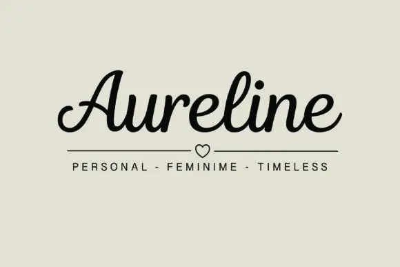
Searly + Aureline
Adds a warm human signature touch for 1-to-3-word callouts without competing against structured serif capitals.
Inspect Aureline specimenPractical applications
Concrete hierarchy, scale and production guidance tailored to Searly’s stroke geometry.
A high contrast serif gives a review a masthead with a period feel, and the unusual A and Y make the name recognisable at a glance.
Hierarchy & layout recipe
Set the masthead at 95 mm cap height across 200 mm, the cover lines in an 8.5 pt serif, and the issue at 7 pt. Print one ink on a coated stock and keep the masthead clear of the image.
Pre-production check
Check the masthead at 95 mm, where a hairline can break on a textured sheet; specify coated. Confirm the 7 pt issue survives lamination and that the A joint stays open.
A contrast serif reads as engraved formality, and the heavy stems keep a long couple's name legible at invitation size. It earns attention without ornament.
Hierarchy & layout recipe
A5 invitation: the names at 26 pt, the request in a 9.5 pt serif, and the date at 8.5 pt caps. Keep 24 mm margins and letterpress one ink on a cotton card.
Pre-production check
Check the 26 pt names in letterpress, where a hairline can sink into the cotton; proof the plate first. Confirm the 9.5 pt request reads at arm's length and that the names clear the trim.
A fine serif gives a wine label a château register, and the heavy stems survive a small die on a curved bottle. The fine serifs hold in foil.
Hierarchy & layout recipe
Print a 70 by 90 mm label: the merchant at 14 pt, the cuvée at 8 pt, and the year at 7 pt. Keep 5 mm inside the die and keep the thinnest hairline above 0.25 mm.
Pre-production check
Check the 14 pt merchant on a curved bottle, where a hairline can fill; keep it above 0.25 mm. Confirm the 7 pt year reads on the shelf and that the label holds in a damp cellar.
Technical & licence verification
Confirm included OTF/TTF/WOFF formats, full glyph tables and licence coverage on the live store page before batch production.
Closest visual alternatives
Matched across letterform anatomy, stroke behaviour and craft applications.
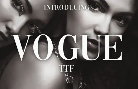
High-contrast didone with hairline serifs
Vogue is a high-contrast didone serif in white over a black-and-white beauty photograph: hairline serifs, a very thin crossbar on the A, a round O and a G with a fine spur, set in capitals as a magazine masthead.
Ideas for this font

Editorial display serif with italics
Raffined is a display serif in cream over a warm skin-toned photograph: a high-contrast roman with sharp serifs and a narrow waist, paired with a true italic that carries a flowing tail, set across four lines at increasing sizes with small tracked notes in the corners.
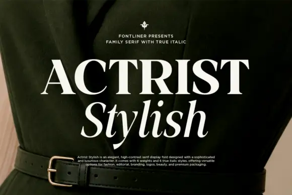
High-contrast upright capitals paired with a slanted serif lower line
Actrist Stylish is a high-contrast display serif with very thin hairlines, sharp wedge serifs and a matching true italic, shown in a fashion editorial layout over a dark garment.
Ideas for this font
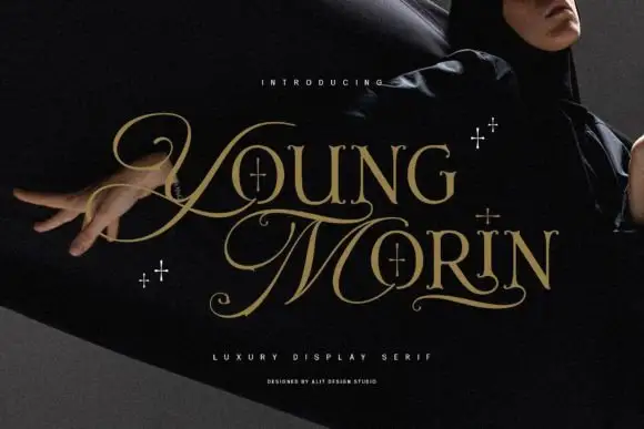
High-contrast looping serif
Young Morin is a high-contrast serif in gold on a dark portrait: fine hairline serifs, an oversized looping Y and M that sweep below the baseline, small four-point sparkles around the words, set in two lines with a tracked descriptor and a credit line beneath.
Ideas for this font
Same independent foundry
Allow optional Google Analytics to measure visits and catalogue actions. Your search words and notes are not included. Privacy & storage