Modern Grotesque Body

Rolive + Mansory
Creates crisp high-hierarchy contrast beneath Rolive headlines across menus, websites and labels.
Inspect Mansory specimenDisclosure: MakerFileHub may earn a commission from qualifying purchases via paid links on this page. How our links work.
Modern luxury serif with hairline joins
Rolive is a luxury modern serif in white over a muted interior photograph: very thin hairlines against thick stems, sharp wedge serifs, tall letters and a wide set, with small capital lines naming the variations in the corners.
Paid link
Get this fontProject & layout blueprintsAt-a-glance maker compatibility
Crisp hairline serifs shine on stationery, foil stamping, and packaging; add slight offset for small decals.
Visual anatomy & craft review
The word is set on one line across a soft photograph of a sofa and a plant, and the face is a modern serif built on contrast: the stems are heavy where the pen would press and the joins are hairlines, the serifs are sharp wedges rather than brackets, the O is a tall ellipse with a vertical stress, the R throws a long curved leg and the V opens with a hairline on the left. The letters are tall and widely spaced, which gives the word the air of a fashion title, and the hairlines are thin enough that a word at large size reads as a rhythm of light and dark rather than a solid line. Two small blocks of tracked capitals sit in the lower left and along an arc at the upper right, naming the variations and the designer. Rolive is a serif for luxury packaging, editorial titles and invitations, and it needs a large size, a plain background and a printer used to holding fine work.
Luxury, thin, fashion
Two-font hierarchy recipes
Tested contrast partners — pairing Rolive with grounded secondary typography.
Rolive + Mansory
Creates crisp high-hierarchy contrast beneath Rolive headlines across menus, websites and labels.
Inspect Mansory specimen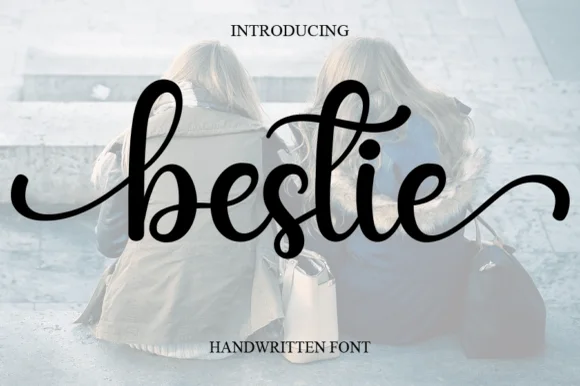
Rolive + Bestie
Adds a warm human signature touch for 1-to-3-word callouts without competing against structured serif capitals.
Inspect Bestie specimenPractical applications
Concrete hierarchy, scale and production guidance tailored to Rolive’s stroke geometry.
A luxury serif gives a small bottle the presence of a premium object, and the thin joins still read as refinement at the size of a label seen across a shop shelf.
Hierarchy & layout recipe
Print a 45 by 75 mm label: set the name at 12 pt on one line, keep 5 mm of clear ground beneath before the volume at 3.5 pt, and hold 3.5 mm of margin on all four sides.
Pre-production check
Hairlines can drop out at twelve points; print one label on the real stock and check the joins before the order.
A modern serif gives a design title its cool, and the wide set fills a title page with air rather than with a block of solid type.
Hierarchy & layout recipe
Print a 200 by 260 mm title page: set the title at 58 pt on one line, keep 40 mm of clear ground beneath before the author at 10 pt, and hold 26 mm of margin on all four sides.
Pre-production check
Thin joins under a matte laminate can disappear; proof one page in the real finish before the run.
A luxury serif suits a modern wedding that avoids ornament, and the wide spacing lets two names sit on one line without a border.
Hierarchy & layout recipe
Print a 120 by 180 mm card: set the names at 26 pt on one line, keep 18 mm of clear ground beneath before the details at 8 pt, and hold 14 mm of margin on all four sides.
Pre-production check
Hot foil on a hairline serif will bridge; order one foil proof on the intended card before the suite.
Technical & licence verification
Confirm included OTF/TTF/WOFF formats, full glyph tables and licence coverage on the live store page before batch production.
Closest visual alternatives
Matched across letterform anatomy, stroke behaviour and craft applications.
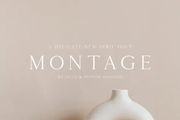
Delicate high-contrast serif
Montage is a delicate serif in white on a soft beige field: very fine hairlines, wide letterspacing, thin bracketed serifs and a high waist, set in caps on one line with a tracked line above and an attribution beneath, on a still life of a ceramic vessel.
Ideas for this font
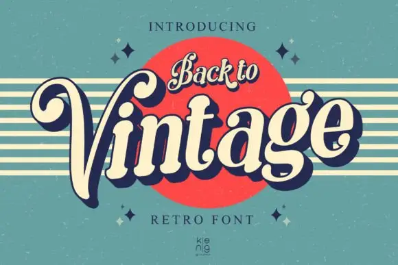
Slanted retro serif with curled V
Back to Vintage shows bold slanted high-contrast letters in cream with a deep navy shadow, where the large V curls inward at its upper left, the g carries a deep rounded lower loop and a small top hook, and a script badge reading Back to sits above on a red disc.
Ideas for this font

Fine serif title with large upper and lower loops
Amilea shows pale yellow high-contrast letters with fine tapered serifs and broad rounded lowercase over a dark portrait, where a thin loop curves below the capital A and a tall upper flourish crosses the central ascender before sweeping right.
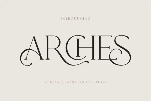
Decorative ligature serif
Arches sets one word in dark ink on a warm neutral field, where wide flat serifs sit on hairline cross strokes, the A climbs to a sharp apex, the R leg sweeps into a long horizontal tail that runs beneath the following letters and the S closes with an extended curl.
Ideas for this font
Same independent foundry
Allow optional Google Analytics to measure visits and catalogue actions. Your search words and notes are not included. Privacy & storage