High-Contrast Display Serif

Scary and Spooky + Gorga
Pairs sculptural editorial warmth with Scary and Spooky's clean modern geometry.
Inspect Gorga specimenDisclosure: MakerFileHub may earn a commission from qualifying purchases via paid links on this page. How our links work.
Tall sans with a looping script
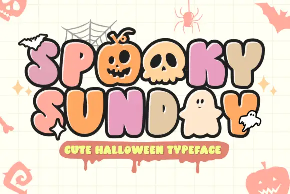
Scary and Spooky is a duo in black and copper: a tall condensed sans capital for the first word and a looping script for the second, with drawn skulls and four-pointed sparkles around the block.
Paid link
Get this fontProject & layout blueprintsAt-a-glance maker compatibility
Weld or Unite overlapping script joins into one continuous vector path before sending to the blade.
Visual anatomy & craft review
The pairing is the design: SCARY is set in a tall narrow sans with uneven stem widths and rounded terminals, so a plain capital reads as hand drawn, and Spooky is set in a looping script whose S opens above the capital line and whose y drops a fat tail beneath the word, crossing the first line on purpose. The two faces share a stroke weight, which is what keeps a sans and a script from looking like two unrelated purchases, and the script supplies all the movement while the capital supplies the structure. Small drawn skulls and sparkles fill the spaces either side, and a pale banner beneath carries the caption. Scary and Spooky is a seasonal duo for party goods, packaging and event graphics, and it works with the capital large and the script as an accent rather than the other way round.
A tall capital paired with a looping script
Two-font hierarchy recipes
Tested contrast partners — pairing Scary and Spooky with grounded secondary typography.
Scary and Spooky + Gorga
Pairs sculptural editorial warmth with Scary and Spooky's clean modern geometry.
Inspect Gorga specimen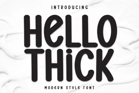
Scary and Spooky + Hello Thick
Introduces organic movement on pull-quotes, signatures and gift tags.
Inspect Hello Thick specimenPractical applications
Concrete hierarchy, scale and production guidance tailored to Scary and Spooky’s stroke geometry.
The capital does the shouting and the script does the mood, which is what a party poster needs, and the pair covers both roles in one purchase.
Hierarchy & layout recipe
Print an A2 poster: set the capital word at 140 pt and the script at 120 pt across it, keep 30 mm of clear ground beneath before the details at 24 pt, and hold 24 mm of margin on all sides.
Pre-production check
A script crossing a capital line can look like an error; print one proof at the final size and check the crossing point before the run.
The duo fits a small label because the capital stays legible at fifteen points and the script adds the theme without a second colour.
Hierarchy & layout recipe
Print a 55 mm round label: set the capital word at 13 pt and the script at 15 pt across it, keep 6 mm of clear ground to the die line, and keep the script tail inside the circle.
Pre-production check
A long script tail can run past a round die and be cut off; print one sheet and cut it before the order.
A porch sign is read at a distance in low light, and the tall capital carries while the script supplies the tone at close range.
Hierarchy & layout recipe
Print a 400 by 250 mm board: set the capital word at 90 pt and the script at 70 pt beneath, keep 20 mm of clear ground before the note at 18 pt, and hold 18 mm of border on all sides.
Pre-production check
Thin script joins disappear in low light; print one board at the final size and check it from the path before the set.
Technical & licence verification
Confirm included OTF/TTF/WOFF formats, full glyph tables and licence coverage on the live store page before batch production.
Closest visual alternatives
Matched across letterform anatomy, stroke behaviour and craft applications.
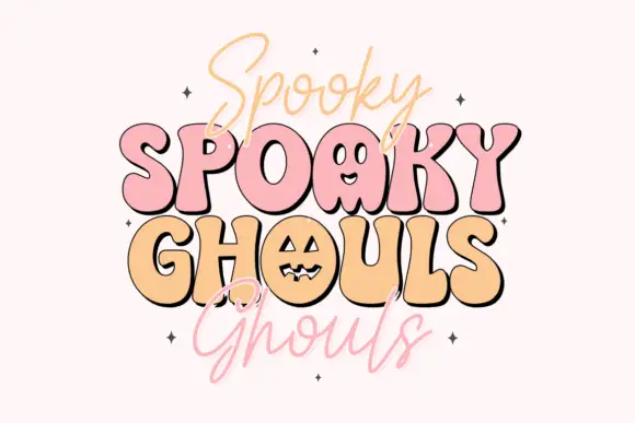
Bouncy rounded Halloween caps with thin casual script
Spooky Ghouls Duo pairs fat rounded Halloween capitals on a bouncing baseline with a hairline casual script above and below them, and turns two counters into faces.
Ideas for this font
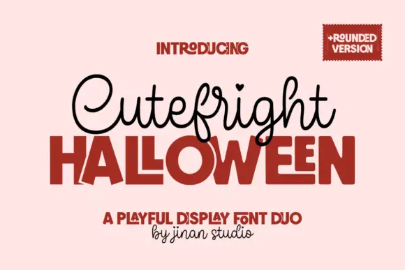
Looped script with heart tittles paired with a heavy rounded display
Cutefright Halloween is a duo that pairs a fine looping script, dotted with small hearts, against a very heavy rounded display face whose counters close into narrow slits.
Ideas for this font
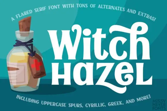
Flared mixed-case serifs with long curling terminals
Witch Hazel shows substantial white serif letters on teal beside an illustrated bottle, where the strokes flare before each serif, the bowls stay round, a tall h curls across the top and a broad z sweeps into a long low tail.
Ideas for this font

Sharp angular blackletter with fractured serifs and kept lowercase counters
Blade Gothic is a blackletter display in which the strokes break into sharp angles, the serifs fracture and the vertical rhythm stays clean, so a title reads as medieval lettering that still resolves at headline scale.
Ideas for this font
Same independent foundry
Allow optional Google Analytics to measure visits and catalogue actions. Your search words and notes are not included. Privacy & storage