Neutral Sans Workhorse

Rudolf and Snowman + Headline
Lets Rudolf and Snowman own the focal silhouette while handling secondary copy, sizing and subheads cleanly.
Inspect Headline specimenDisclosure: MakerFileHub may earn a commission from qualifying purchases via paid links on this page. How our links work.
Playful multicolour sticker display
Rudolf and Snowman is a playful display in pastel colours on white: rounded caps of uneven height, a heavy white outline with a soft drop shadow, a large ampersand, and sparkle stars around the lockup, so the pair reads as a layered sticker set for a children's Christmas.
Paid link
Get this fontProject & layout blueprintsAt-a-glance maker compatibility
Sturdy stroke walls and open counters weed cleanly on adhesive vinyl, HTV apparel film, and cut cardstock.
Visual anatomy & craft review
The two lines are stacked and each letter is filled with a different pastel, outlined in white, and shadowed with a soft grey, which builds three visual layers on a flat sheet and makes the lockup read as cut paper. The letterforms are soft and slightly uneven: the stems bow, the corners round off, and the heights drift, which keeps the whole thing from looking like a mechanical grotesque. The ampersand is oversized and set between the lines, and four sparkle stars sit at the corners of the block, so the composition is closed without a border. Because the outline is thick, the face works at small sizes as a sticker and at banner size as a wall graphic, and the specimen sets two tracked captions in a light sans so the decorative block stays uncontested.
Playful, multicolour, layered, festive
Two-font hierarchy recipes
Tested contrast partners — pairing Rudolf and Snowman with grounded secondary typography.
Rudolf and Snowman + Headline
Lets Rudolf and Snowman own the focal silhouette while handling secondary copy, sizing and subheads cleanly.
Inspect Headline specimen
Rudolf and Snowman + Mewah
Grounds bold display lettering with classic typographic authority on posters, badges and apparel.
Inspect Mewah specimenPractical applications
Concrete hierarchy, scale and production guidance tailored to Rudolf and Snowman’s stroke geometry.
A layered pastel display reads as festive without a photograph, and the sticker outline keeps the letters legible when a school prints the poster on a colour copier.
Hierarchy & layout recipe
A2 portrait: the headline at 120 mm cap height with a 6 mm outline, the stalls in a 14 mm sans, and the times in 18 mm. Keep 30 mm margins and limit the palette to four pastels so the copier holds the layers.
Pre-production check
Check the A2 on a copier, where soft shadows can print as grey mud; drop the shadow for that output. Confirm the 14 mm stalls read at two metres and that the outlines do not merge two neighbouring letters.
A pastel multicolour display keeps a December birthday distinct from Christmas décor, and the layered outline gives the banner depth on a plain wall.
Hierarchy & layout recipe
Print 800 by 400 mm: the name at 140 mm cap height, the age in a 40 mm rounded sans, and sparkles at the two upper corners. Keep 25 mm margins and print on a white ground so the three layers stay distinct.
Pre-production check
Check the banner at five metres, where the soft shadow can blur the letter edges; keep the shadow at one step. Confirm the 40 mm age reads at three metres and that the sparkles clear the eyelets.
A layered sticker display gives a bakery a seasonal set that reads from a counter, and the thick white outline means the stickers work on both paper bags and dark cups.
Hierarchy & layout recipe
Die-cut 50 mm stickers: the phrase at 16 pt with a 2 mm outline, the shop name at 6 pt, and 2.5 mm clear to the die. Keep the pastel palette to three tones per sticker so a short run stays affordable.
Pre-production check
Check the 16 pt phrase, where the outline can close the counters; open the spacing. Confirm the sticker reads on a brown bag and that the 6 pt shop name survives the die cutting.
Technical & licence verification
Confirm included OTF/TTF/WOFF formats, full glyph tables and licence coverage on the live store page before batch production.
Closest visual alternatives
Matched across letterform anatomy, stroke behaviour and craft applications.
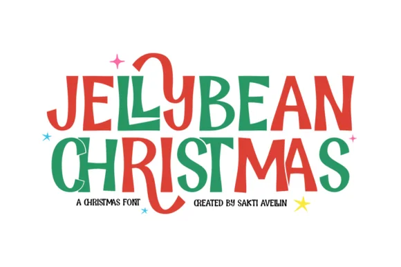
Chunky hand-drawn Christmas capitals with one letter dropping below the line
Jellybean Christmas is a heavy hand-drawn capital alphabet in which the strokes stay fat and slightly uneven, the corners soften and one letter in each line is allowed to fall out of the baseline, so a greeting reads as cut paper.
Ideas for this font
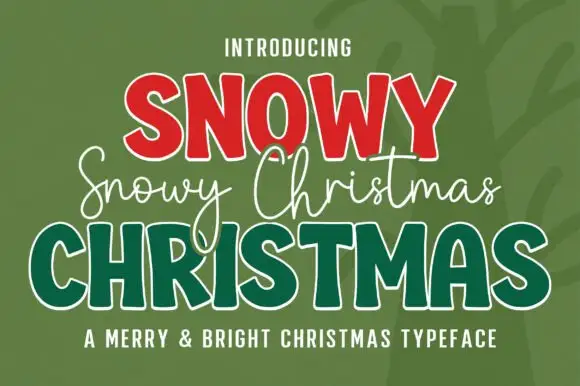
Three-layer Christmas set in red, white and green
Snowy Christmas is a three-part set in red, white and green on a dark ground: fat slab capitals in red with a white inline, a white monoline script written across the middle, and outlined green capitals underneath, sold as one Christmas typeface.
Ideas for this font
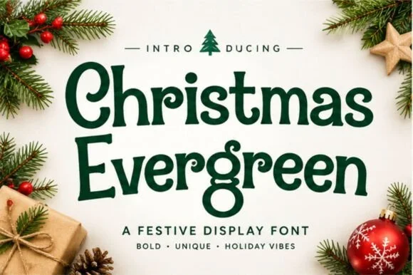
Soft vintage holiday serif with rounded bowls and curled terminals
Christmas Evergreen is a soft vintage serif in which the bowls are rounded, the terminals curl gently and the contrast is moderate, so a greeting reads as mid-century packaging lettering rather than as a formal serif.
Ideas for this font
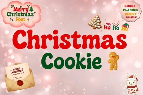
Chubby retro holiday bubble face with rounded bowls and playful counters
Christmas Cookie is a chubby retro mixed-case face in which the bowls are round, the strokes are fat and some letters carry a curl, so a greeting reads as a holiday cookie tin label.
Ideas for this font
Same independent foundry
Allow optional Google Analytics to measure visits and catalogue actions. Your search words and notes are not included. Privacy & storage