High-Contrast Display Serif

Summer Archive + Cervelique
Pairs sculptural editorial warmth with Summer Archive's clean modern geometry.
Inspect Cervelique specimenDisclosure: MakerFileHub may earn a commission from qualifying purchases via paid links on this page. How our links work.
Retro mixed-style beach collection
Summer Archive is a collection of six retro styles in a warm coral and teal palette: a fat display, a flared serif, a bold serif, a script, a cursive and a sans with an extruded companion, plus illustration packs.
Paid link
Get this fontProject & layout blueprintsAt-a-glance maker compatibility
Cut solid base, outline, and shadow layers in separate vinyl colors and align on registration marks.
Visual anatomy & craft review
SUMMER ARCHIVE is the loudest element on the card, set in a heavy retro display with a slight arch and an inline cut, and California Beach beneath it is written in a bold retro script with a full loop on the C and a tail on the h. The rest of the card is a specimen: a flared serif for The Best, a sans for the tracked caps, a cursive for the annotations, and small ornaments and rules that tie the six voices together. Two toucans sit in the upper corners, a parasol and a deck chair at the lower, and the foot lists the six styles in tracked caps. The bundle is for coastal packaging, event material and merch: the range is the point, because one purchase covers a label, a poster and a sign, and the retro palette keeps the six styles reading as one family.
A six-style retro beach bundle
Two-font hierarchy recipes
Tested contrast partners — pairing Summer Archive with grounded secondary typography.
Summer Archive + Cervelique
Pairs sculptural editorial warmth with Summer Archive's clean modern geometry.
Inspect Cervelique specimen
Summer Archive + Simple Alphabet
Introduces organic movement on pull-quotes, signatures and gift tags.
Inspect Simple Alphabet specimenPractical applications
Concrete hierarchy, scale and production guidance tailored to Summer Archive’s stroke geometry.
A retro display with a script beneath is the classic festival poster structure, and the bundle supplies the small caps for the line-up as well.
Hierarchy & layout recipe
Print an A2 poster: set the festival name at 110 pt in the display, set the line-up at 16 pt in the sans with 28 mm of clear ground, and hold 24 mm of border on all sides.
Pre-production check
Six styles on one poster can fight; print one at the final size and check only the intended three voices appear before the run.
One purchase covers a bag, a label and a shelf card, and the retro palette keeps a small range looking like one product line.
Hierarchy & layout recipe
Print a 70 by 90 mm bag label: set the brand at 16 pt in the display, set the variant at 8 pt in the script with 6 mm of clear ground, and hold 5 mm of margin on all sides.
Pre-production check
The inline cut of the display fills on a small bag; print one on the real stock and check the counters before the order.
A retro display and a script give a seasonal cover a period look without a photograph, and the flared serif carries the cover lines.
Hierarchy & layout recipe
Print a 230 by 300 mm cover: set the cover title at 90 pt in the display, set the cover lines at 12 pt in the flared serif with 26 mm of clear ground, and hold 20 mm of margin.
Pre-production check
Warm coral and teal can vibrate on newsprint; print one cover on the actual paper and check the edge before the run.
Technical & licence verification
Confirm included OTF/TTF/WOFF formats, full glyph tables and licence coverage on the live store page before batch production.
Closest visual alternatives
Matched across letterform anatomy, stroke behaviour and craft applications.
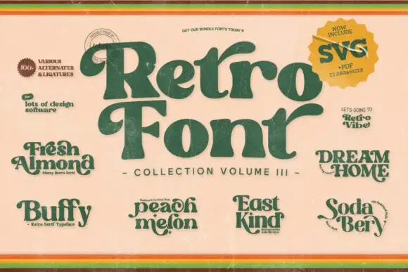
A collection of curled retro serif previews
Retro Groovy Bundle presents several named retro samples around a large curved serif title, with heavy green lettering on a warm cream cover, small name plates reading Fresh Almond, Buffy, Peach Melon, East Kind, Dream Home and Soda Berry, and a corner badge that advertises SVG, PDF and EPS files.
Ideas for this font
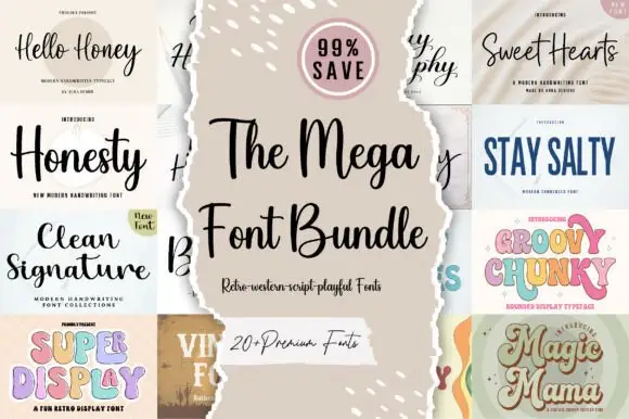
Twenty-plus scripts, serifs and displays
The Mega Font Bundle is a set of more than twenty faces: modern handwriting scripts, a clean signature, a wide comic serif, a chunky pastel display, a vintage label serif and a swashed script, presented as a grid of torn-paper tiles around a central card.
Ideas for this font
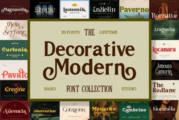
Collection of decorative serif cuts with curled initials and ornate details
Decorative Modern is a collection of decorative serif cuts in which a curled capital M, thin contrasting serifs, heavy soft headings and ornamental initials appear across separate styles, so one listing covers several dressings of the same formal voice.
Ideas for this font
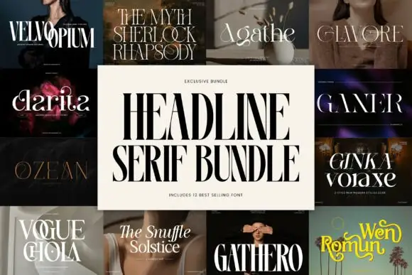
Collage of condensed headings and broad ornamental serif titles
Headline Serif Bundle shows a central heavy condensed-capital title surrounded by varied serif specimens, where the panels include fine tall capitals, curling mixed case and broader ornamental titles, and the cover advertises a large set of best-selling fonts with PUA extras, ligatures and stylistic alternates.
Ideas for this font
Same independent foundry
Allow optional Google Analytics to measure visits and catalogue actions. Your search words and notes are not included. Privacy & storage



