Neutral Sans Workhorse

Milky + Noar
Lets Milky own the focal silhouette while handling secondary copy, sizing and subheads cleanly.
Inspect Noar specimenDisclosure: MakerFileHub may earn a commission from qualifying purchases via paid links on this page. How our links work.
High-contrast arched display
Milky is a high-contrast display in cream over a photograph of hands: mixed case with an arched M that rises into a peak, a round i dot held above the stem, a looping y descender, hairline joins and a wide set, with a small line at the top and a caption beneath.
Paid link
Get this fontProject & layout blueprintsAt-a-glance maker compatibility
Sturdy stroke walls and open counters weed cleanly on adhesive vinyl, HTV apparel film, and cut cardstock.
Visual anatomy & craft review
The word is set across four hands, which is a hard test for a hairline face, and the arched M with its peak and the looping y are what make it work: the heavy strokes carry the eye and the hairlines read as gaps. That construction sets a size floor and a substrate requirement, because the hairlines break on rough stock and at small sizes, and the plate sets the word large enough that the loop of the y reads as a drawn gesture. The photograph is staging, and the two small lines are product copy that name the style and the studio. Because the letters are wide and contrasting, the face suits a wordmark, a cover and a label at display sizes rather than for a paragraph.
Display, contrast, arched, elegant
Two-font hierarchy recipes
Tested contrast partners — pairing Milky with grounded secondary typography.
Milky + Noar
Lets Milky own the focal silhouette while handling secondary copy, sizing and subheads cleanly.
Inspect Noar specimen
Milky + Medvilea Editorial
Grounds bold display lettering with classic typographic authority on posters, badges and apparel.
Inspect Medvilea Editorial specimenPractical applications
Concrete hierarchy, scale and production guidance tailored to Milky’s stroke geometry.
A high-contrast mark gives a jewellery line elegance, and the arched M makes a short name recognisable at small sizes on a box.
Hierarchy & layout recipe
Set the mark at 18 pt on a box, 95 mm on a window and 13 pt on a card, keeping the hairlines and the y loop uncut. Keep one colour and clear space equal to the cap height.
Pre-production check
Check the 13 pt card mark, where a hairline can vanish; keep the size above 15 pt. Confirm the window mark reads at eight metres and that the loop cuts cleanly in vinyl.
A high-contrast title gives a beauty cover polish, and the arched M holds a wide measure with one word. The arched M holds the width.
Hierarchy & layout recipe
Set the title at 100 mm cap height across 200 mm, the cover lines in an 8 pt sans, and the issue at 7 pt. Print one ink on a coated stock and keep 24 mm margins at the head.
Pre-production check
Check the title at 100 mm, where a join can break on coated stock; keep it above 0.25 mm. Confirm the 7 pt issue survives lamination and that the title clears the trim.
A contrast display reads as contemporary formality, and the arched M gives the names a lift without a script. The arch gives the names a lift.
Hierarchy & layout recipe
A5 invitation: the names at 26 pt, the request in a 9.5 pt serif, and the date at 8.5 pt caps. Keep 24 mm margins and letterpress one ink on a heavy, smooth card.
Pre-production check
Check the 26 pt names in letterpress, where a hairline can sink; proof the plate first. Confirm the request reads at arm's length and that the y loop clears the trim.
Technical & licence verification
Confirm included OTF/TTF/WOFF formats, full glyph tables and licence coverage on the live store page before batch production.
Closest visual alternatives
Matched across letterform anatomy, stroke behaviour and craft applications.
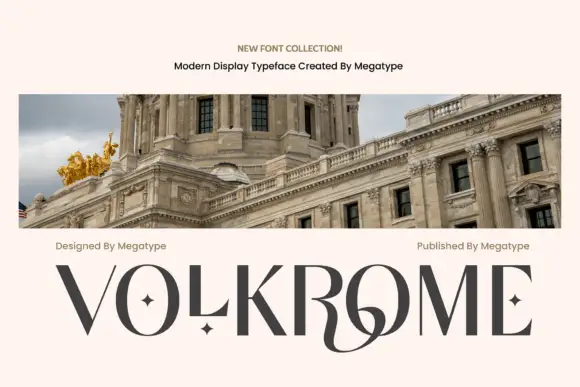
Angular contrast display
Volkrome is an angular contrast display in charcoal on a pale sheet, shown above a photograph of a domed building: wide capitals with fine curves, sharp junctions, small star counters and a sweeping joined centre, with two credits above and the name set across the foot.
Ideas for this font
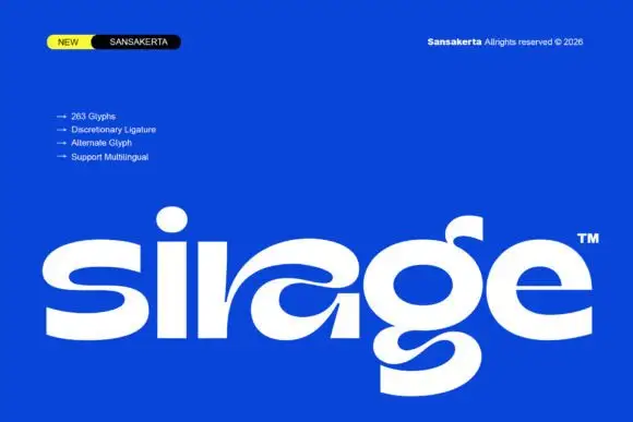
Wide display lowercase with flowing joints
Sirage is a wide display in white on a saturated blue: lowercase with a flowing a construction that sweeps through the bowl, an extended double-bowl g, thick even strokes and round terminals, set as one large word with a small badge at the top left and a list of features beside it.
Ideas for this font
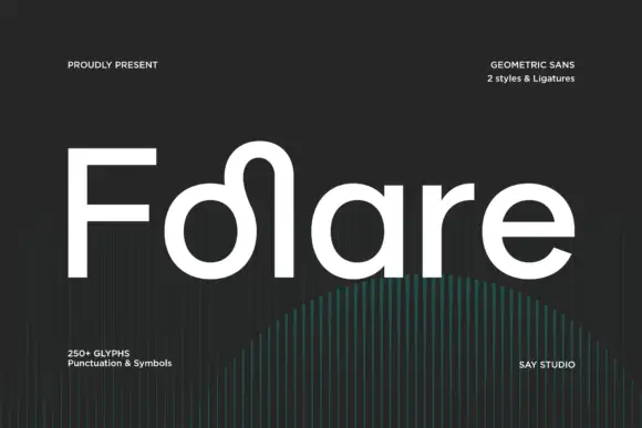
Rounded mixed case with a looped rise between the o bowl and tall l stem
Folare is a geometric sans in which the lowercase l loops over the preceding letter, the counters are near perfect circles, and every terminal is cut flat on the horizontal.
Ideas for this font
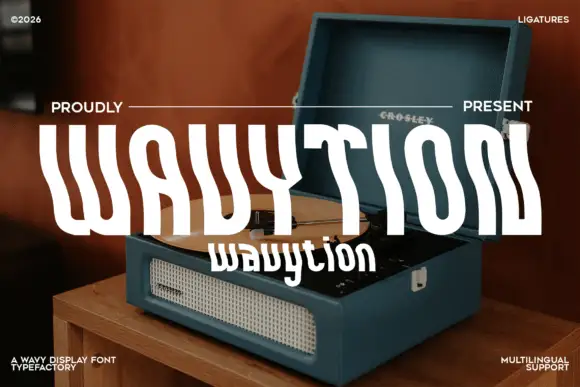
Waved condensed display
Wavytion is a waved display in white over a photograph of a portable record player: very tall narrow forms whose stems bend into broad alternating waves, so the word reads as a ribbon, with a second line in a softer wave beneath and small notes in the corners.
Ideas for this font
Same independent foundry
Allow optional Google Analytics to measure visits and catalogue actions. Your search words and notes are not included. Privacy & storage