Editorial Serif Anchor

Welcome Honey + The Avenue Editorial
Anchors Welcome Honey's fluid strokes with crisp Roman proportions on wedding suites, headers and packaging.
Inspect The Avenue Editorial specimenDisclosure: MakerFileHub may earn a commission from qualifying purchases via paid links on this page. How our links work.
Brush signature script with a fine connector
Welcome Honey is a brush signature script in white over a warm sepia photograph of a wooden bench: monoline downstrokes that swell slightly at the entry, a W built from two long crossing strokes and a descender on the y that drops below the second word.
Paid link
Get this fontProject & layout blueprintsAt-a-glance maker compatibility
Set Cricut or Silhouette operation to Pen, Foil Quill, or Laser Score — not Basic Blade Cut.
Visual anatomy & craft review
The words are written at a slight rise and the drawing sits between a signature and a brush script: stroke weight is nearly even, but the entries and exits carry a little pressure, so the W opens with a long diagonal that crosses back over the letter and the H lifts a narrow loop above the cap line. Connections are fine and sometimes broken, which reads as a fast hand rather than a formal calligraphy, and the letters lean forward consistently so the whole line has direction. The mockup places it over a sepia photograph of a carved bench with dappled light, and the white type keeps its contrast because the image is warm and mid-toned rather than bright. Three small italic serif lines introduce the face, describe the brush, and name the foundry, which shows the intended pairing: the script for the name, a quiet serif for everything a customer must actually read.
Signature, brushy, warm, loose
Two-font hierarchy recipes
Tested contrast partners — pairing Welcome Honey with grounded secondary typography.
Welcome Honey + The Avenue Editorial
Anchors Welcome Honey's fluid strokes with crisp Roman proportions on wedding suites, headers and packaging.
Inspect The Avenue Editorial specimen
Welcome Honey + Prime Nordic
Keeps small-scale dates, URLs, nutrition facts and care instructions crisp and legible below script titles.
Inspect Prime Nordic specimenPractical applications
Concrete hierarchy, scale and production guidance tailored to Welcome Honey’s stroke geometry.
A brush signature gives a rustic suite a hand-written feel while staying more legible than a formal script, and it holds up over a photograph where a thin monoline would vanish.
Hierarchy & layout recipe
A5 card: the couple's names at 30 pt in one line, the venue in an 11 pt serif small caps below, and the date in 9 pt italic. Keep 20 mm between the script line and the serif so the descender of the y does not collide.
Pre-production check
Check the descender of the y against the line beneath at actual size, and confirm the swelled entries do not blob together on uncoated card. Read the names aloud from the proof to make sure the crossing W still parses as a letter.
Ending a card with a brush signature reproduces the gesture of signing it by hand, and a loose script keeps the note from feeling like a form letter.
Hierarchy & layout recipe
Set the phrase at 22 pt at the lower right of a folded note, 15 mm above the trim, with the message in a 10 pt serif and a 10 mm gap. Print in a single warm ink on cream stock so the brush tone matches the paper.
Pre-production check
Check the note at actual size, where the fine connectors can break up at 22 pt, and confirm the phrase clears the fold by 5 mm. Verify the ink is not so light that the thin exits disappear under household lighting.
A brush signature carries the idea of a small producer signing each jar, and the warm informal drawing sits well on a label that has to compete on a crowded shelf.
Hierarchy & layout recipe
Round label of 60 mm: the name at 18 pt curved along the lower arc, the weight in a 7 pt sans at the centre, and the apiary location in 6 pt caps. Keep 5 mm clear inside the label edge so the descenders never touch the die line.
Pre-production check
Check the curved setting at actual size, where the script's forward lean fights the arc and letters start to crowd; adjust the arc radius rather than the tracking. Confirm the 6 pt caps stay legible and the 18 pt name reads from a metre away.
Technical & licence verification
Confirm included OTF/TTF/WOFF formats, full glyph tables and licence coverage on the live store page before batch production.
Closest visual alternatives
Matched across letterform anatomy, stroke behaviour and craft applications.
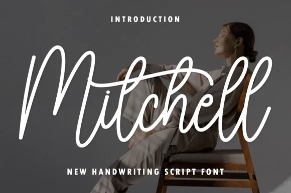
Tall upright brush-pen signature calligraphy script
Mitchell is a stylish, tall-looped brush-signature script pairing high editorial ascenders ('M', 't', 'h', 'l') with smooth, vinyl-friendly stroke weight.
Ideas for this font
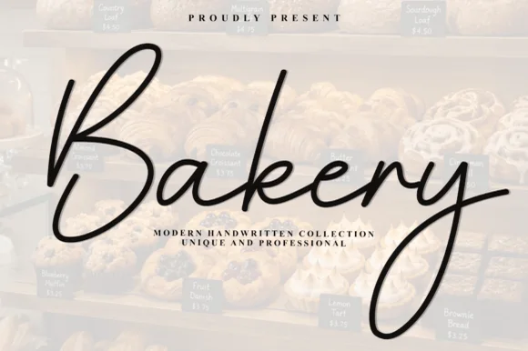
Airy elongated patisserie signature calligraphy script
Bakery (by Plafont store) is an airy, graceful fine-pen signature script sweeping tall 'B/k' loops and elongated 'y' descenders.
Ideas for this font
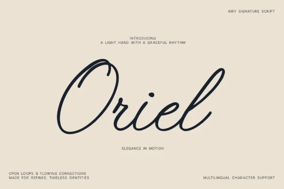
Airy open-loop minimalist monoline signature script (Multilingual)
Oriel is an airy, minimalist monoline signature script featuring wide open oval 'O' loops, unhurried rhythm, and full multilingual support.
Ideas for this font
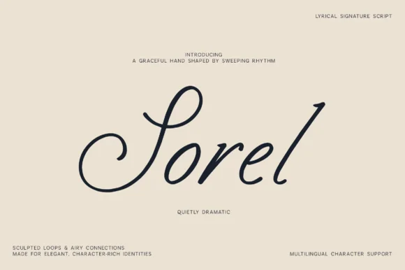
Lyrical monoline-shaded calligraphic signature script
Sorel is a poised, slanted lyrical signature script defined by an expansive double-curled S-loop and crisp high-rising ascenders.
Ideas for this font
Allow optional Google Analytics to measure visits and catalogue actions. Your search words and notes are not included. Privacy & storage