Editorial Serif Anchor

Billion Dollars + Orvelia
Anchors Billion Dollars's fluid strokes with crisp Roman proportions on wedding suites, headers and packaging.
Inspect Orvelia specimenDisclosure: MakerFileHub may earn a commission from qualifying purchases via paid links on this page. How our links work.
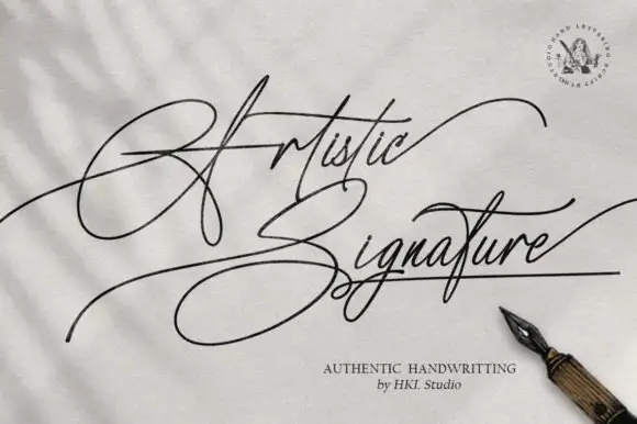
Fine sloping antique handwriting with visible pen texture
Billion Dollars is fine sloping handwriting drawn to look like ink on old paper, with irregular stroke edges, uneven joins and letters that lean together at a consistent angle.
Paid link
Get this fontProject & layout blueprintsAt-a-glance maker compatibility
Weld or Unite overlapping script joins into one continuous vector path before sending to the blade.
Visual anatomy & craft review
The capital B starts as a narrow loop that rises above the cap line and then descends in a sloped stem, and the letters after it keep the same forward angle without drifting, so the word looks written rather than set. The texture is the character: edges are slightly ragged, some strokes thin where the nib lifted, and the joins between letters vary in darkness, which is what produces the antique feel. Ascenders on the l and the d are tall and straight, the o and the e close their counters tightly, and the final r and s finish in fine tapering tails that sit at different heights, as a real hand would leave them. There is no fixed baseline: the word dips slightly in the middle and recovers at the end. The antique bag illustration and the small serif notes are presentation; the script is the two words.
Fine · Sloped · Antique
Two-font hierarchy recipes
Tested contrast partners — pairing Billion Dollars with grounded secondary typography.
Billion Dollars + Orvelia
Anchors Billion Dollars's fluid strokes with crisp Roman proportions on wedding suites, headers and packaging.
Inspect Orvelia specimen
Billion Dollars + Kohilo
Keeps small-scale dates, URLs, nutrition facts and care instructions crisp and legible below script titles.
Inspect Kohilo specimenPractical applications
Concrete hierarchy, scale and production guidance tailored to Billion Dollars’s stroke geometry.
A fine antique hand gives a long-form feature a documentary voice, and the visible pen texture signals a primary source rather than a designed logo.
Hierarchy & layout recipe
Set the title at 40 pt on the opening spread, keep the standfirst in a text serif at 10 pt, and hold 18 mm between the title and the first paragraph so the long tails are not crowded.
Pre-production check
Fine textured strokes on newsprint can fill in; check the printed page and hold the title at 40 pt rather than tightening the letterfit.
The antique texture matches the stock a dealer sells, and the fine slope keeps a long trading name readable on a narrow ticket without looking like a modern script.
Hierarchy & layout recipe
Set the dealer's name at 16 pt on a 40 by 90 mm ticket, keep the price in a clean serif at 10 pt, and leave 8 mm at the right so the trailing tail has room to run out.
Pre-production check
Long tickets are printed on card that gets handled and bent; check the fine tails at the cut edge and shorten them if they fall within 3 mm of the trim.
An antique hand suits a booklet that guests keep, and the irregular texture makes a printed cover feel like a written document rather than a programme.
Hierarchy & layout recipe
Set the heading at 26 pt on an A6 cover, set the date in a small caps serif at 8 pt, and leave 14 mm of clear space below the heading so the descenders stay off the fold.
Pre-production check
Booklet covers crease along the spine; check the artwork against the spine position and move the heading up if a tail crosses it.
Technical & licence verification
Confirm included OTF/TTF/WOFF formats, full glyph tables and licence coverage on the live store page before batch production.
Closest visual alternatives
Matched across letterform anatomy, stroke behaviour and craft applications.
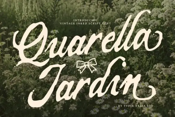
Rough edged botanical script
Quarella Jardin is a vintage inked script in cream on a meadow of small white flowers: fat slanted letters, rough ink edges and a drawn bow between the two words.
Ideas for this font
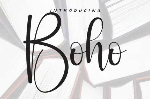
Tall high-contrast script with an oversized B
Boho opens with an oversized narrow B that drops a deep lower bowl, the h lifts a tall loop and the two small o forms join through fine crossing connectors, so a single short name reads as a tall written line.
Ideas for this font
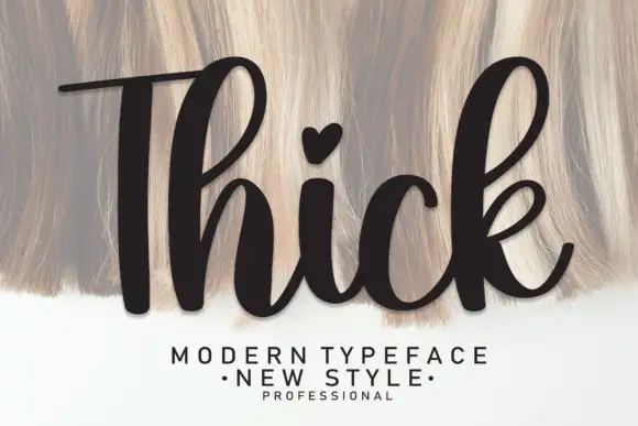
Heavy upright script with a heart dot
Thick is a heavy upright script in black over a pale textured ground: very fat even strokes, a tall narrow capital T drawn with a long bar, a heart in place of the dot on the i and a heavy leg on the k.
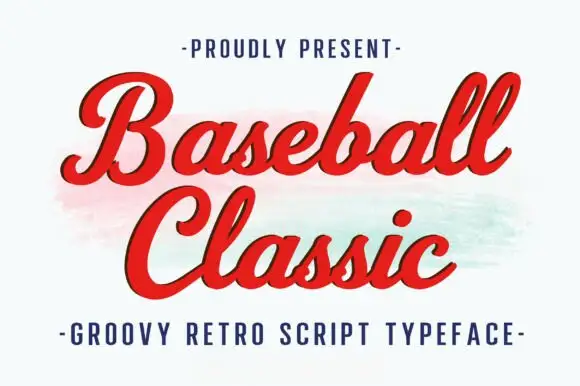
Thick retro sports script with high contrast and a lean
Baseball Classic is a thick retro sports script that leans forward, its downstrokes heavy and its joins thin, with looped capitals on both words and a small ball terminal at the exits.
Ideas for this font
Same independent foundry
Allow optional Google Analytics to measure visits and catalogue actions. Your search words and notes are not included. Privacy & storage