High-Contrast Display Serif

Price Mart Duo + Askinо
Pairs sculptural editorial warmth with Price Mart Duo's clean modern geometry.
Inspect Askinо specimenDisclosure: MakerFileHub may earn a commission from qualifying purchases via paid links on this page. How our links work.
Heavy sign capitals and a smooth script
Price Mart Duo is a sign display pair in rust orange and charcoal on cream: heavy uppercase letters with cut-off corners and a slanted script beneath that fills the same width in a lighter hand.
Paid link
Get this fontProject & layout blueprintsAt-a-glance maker compatibility
Weld or Unite overlapping script joins into one continuous vector path before sending to the blade.
Visual anatomy & craft review
The pair is built for signage: PRICE is set in fat capitals with flat tops and angled cuts, so each letter looks cut from board and stacked on a shop window, while Mart is set in a smooth slanted script whose letters connect and whose final t lifts into a small swash. The two share a colour family but not a shape, which is what makes a sign read as painted by hand rather than typeset: the capitals hold the structure and the script supplies the movement. Drawn four-pointed stars and a small angled label fill the corners, and a script line above names the face as a sign display font, with a fine script banner at the lower left. The duo is made for shopfronts, market stalls and packaging that want a mid-century retail voice, and it needs a wide sign and short words.
A shop-sign capital paired with a neat script
Two-font hierarchy recipes
Tested contrast partners — pairing Price Mart Duo with grounded secondary typography.
Price Mart Duo + Askinо
Pairs sculptural editorial warmth with Price Mart Duo's clean modern geometry.
Inspect Askinо specimen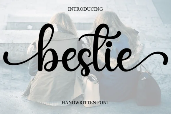
Price Mart Duo + Bestie
Introduces organic movement on pull-quotes, signatures and gift tags.
Inspect Bestie specimenPractical applications
Concrete hierarchy, scale and production guidance tailored to Price Mart Duo’s stroke geometry.
A sign capital plus a script reads as a painted shop board, which suits a reception built around food stalls instead of a plated dinner.
Hierarchy & layout recipe
Print a 600 by 400 mm board: set the capital line at 96 pt, set the script name at 80 pt beneath with 24 mm of clear ground, and hold 22 mm of border on all four sides of the board.
Pre-production check
Two weights set close can compete; print one board at the final size and check which line reads first from across the room before the set.
The pair gives a retail feature a period voice, and the capitals read as a headline while the script carries a subtitle without a second typeface.
Hierarchy & layout recipe
Print a 230 by 300 mm opener: set the title at 84 pt in the capitals, set the standfirst at 34 pt in the script with 24 mm of clear ground, and hold 22 mm of margin on both sides.
Pre-production check
A heavy capital at eighty-four points can look like a poster; print one opener at the finished size and judge the proportion before the issue.
A sign pair works on small labels because the capitals stay legible at fourteen points, and the script gives each product a hand-written note.
Hierarchy & layout recipe
Print six 60 by 90 mm labels: set each product at 16 pt in the capitals, set the note at 10 pt in the script with 6 mm of clear ground, and hold 5 mm of margin on all four sides.
Pre-production check
Small capitals with cut corners lose their shape at sixteen points; print one of each label on the real stock before the order.
Technical & licence verification
Confirm included OTF/TTF/WOFF formats, full glyph tables and licence coverage on the live store page before batch production.
Closest visual alternatives
Matched across letterform anatomy, stroke behaviour and craft applications.
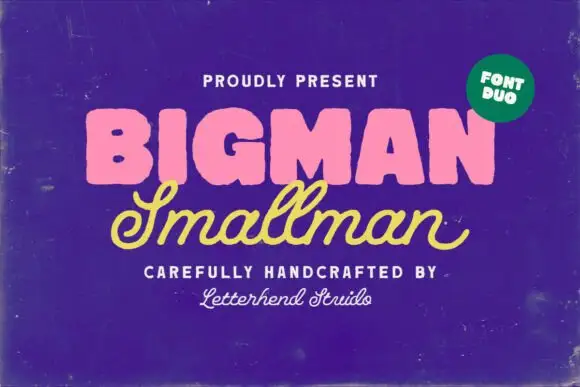
Heavy rounded block capitals paired with a slanted monoline signature script
Bigman Smallman pairs a very heavy rounded capital alphabet with a slanted monoline signature script, so the pair reads as one loud word and one quiet signed line beneath it.
Ideas for this font
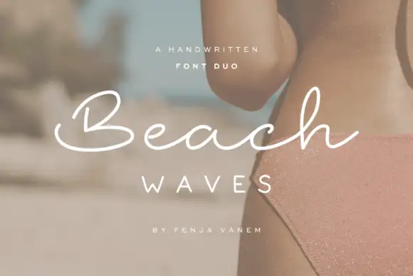
Duo pairing a brushed monoline signature with wide-tracked capitals
Beach Waves is a two-cut family in which a brushed monoline script writes one word and a wide-tracked sans sets the other, so a design gets a relaxed written line and a calm structural line from one purchase.
Ideas for this font
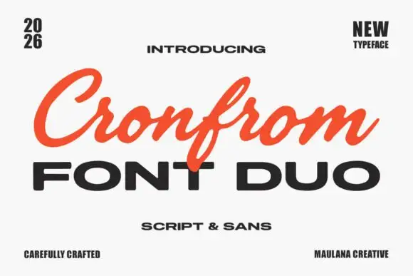
Slanted retro script paired with a wide bold sans in capitals
Cronfrom pairs a slanted retro script with a wide bold sans, so one lockup can carry a handwritten sign name and a hard-edged second line beneath it.
Ideas for this font
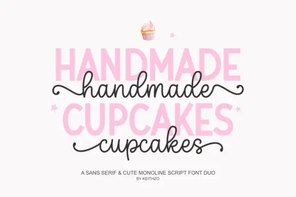
Bold sans serif paired with a monoline script with curled outer tails
Handmade Cupcakes pairs a bold sans serif in capitals with a light monoline script whose tails curl at both ends, so a label can carry a firm product word and a soft handwritten line.
Ideas for this font
Allow optional Google Analytics to measure visits and catalogue actions. Your search words and notes are not included. Privacy & storage