High-Contrast Display Serif

Pretzel + Medvilea Editorial
Pairs sculptural editorial warmth with Pretzel's clean modern geometry.
Inspect Medvilea Editorial specimenDisclosure: MakerFileHub may earn a commission from qualifying purchases via paid links on this page. How our links work.
Retro condensed sans display
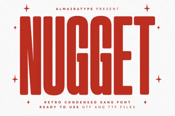
Pretzel is a retro condensed display in orange-red on a textured cream ground: flat-sided letters with tight curves, blunt corners and very little space between the stems, set in one word across the plate with a tracked line above and two lines beneath.
Paid link
Get this fontProject & layout blueprintsAt-a-glance maker compatibility
Sturdy stroke walls and open counters weed cleanly on adhesive vinyl, HTV apparel film, and cut cardstock.
Visual anatomy & craft review
The word fills the plate and the drawing is a condensed grotesque: the sides are flat, the curves turn tightly, and the counters are narrow slots, which lets seven letters run across the width without losing height. That is the point of the face, and the plate demonstrates it by setting one word as large as the sheet allows. The corners are blunt rather than rounded, so the letters read as cut vinyl rather than as a soft retro style, and the two tracked lines beneath name the category and the file formats, which is the practical information a buyer looks for. Because the strokes are heavy and the spacing is tight, the face works at poster size and on a garment, and the specimen keeps the background plain so the orange carries the page.
Retro, condensed, bold, sport
Two-font hierarchy recipes
Tested contrast partners — pairing Pretzel with grounded secondary typography.
Pretzel + Medvilea Editorial
Pairs sculptural editorial warmth with Pretzel's clean modern geometry.
Inspect Medvilea Editorial specimen
Pretzel + Black Ink Brush
Introduces organic movement on pull-quotes, signatures and gift tags.
Inspect Black Ink Brush specimenPractical applications
Concrete hierarchy, scale and production guidance tailored to Pretzel’s stroke geometry.
A condensed retro display fits a long shop name into a narrow fascia, which a wide face cannot do without shrinking the cap height.
Hierarchy & layout recipe
Paint a 1,000 by 350 mm fascia: the name at 110 mm cap height, the menu in a 22 mm sans, and a 4 mm rule. Keep 20 mm margins and paint two colours on a cream board.
Pre-production check
Check the fascia at five metres, where tight counters can fill with paint; keep them above 6 mm. Confirm the 22 mm menu reads at two metres and that the rule clears the fixings.
A condensed display sets a long fixture line in one row, and the blunt corners print sharply on a cheap sheet at the copier.
Hierarchy & layout recipe
A3 poster: the fixture at 80 mm cap height, the date in a 24 mm display, and the venue at 9 mm. Keep 22 mm margins and print one colour on a light sheet with a bold rule beneath the title.
Pre-production check
Check the A3 at three metres, where tight spacing can join the letters; add 2 percent tracking. Confirm the 9 mm venue reads at arm's length and that the title fits the sheet.
A retro display reads as painted lettering at market distance, and the tight construction keeps a long stall name inside a small board.
Hierarchy & layout recipe
Paint a 900 by 350 mm board: the stall at 100 mm cap height, the prices in a 22 mm sans, and a 5 mm border. Keep 22 mm margins and paint two colours on a light board.
Pre-production check
Check the board at four metres, where a blunt corner can read as a chip; keep the edges clean. Confirm the 22 mm prices read at two metres and that the border clears the frame.
Technical & licence verification
Confirm included OTF/TTF/WOFF formats, full glyph tables and licence coverage on the live store page before batch production.
Closest visual alternatives
Matched across letterform anatomy, stroke behaviour and craft applications.
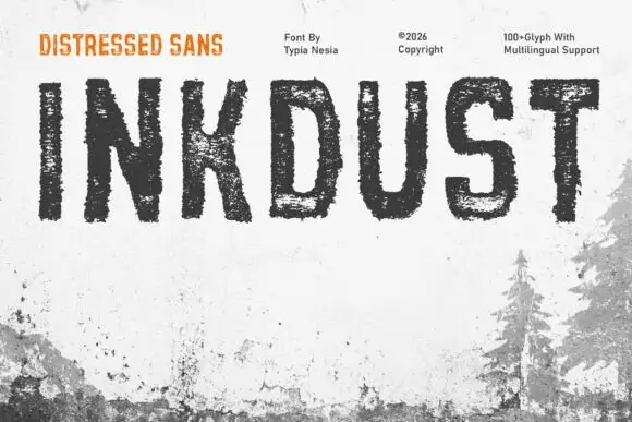
Narrow distressed capitals with broken interiors and ragged edges
Inkdust is a narrow distressed sans in which the stems stay tall, the bowls stay simple and heavy erosion breaks the fill with white gaps and ragged edges, so a single name reads as paint worn off a shipping crate.
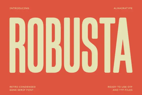
Tall condensed retro sans
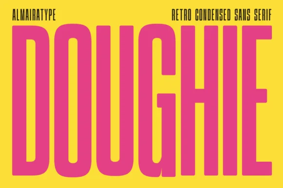
Robusta is a tall condensed sans in cream on terracotta: very tall caps with softly squared curves, an even heavy stroke and a triangular counter in the A, set as one word across the plate with tracked notes in all four corners.
Ideas for this font
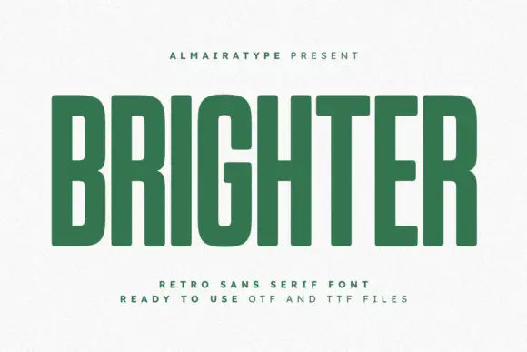
Tall green block capitals with narrow rectangular counters and softly rounded corners
Brighter presents a green uppercase word on white, where long straight stems enclose narrow rectangular B, R and G interiors, subtle curved corners soften the dense rectangles and the title runs far heavier than the widely spaced captions below it.
Ideas for this font
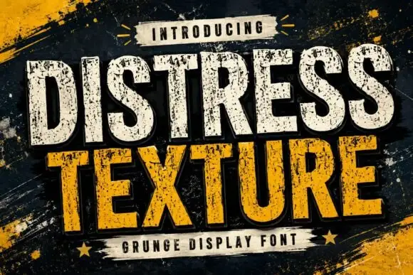
Tall heavy capitals with dense chipped texture and flat terminals
Distress Texture is a heavy tall sans in capitals only, its strokes eaten by dense irregular chips and its terminals cut flat, so a word looks stencilled, weathered and printed through a mask.
Ideas for this font
Same independent foundry
Allow optional Google Analytics to measure visits and catalogue actions. Your search words and notes are not included. Privacy & storage