Modern Grotesque Body

Preppy Varsity + Godthem
Creates crisp high-hierarchy contrast beneath Preppy Varsity headlines across menus, websites and labels.
Inspect Godthem specimenDisclosure: MakerFileHub may earn a commission from qualifying purchases via paid links on this page. How our links work.
Pastel layered varsity family
Preppy Varsity is a layered varsity slab in pastel colours on cream: wide square serifs, flat tops, a mirrored repeat of the word above and below in outline, a stitch detail along the caps and a chequered rule at the edges, so the plate reads as a sports patch set rather than a headline.
Paid link
Get this fontProject & layout blueprintsAt-a-glance maker compatibility
Sturdy stroke walls and open counters weed cleanly on adhesive vinyl, HTV apparel film, and cut cardstock.
Visual anatomy & craft review
The centre line is solid and each letter carries a stitch line near the cap height, which is what makes the block read as appliqué rather than as printed type. Above and below, the same word repeats in outline and mirrored, which turns the composition into a pattern and shows how a varsity face behaves when repeated. The palette is five pastels, and because the fills are light, the stitch and the outline carry the letter shapes instead of contrast. Spacing is tight in the centre line and wider in the repeats, which is a legitimate use of the face at two densities. The chequered rules at the top and bottom close the composition, and the small script credit at the foot names the designer.
Varsity, pastel, layered, sporty
Two-font hierarchy recipes
Tested contrast partners — pairing Preppy Varsity with grounded secondary typography.
Preppy Varsity + Godthem
Creates crisp high-hierarchy contrast beneath Preppy Varsity headlines across menus, websites and labels.
Inspect Godthem specimen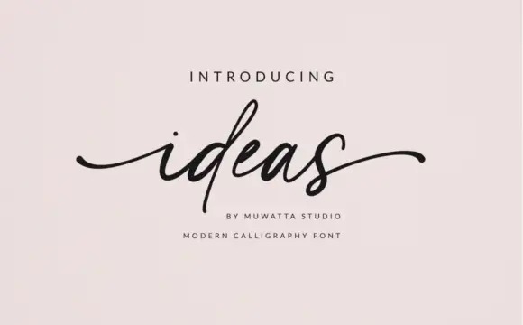
Preppy Varsity + Ideas
Adds a warm human signature touch for 1-to-3-word callouts without competing against structured serif capitals.
Inspect Ideas specimenPractical applications
Concrete hierarchy, scale and production guidance tailored to Preppy Varsity’s stroke geometry.
A stitched varsity slab is what a club patch actually looks like, and the pastel palette keeps a school identity soft rather than aggressive.
Hierarchy & layout recipe
Cut a 200 mm patch: the name at 45 mm cap height, a 2.5 mm stitch inset, and a 3 mm border. Keep the stitch inside the letter so the twill edge does not cut it and limit the palette to three colours for the embroidery.
Pre-production check
Check the stitch at 2.5 mm on twill, where a finer line disappears into the weave; thicken it to 3 mm. Confirm the patch curves onto a sleeve without puckering and that the name reads at five metres.
A pastel varsity banner reads as a party rather than a match, and the layered repeats fill a long wall without a second design.
Hierarchy & layout recipe
Print 900 by 400 mm: the name at 130 mm cap height, the age in a 45 mm sans, and a 6 mm rule. Keep 25 mm margins and print three pastel inks on a light ground so the stitch detail stays visible.
Pre-production check
Check the banner at four metres, where a light pastel can disappear against a pale ground; deepen one tone. Confirm the 45 mm age reads at three metres and that the repeats align to the eyelets.
A varsity label reads as a sports brand for children without the aggression of a dark college face, and the flat colours survive a woven label.
Hierarchy & layout recipe
Set the brand at 20 mm on a woven label, 12 pt on a card and 50 mm on a chest print. Keep the stitch detail out of the woven version and hold the strokes above 1.2 mm so the weave carries them.
Pre-production check
Check the 20 mm woven label, where a light pastel can grey out in the thread; deepen the fill. Confirm the 50 mm chest print survives a wash and that the card version still reads at 12 pt.
Technical & licence verification
Confirm included OTF/TTF/WOFF formats, full glyph tables and licence coverage on the live store page before batch production.
Closest visual alternatives
Matched across letterform anatomy, stroke behaviour and craft applications.
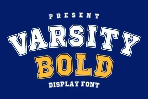
Arched collegiate block display
Varsity Bold is a collegiate block display in white outline and gold outline on navy: broad slab capitals with an inner keyline, set in two lines on a gentle upward arch, with a small tracked line above and a plain note beneath.
Ideas for this font
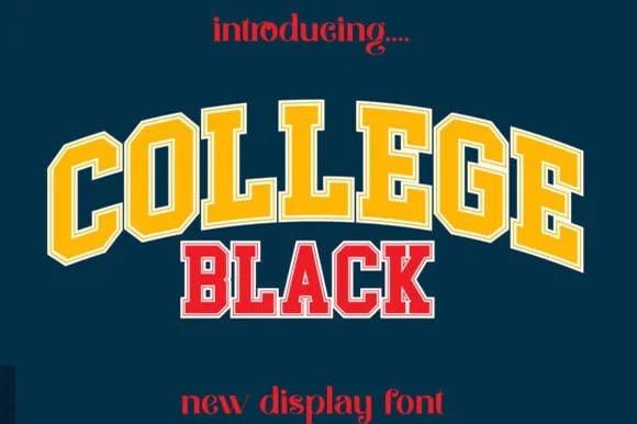
Double-outlined varsity jersey display
College Black pairs heavy collegiate slab capitals with a built-in athletic border framing, where wide stable letterforms and generous counter openings keep arched headlines crisp on jerseys, pennants and party backdrops.
Ideas for this font
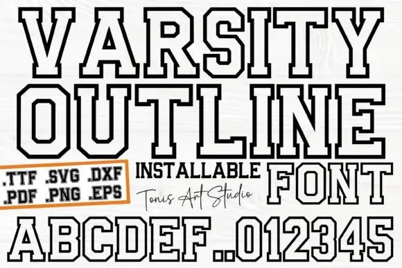
Outlined athletic capitals with clipped corners and broad squared feet
Ab Varsity Outline is an athletic slab in which the capitals keep a white interior inside a heavy dark outline, the outer corners clip away, the feet square off broad and the O and R turn polygonal, so a team name reads as a stitched patch letter without the fill.
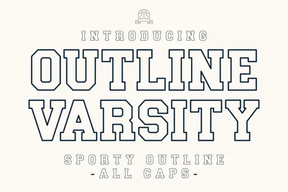
Varsity outline block in a single fine weight
Outline Varsity is a varsity block drawn as an outline only, in navy on cream: octagonal shoulders, flat serifs traced in a single even line, with the interior left open and the capitals spaced wide.
Ideas for this font
Allow optional Google Analytics to measure visits and catalogue actions. Your search words and notes are not included. Privacy & storage