Modern Grotesque Body

Nocturne + Monure
Creates crisp high-hierarchy contrast beneath Nocturne headlines across menus, websites and labels.
Inspect Monure specimenDisclosure: MakerFileHub may earn a commission from qualifying purchases via paid links on this page. How our links work.
Heavy high-contrast display serif
Nocturne is a heavy high-contrast display serif in black on warm cream: swollen bold strokes, hairline joins, a tall ascender on the N and a distinctive flat-cut t, set with a diamond rule and small tracked capitals.
Paid link
Get this fontProject & layout blueprintsAt-a-glance maker compatibility
Sturdy stroke walls and open counters weed cleanly on adhesive vinyl, HTV apparel film, and cut cardstock.
Visual anatomy & craft review
The word fills the upper half of the page in a display weight that is unusual for a serif: the stems are genuinely fat, the hairlines remain thin, and the bracketing is minimal, so the face reads as a poster letter rather than a text face. The N and the h carry tall ascenders that sit above the cap line, the o and the u have small counters relative to their stroke weight, and the t ends in a clean horizontal cut instead of a curved tail, which gives the word a slightly condensed, press-room look. The second line repeats the family name at a smaller size in the same weight, and beneath it a thin rule with a diamond in the middle separates the descriptor from the specimen. The mockup is a creased cream paper photographed at an angle with a soft shadow, and the type is printed in one black ink, which is the honest presentation for a face whose only ornament is its own contrast.
Dramatic, editorial, bold, contrasted
Two-font hierarchy recipes
Tested contrast partners — pairing Nocturne with grounded secondary typography.
Nocturne + Monure
Creates crisp high-hierarchy contrast beneath Nocturne headlines across menus, websites and labels.
Inspect Monure specimen
Nocturne + Hello Honey
Adds a warm human signature touch for 1-to-3-word callouts without competing against structured serif capitals.
Inspect Hello Honey specimenPractical applications
Concrete hierarchy, scale and production guidance tailored to Nocturne’s stroke geometry.
A heavy display serif holds a cover against a photograph where a lighter didone would disappear, and the extreme contrast gives the title an editorial silhouette at newsstand size.
Hierarchy & layout recipe
Set the title at 96 pt across 200 mm, tighten tracking to minus 20 units, and set the issue line in a 9 pt roman at the foot with a 0.5 pt rule above. Keep the whole cover to two inks: black and one spot for the rule.
Pre-production check
Check the hairlines at 96 pt on the cover stock, where a heavy serif at large size can show fill-in at the joins if the ink is too tacky. Confirm the title's descender-free line clears the cover line by 15 mm and reads at two metres.
A heavy contrasted serif signals small-batch weight and age better than a script, and it stays readable when the label is seen across a bar at an angle.
Hierarchy & layout recipe
Print a 80 by 110 mm label: the name at 30 pt, the expression in a 8 pt sans caps below, and the abv in 7 pt at the base. Set the whole label in one ink on a cream stock and let a single foil rule carry the premium cue.
Pre-production check
Check the small counters of the o and the u at 30 pt, which can fill on a textured stock, and confirm the 7 pt abv stays legible on the curved shoulder of the bottle. Verify the foil rule does not touch the descender-free baseline.
A dramatic serif reads as gothic without a blackletter, which keeps a Halloween poster legible to an audience that would struggle with dense gothic texture.
Hierarchy & layout recipe
A2 portrait: the title at 140 mm cap height in black on cream, the date in a 14 mm sans caps, and a 0.5 pt frame rule 20 mm from the trim with a diamond at the top centre. Keep the display word in the upper two thirds.
Pre-production check
Check the hairline joins at 140 mm where the thin strokes can read as gaps in a distance view, and confirm the frame rule clears the trim by 20 mm. Read the poster from eight metres to verify the title still parses despite the heavy contrast.
Technical & licence verification
Confirm included OTF/TTF/WOFF formats, full glyph tables and licence coverage on the live store page before batch production.
Closest visual alternatives
Matched across letterform anatomy, stroke behaviour and craft applications.
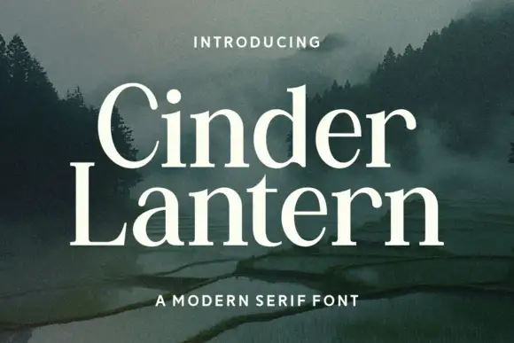
Open traditional serif with contrasting stems and curved serif transitions
Cinder Lantern is an open traditional serif in which the stems contrast clearly, the bowls stay broad and round, the L carries a long fine foot and the t rises above a compact lowercase, so a two-line title reads as a calm editorial head.
Ideas for this font
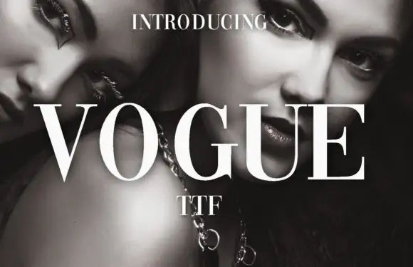
High-contrast didone with hairline serifs
Vogue is a high-contrast didone serif in white over a black-and-white beauty photograph: hairline serifs, a very thin crossbar on the A, a round O and a G with a fine spur, set in capitals as a magazine masthead.
Ideas for this font

High-contrast fashion serif with thin hairlines and sculpted stems across nine weights
Augler is a high-contrast fashion serif in which the hairlines stay razor thin, the stems carry sculpted weight and the family runs across nine cuts, so one word can sit light on a cover or heavy in a caption without changing voice.
Ideas for this font

Editorial display serif with italics
Raffined is a display serif in cream over a warm skin-toned photograph: a high-contrast roman with sharp serifs and a narrow waist, paired with a true italic that carries a flowing tail, set across four lines at increasing sizes with small tracked notes in the corners.
Same independent foundry
Allow optional Google Analytics to measure visits and catalogue actions. Your search words and notes are not included. Privacy & storage



