Neutral Sans Workhorse

Neo Paralletter + Modern Heritage
Lets Neo Paralletter own the focal silhouette while handling secondary copy, sizing and subheads cleanly.
Inspect Modern Heritage specimenDisclosure: MakerFileHub may earn a commission from qualifying purchases via paid links on this page. How our links work.
Narrow gothic with vertical broken strokes
Neo Paralletter is a narrow gothic display with vertical broken strokes and thin connecting hairlines, shown as white capital letters on a royal blue field with a green badge, and named after the gothic texture it borrows rather than its historical form.
Paid link
Get this fontProject & layout blueprintsAt-a-glance maker compatibility
Sturdy stroke walls and open counters weed cleanly on adhesive vinyl, HTV apparel film, and cut cardstock.
Visual anatomy & craft review
The letters are extremely narrow and built from straight vertical bars with small angular cuts, so the word reads as a barcode of strokes rather than as a blackletter, and the joins between letters are thin diagonal hairlines that keep the rhythm continuous. Cap heights are uniform and the x-height equivalents sit low, which gives the word a machine-cut look, and the spacing is tight enough that the gaps between letters are almost the same width as the counters, so the whole line reads as a single texture at a distance and resolves into letters up close. The specimen is deliberately stark: a blue rectangle floating on dark grey, a green outlined badge with the name stacked in three lines, and a small column of grey labels along the left edge giving the language, style and licence details. This is a face for music packaging and club graphics, where the same word has to work as texture from across a room.
Gothic, narrow, graphic, contemporary
Two-font hierarchy recipes
Tested contrast partners — pairing Neo Paralletter with grounded secondary typography.
Neo Paralletter + Modern Heritage
Lets Neo Paralletter own the focal silhouette while handling secondary copy, sizing and subheads cleanly.
Inspect Modern Heritage specimen
Neo Paralletter + Marquis - Elegant Modern Serif
Grounds bold display lettering with classic typographic authority on posters, badges and apparel.
Inspect Marquis - Elegant Modern Serif specimenPractical applications
Concrete hierarchy, scale and production guidance tailored to Neo Paralletter’s stroke geometry.
A narrow gothic reads as texture at sleeve size and as lettering up close, which is what a record cover needs when the artwork is flat colour rather than a photograph.
Hierarchy & layout recipe
Set the name at 40 pt across a 300 mm sleeve, tracked at minus 10 units, white on a single flat blue, with the catalogue number in a 7 pt grotesque at the lower left. Keep the whole sleeve to two colours so the texture of the strokes is the image.
Pre-production check
Check the hairlines between letters at 40 pt, where a 0.2 pt join will break on uncoated board and the word will read as separate bars. Confirm the 7 pt catalogue number stays legible against the blue and that the word still reads at 150 px wide in a store listing.
A narrow gothic sets a dark, contemporary mood without the medieval baggage of a blackletter, which suits a night that wants to look modern rather than historical.
Hierarchy & layout recipe
A3 portrait: the name at 110 mm cap height across the top third, the line-up in a 10 mm grotesque beneath, and the date at 30 mm. Keep a 20 mm margin so the tight letter rhythm has air around it, and print white on a single dark ground.
Pre-production check
Check the word at three metres, where the tight spacing can read as a solid bar; open the tracking by 30 units for the poster only. Confirm the 10 mm line-up reads under club lighting and that the white on dark holds a 4.5:1 contrast.
A narrow gothic works as a section marker on a page built from photographs, because it is graphic rather than decorative and holds its shape against busy images.
Hierarchy & layout recipe
Set the section name at 64 pt on a half-page divider, the number in a 9 pt grotesque to the left, and a 0.5 pt rule beneath spanning the measure. Print white on a black page and keep the rest of the divider empty.
Pre-production check
Check the divider in the proof, where a white-on-black gothic can gain weight and close its counters; compare against the screen at 100 percent. Confirm the 9 pt number aligns to the cap height rather than the baseline and that the rule clears the descenders.
Technical & licence verification
Confirm included OTF/TTF/WOFF formats, full glyph tables and licence coverage on the live store page before batch production.
Closest visual alternatives
Matched across letterform anatomy, stroke behaviour and craft applications.
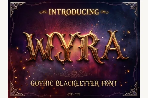
Metallic bevel gothic blackletter
Myra is a gothic blackletter in gold relief on a starry night scene: tall narrow letters with diamond-shaped finials, sharp ascending spurs and a heavy embossed bevel, so the word reads as a carved sign lit from one side rather than as a flat alphabet.
Ideas for this font
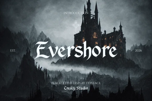
Windswept fantasy calligraphic blackletter (Multilingual)
Evershore is a romantic dark-fantasy blackletter with windswept 'E/h/s' calligraphic plumes and full multilingual character support.
Ideas for this font
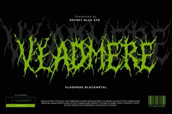
Black-metal jagged logo display
Vladmere is a black-metal logo face in lime green on black: letters built from thin jagged blades that lean and intersect, a mirrored grey copy behind the word, and a barcode-style badge at the foot that gives the specimen the look of a record sleeve.
Ideas for this font
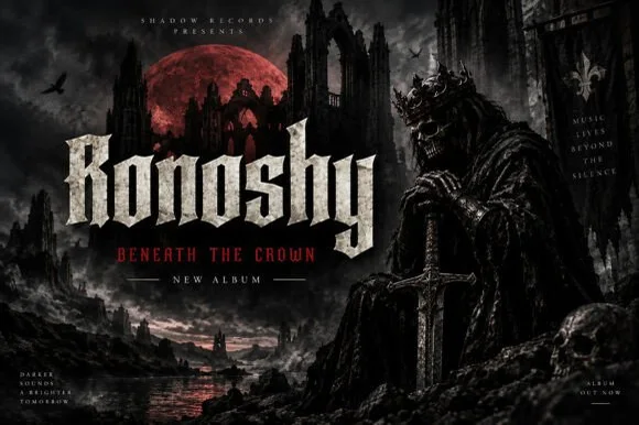
Sharp blackletter with stone texture
Ronoshy is a blackletter display in bone white on a dark gothic scene: tall spiked capitals with hairline joins and sharp terminals, textured like carved stone, set above a red subtitle in a small rounded capital face.
Ideas for this font
Allow optional Google Analytics to measure visits and catalogue actions. Your search words and notes are not included. Privacy & storage