Modern Grotesque Body

Midnight Vintage + Helina
Creates crisp high-hierarchy contrast beneath Midnight Vintage headlines across menus, websites and labels.
Inspect Helina specimenDisclosure: MakerFileHub may earn a commission from qualifying purchases via paid links on this page. How our links work.
Quirky vintage serif
Midnight Vintage is a quirky serif in two colours on white: heavy stems with flat slab-like serifs, a curling spur on the R and a hooked G, one line in violet and one in orange, with small four-point stars set between the words and two tracked lines beneath.
Paid link
Get this fontProject & layout blueprintsAt-a-glance maker compatibility
Sturdy stroke walls and open counters weed cleanly on adhesive vinyl, HTV apparel film, and cut cardstock.
Visual anatomy & craft review
The two words are stacked and each is set in a different colour, which is a presenting choice rather than a letterform one, but it matters because it shows how the face behaves as a two-line lockup. The drawing is a vintage display serif with heavy stems and flat serifs, and the quirks sit in the details: the R spur curls, the G hooks, and the waist is high, which keeps the pair looking like a mid-century sign rather than a book face. The small stars between the words are part of the composition, and the two tracked lines beneath are set in a plain condensed face so they do not compete. Because the stems are heavy, the face works at display sizes and on a poster, and the plate keeps the ground white so both inks read cleanly.
Serif, vintage, quirky, warm
Two-font hierarchy recipes
Tested contrast partners — pairing Midnight Vintage with grounded secondary typography.
Midnight Vintage + Helina
Creates crisp high-hierarchy contrast beneath Midnight Vintage headlines across menus, websites and labels.
Inspect Helina specimen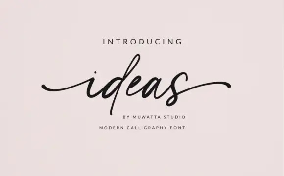
Midnight Vintage + Ideas
Adds a warm human signature touch for 1-to-3-word callouts without competing against structured serif capitals.
Inspect Ideas specimenPractical applications
Concrete hierarchy, scale and production guidance tailored to Midnight Vintage’s stroke geometry.
A quirky vintage serif reads as a mid-century sign, and the heavy stems hold at fascia size where a lighter serif would soften against a dark street.
Hierarchy & layout recipe
Paint a 1,100 by 380 mm fascia: the bar name at 120 mm cap height, the line beneath in a 24 mm condensed sans, and a 5 mm rule. Keep 28 mm margins and paint two colours on a dark board.
Pre-production check
Check the fascia at six metres, where the curling spur can read as damage; keep it above 8 mm. Confirm the 24 mm line reads at three metres and that the rule clears the fixings.
A vintage serif gives a period title weight, and the two-colour lockup lets a cover carry a subject and a subtitle as one object.
Hierarchy & layout recipe
Set the title at 85 mm cap height across 200 mm, the subtitle in a 12 pt serif, and the author at 9 pt. Print two colours on a cream stock and keep the stars away from the subtitle.
Pre-production check
Check the title at thumbnail size, where the spur can merge with the next letter; open the spacing. Confirm the 9 pt author survives lamination and that the title clears the trim by 12 mm.
A quirky vintage face sets a decade theme in one line, and the heavy strokes stay legible on a poster pinned in a corridor.
Hierarchy & layout recipe
A3 poster: the occasion at 70 mm cap height, the date in a 20 mm sans, and the address at 9 mm. Keep 25 mm margins, print two colours on a light ground, and keep the stars as the only ornament.
Pre-production check
Check the poster at four metres, where a two-colour lockup can lose the lighter ink; hold the contrast above 4.5:1. Confirm the 9 mm address reads at arm's length and that the stars clear the type.
Technical & licence verification
Confirm included OTF/TTF/WOFF formats, full glyph tables and licence coverage on the live store page before batch production.
Closest visual alternatives
Matched across letterform anatomy, stroke behaviour and craft applications.
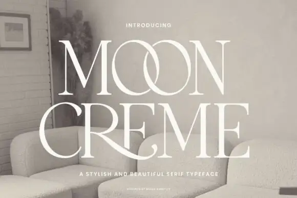
Fine contrasting capitals with overlapping circular bowls
Moon Creme shows tall white serif capitals with fine hairlines and broad round O forms on a muted interior photograph, where the two O letters overlap into a single linked shape and the R leg of the lower row sweeps beneath the following letters before curling away.
Ideas for this font
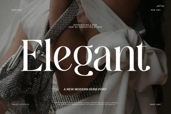
Broad contrasting mixed case with a deep rounded g
Elegant shows large white serif letters with heavy verticals and very fine connecting strokes over a fashion photograph, where the rounded lower bowl of the g drops beneath a broad open e and a narrow upright l, and the word spans the full width of the frame.
Ideas for this font

Modern combination serif with italic
Things is a modern serif in blue on white: moderate-high contrast, a wide f with an overhanging arm, a g whose descender loops fully closed, and tall ascenders, presented with a note that the family includes an italic and a paragraph of small text.
Ideas for this font

Curly ornamental serif
Sparky Dream sets two gold rows of curled serif lettering on a night sky, where large spirals rise above the words, a wide curl sits between the rows and a low figure-eight flourish drops beneath the second word so the outer silhouette fills most of the square field.
Same independent foundry
Allow optional Google Analytics to measure visits and catalogue actions. Your search words and notes are not included. Privacy & storage