Neutral Sans Workhorse

Gingerbread White Cream + Monure
Lets Gingerbread White Cream own the focal silhouette while handling secondary copy, sizing and subheads cleanly.
Inspect Monure specimenDisclosure: MakerFileHub may earn a commission from qualifying purchases via paid links on this page. How our links work.
Brown biscuit-like capitals with white icing lines and dark offset edges
Gingerbread White Cream draws every capital as a biscuit: a warm ginger body, a piped icing outline, sugar dots and a white flood of icing over the top of some letters, with gingerbread men, trees and houses as extras.
Paid link
Get this fontProject & layout blueprintsAt-a-glance maker compatibility
Sturdy stroke walls and open counters weed cleanly on adhesive vinyl, HTV apparel film, and cut cardstock.
Visual anatomy & craft review
ABCD fills the upper half of the card as four biscuits, each with a different treatment: the A is a plain baked letter with an icing seam, the B wears a white icing flood down one side, the C is built from piped lines, the D is iced all over with dots and a bow. Under them the words GINGERBREAD ALPHABET are set in a smaller version of the same construction, which shows the set holds at label size. The ground is a pale cream scattered with gingerbread men, fir trees and houses in flat brown and white, and two banners at the top and bottom name the bundle and the formats. The palette is deliberately narrow — ginger, cream, brick red, forest green — which is what keeps a word of biscuits from looking like a toy shop.
Brown biscuit-like capitals with white icing lines and dark offset edges
Two-font hierarchy recipes
Tested contrast partners — pairing Gingerbread White Cream with grounded secondary typography.
Gingerbread White Cream + Monure
Lets Gingerbread White Cream own the focal silhouette while handling secondary copy, sizing and subheads cleanly.
Inspect Monure specimen
Gingerbread White Cream + Kernova
Grounds bold display lettering with classic typographic authority on posters, badges and apparel.
Inspect Kernova specimenPractical applications
Concrete hierarchy, scale and production guidance tailored to Gingerbread White Cream’s stroke geometry.
The letters look like the product before the label is read, and the icing detail gives a plain jar a seasonal finish without a printed illustration.
Hierarchy & layout recipe
Print a 55 by 70 mm jar label: set the brand name at 16 pt on one row, keep 6 mm of clear ground beneath before the weight at 4.5 pt, and hold 5 mm from the icing edge to the die line.
Pre-production check
Piped icing lines fill in below 18 pt; print one label on the real stock and check the seams before the batch.
A word set as biscuits is the whole illustration on a card, and the cream ground with its narrow festive palette keeps it warm rather than commercial.
Hierarchy & layout recipe
Print a 120 by 170 mm card: set the greeting at 40 pt across two rows, keep 16 mm of clear ground beneath before the written note, and hold 13 mm from the icing to the card edge.
Pre-production check
White icing on cream card loses its edge; print one card on the intended board and check the contrast first.
The set gives a bakery a seasonal box that still looks made by hand, and one word on a plain kraft box already reads as a gift.
Hierarchy & layout recipe
Print a 70 by 50 mm box label: set the bakery name at 17 pt on one row, keep 6 mm of clear ground beneath before the town at 4.5 pt, and hold 5 mm from the outline to the label edge.
Pre-production check
Kraft brown swallows the ginger fill; print one label on the real box material and check the contrast before the order.
Technical & licence verification
Confirm included OTF/TTF/WOFF formats, full glyph tables and licence coverage on the live store page before batch production.
Closest visual alternatives
Matched across letterform anatomy, stroke behaviour and craft applications.
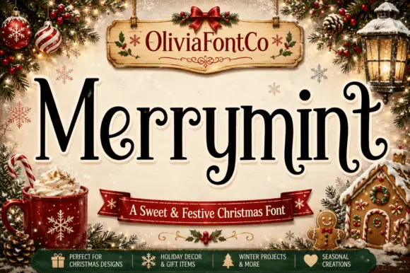
Festive serif with curled terminals
Merrymint is a festive serif in near-black on cream: a moderate-contrast serif with ball terminals that curl into hooks, a wide x-height, generous spacing and a slight bounce, framed by a Christmas still life with a banner naming it a sweet and festive face.
Ideas for this font
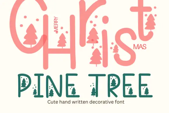
Pine tree illustrated display
Pine Tree is a seasonal decorative face in coral and green on cream: a large rounded script-style Christmas line at the top, and a lighter capitals line beneath in which small pine-tree silhouettes hang from the letters and small dots float between them, with a caption under that.
Ideas for this font
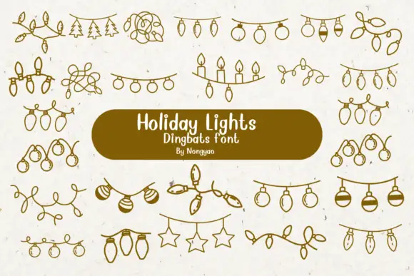
Loose line-art dingbats of hanging lights, baubles and tangled strings
Holiday Lights is a dingbat font that draws Christmas light garlands in one even line: bulb strings, loops of wire, rows of candles, hanging stars and sprigs of pine, all ready to be dropped between two pieces of type.
Ideas for this font
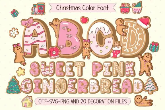
Gingerbread colour display
Sweet Pink Gingerbread is a festive colour display on a pale pink ground: fat capitals drawn as iced biscuit shapes with brown depth, piped white icing and tiny festive motifs, with gingerbread figures and gifts scattered around and two ribbons that name the formats and the count of decoration files.
Same independent foundry
Allow optional Google Analytics to measure visits and catalogue actions. Your search words and notes are not included. Privacy & storage