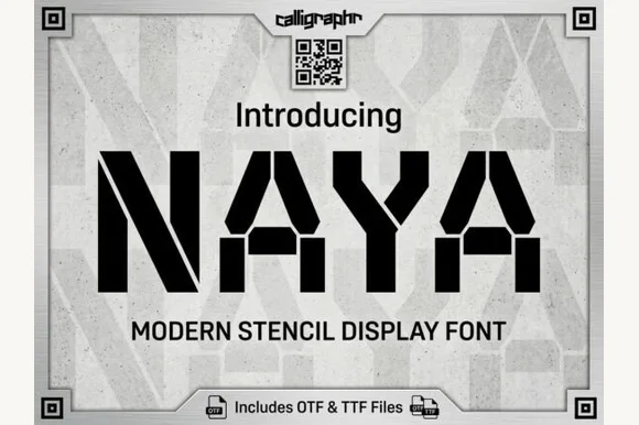
Neutral Sans Workhorse

Layla + Olline
Lets Layla own the focal silhouette while handling secondary copy, sizing and subheads cleanly.
Inspect Olline specimenDisclosure: MakerFileHub may earn a commission from qualifying purchases via paid links on this page. How our links work.
Signature script with long flourishes
Layla is a signature script in near-black on white: a fine connected stroke, very tall looping ascenders, a long entry flourish on the first letter and an exit swash that trails away beneath the word, with a tracked caption beneath in a light roman.
Paid link
Get this fontProject & layout blueprintsAt-a-glance maker compatibility
Weld or Unite overlapping script joins into one continuous vector path before sending to the blade.
Visual anatomy & craft review
The word is set once, wide, and the drawing is a signature script: the stroke is fine and even, the loops rise well above the x-height, and the terminals taper to points, which gives the lettering its pen-written character. The long entry and exit flourishes are structural — they carry the eye across the word — and the loops are open enough that the name reads without effort. Because the stroke is fine, the face needs a decent size and a plain ground, and the specimen keeps the page white so the hairlines survive. The tracked caption beneath is a light roman in small caps, and there is nothing else on the plate, which keeps the signature as the only subject.
Script, signature, elegant, romantic
Two-font hierarchy recipes
Tested contrast partners — pairing Layla with grounded secondary typography.
Layla + Olline
Lets Layla own the focal silhouette while handling secondary copy, sizing and subheads cleanly.
Inspect Olline specimen
Layla + Bulgary
Grounds bold display lettering with classic typographic authority on posters, badges and apparel.
Inspect Bulgary specimenPractical applications
Concrete hierarchy, scale and production guidance tailored to Layla’s stroke geometry.
A signature script gives a formal invitation a handwritten head, and the fine stroke keeps the names elegant on a heavy card where a heavy script would look blunt.
Hierarchy & layout recipe
A5 invitation: the names at 28 pt, the request in a 10 pt roman, and the date at 8 pt caps. Keep 22 mm margins, leave 10 mm for the flourishes, and letterpress one ink on a cotton card.
Pre-production check
Check the 28 pt names in letterpress, where hairlines can sink; proof the plate. Confirm the 10 pt request reads at arm's length and that the swash clears the trim by 10 mm.
A fine script reads as a hand-signed label, and the long flourishes give a small bottle a mark of its own without commissioning an illustration.
Hierarchy & layout recipe
Print a 45 by 70 mm label: the product at 14 pt, the volume in a 6 pt roman, and 4 mm inside the die. Keep the flourishes clear of the die edge and print one ink on a coated stock so the hairlines stay crisp.
Pre-production check
Check the 14 pt product on a curved bottle, where the fine stroke can distort; keep the size above 12 pt. Confirm the 6 pt volume reads on the shelf and that the swash clears the die by 3 mm.
A signature script carries the tone of a written note, and the even fine stroke leaves room for a message in a companion roman on the same card.
Hierarchy & layout recipe
A6 folded card: the greeting at 26 pt, the message in a 9 pt roman at 13 pt leading, and a signature line at 18 pt. Keep 14 mm margins and print one ink on a soft white card.
Pre-production check
Check the 26 pt greeting, where a loop can touch the message block; keep 10 mm clear. Confirm the 9 pt message reads comfortably and that the card folds without cracking the ink.
Technical & licence verification
Confirm included OTF/TTF/WOFF formats, full glyph tables and licence coverage on the live store page before batch production.
Closest visual alternatives
Matched across letterform anatomy, stroke behaviour and craft applications.
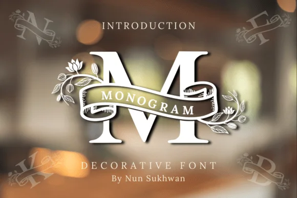
Ribbon-banner floral serif monogram
Amorette Monogram wraps classically built serif initials in a curved ribbon scroll and blooming botanical vines, and the corner specimens show N, F, K and B each carrying their own banner and floral detailing around bold structural stems.
Ideas for this font
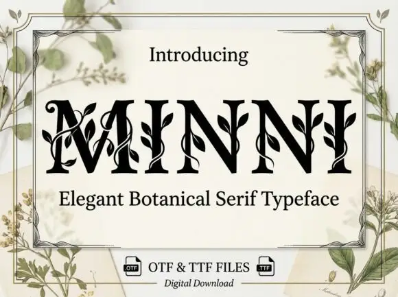
Botanical ornamented serif
Minni is a botanical serif in black on cream: high-contrast caps whose stems sprout leaves and curling vines, sharp serifs and a narrow waist, with a light botanical frame and small file badges at the foot.
Ideas for this font
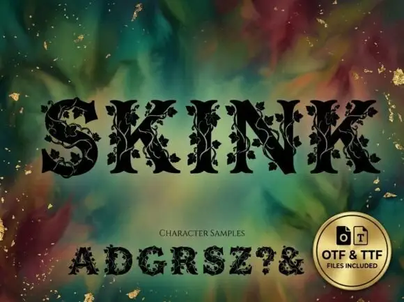
Vine-wrapped angular serif
Skink is a heavy angular serif in black over a marbled green and gold ground: capitals with sharp joins, thick stems and a climbing vine with leaves and small grapes drawn across the strokes, set as one word above a character sample row and a round badge that names the formats.
Ideas for this font
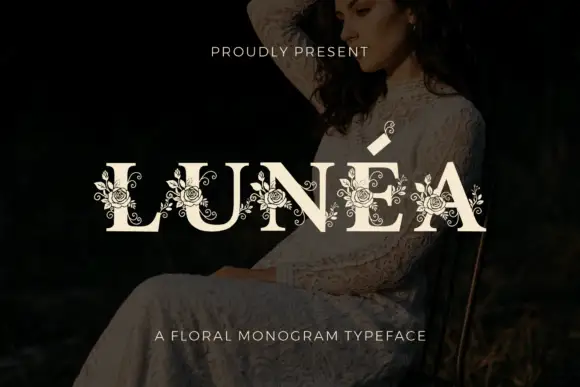
Floral monogram display
Lunéa is a floral monogram display in cream over a dark portrait: broad serif capitals with a fine accent, and fine roses, leaves and curled tendrils drawn over every letter, with a small sprig above the A and a tracked line beneath naming the style.
Ideas for this font
Same independent foundry
Allow optional Google Analytics to measure visits and catalogue actions. Your search words and notes are not included. Privacy & storage