Editorial Serif Anchor

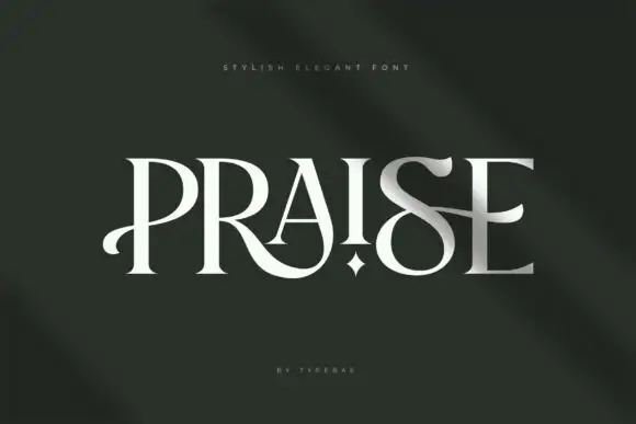
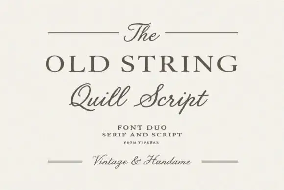
La Charly + Wolles Elegant Modern Serif
Anchors La Charly's fluid strokes with crisp Roman proportions on wedding suites, headers and packaging.
Inspect Wolles Elegant Modern Serif specimenDisclosure: MakerFileHub may earn a commission from qualifying purchases via paid links on this page. How our links work.
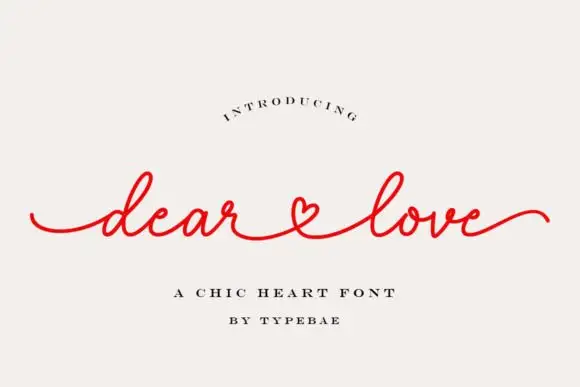
Light script with very long flat tails and a small x-height
La Charly is a light script with very long flat entry and exit tails, a small x-height and narrow letters, drawn so a short phrase reads as a delicate line spanning a wide measure.
Paid link
Get this fontProject & layout blueprintsAt-a-glance maker compatibility
Weld or Unite overlapping script joins into one continuous vector path before sending to the blade.
Visual anatomy & craft review
The entry tail runs in from the left almost perfectly flat for the width of the first word, then the l and the a rise into small loops before settling into narrow x-height letters, and the phrase finishes with an exit tail that mirrors the entry. Weight is light and even, with only a slight thickening where the stroke turns, and the letters stay narrow enough that two words fit one line. The ascenders are short and the descenders are short, which keeps the whole composition in a shallow horizontal band, and the terminals taper to points rather than stopping. The capital C of the second word opens with a small loop that keeps the phrase from feeling stiff. The pale ground, the gold small caps word and the tracked captions are presentation; the script is the two words.
Light · Extended · Delicate
Two-font hierarchy recipes
Tested contrast partners — pairing La Charly with grounded secondary typography.
La Charly + Wolles Elegant Modern Serif
Anchors La Charly's fluid strokes with crisp Roman proportions on wedding suites, headers and packaging.
Inspect Wolles Elegant Modern Serif specimen
La Charly + Limited Coffee
Keeps small-scale dates, URLs, nutrition facts and care instructions crisp and legible below script titles.
Inspect Limited Coffee specimenPractical applications
Concrete hierarchy, scale and production guidance tailored to La Charly’s stroke geometry.
The long flat tails let a short phrase span a wide band without stretched tracking, and the light stroke keeps the piece elegant at small sizes.
Hierarchy & layout recipe
Set both words at 22 pt across a 210 by 55 mm band, place the fold on a plain stretch between letters, and leave 15 mm at each end for the tails to taper out.
Pre-production check
A flat tail under 0.12 mm drops out in offset; ask for the printer's minimum line weight and thicken both tails rather than shortening them.
The delicate line suits a small, high-value product, and the long tails let a short studio name fill a narrow label without a border.
Hierarchy & layout recipe
Set the studio name at 12 pt on a 30 by 70 mm label, keep the metal and stone types in a 5 pt sans, and leave 6 mm at each end so both tails finish inside the label.
Pre-production check
Foil on a hairline tail bridges at the turns; ask for a dummy and simplify the tail if the foil fills in at the loops.
The shallow band of lettering suits a slim card, and the delicate stroke keeps a romantic line from feeling sentimental or heavy.
Hierarchy & layout recipe
Set the message at 20 pt on a 210 by 99 mm slim card, set the sender in the same face at 11 pt, and hold 20 mm at each end so the tails stay inside the trim.
Pre-production check
Slim cards are printed two-up and cut; check the artwork against the cut line and keep the tails 8 mm clear of the trim.
Technical & licence verification
Confirm included OTF/TTF/WOFF formats, full glyph tables and licence coverage on the live store page before batch production.
Closest visual alternatives
Matched across letterform anatomy, stroke behaviour and craft applications.
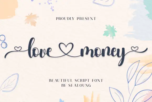
Heart-linked high-contrast script
Love Money is a fine script in navy on a watercolour ground: high-contrast strokes, looping ascenders, and hearts drawn into the line so that the two words are joined and closed by them.
Ideas for this font
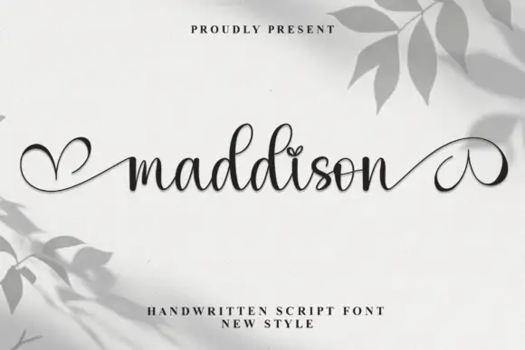
Fine heart-ended connected script
Maddison is a fine connected script in black on a pale grey wall with leaf shadows: small round bowls, a level baseline, and entry and exit strokes that curl into drawn hearts at both ends of the word.
Ideas for this font
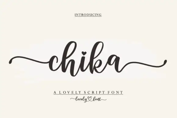
Round connected script with a heart dot and long tapering outer tails
Chika is a round connected script with a heavy even stroke, a heart instead of a dot on the i and long tapering tails that leave the word flat on both sides.
Ideas for this font
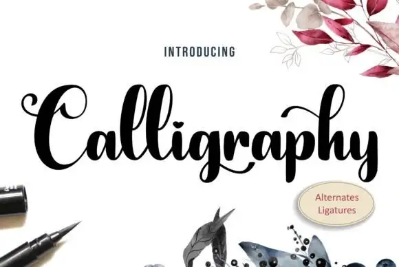
Heavy high-contrast looped calligraphy with swashed capitals and tight fit
Calligraphy is heavy high-contrast looped lettering in which the capitals carry wide swashes, the stems are thick and the joins are hairline, so a single word reads as a drawn flourish rather than a written line.
Ideas for this font
Same independent foundry
Allow optional Google Analytics to measure visits and catalogue actions. Your search words and notes are not included. Privacy & storage