Editorial Serif Anchor

Dear Love + Aureline
Anchors Dear Love's fluid strokes with crisp Roman proportions on wedding suites, headers and packaging.
Inspect Aureline specimenDisclosure: MakerFileHub may earn a commission from qualifying purchases via paid links on this page. How our links work.
Fine lowercase script with long flat tails and a heart-shaped connector
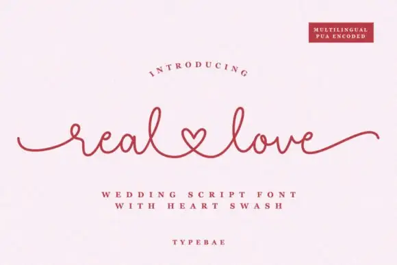
Dear Love is a fine lowercase script in which the stroke stays light and even, the ends run out as flat tails and the words are joined by a connector drawn as a small heart.
Paid link
Get this fontProject & layout blueprintsAt-a-glance maker compatibility
Weld or Unite overlapping script joins into one continuous vector path before sending to the blade.
Visual anatomy & craft review
The d opens with a looped stem, the e closes a small round bowl, the a keeps an open counter, the r holds a short arm and the l rises into a narrow loop, all at one even weight with slightly dry ends. Because there are no capitals, the phrase reads as something written in one line, and the heart connector between the two words replaces the space with a gesture, which is what the face is remembered for. The tails at each end let a short phrase hold a wide card, and the light weight keeps it from dominating at 24 pt. The connector is the practical detail: it needs to be set as a glyph rather than typed as a space. The cream ground, the red ink, the arched caption and the two credit lines are presentation; the script is the two words.
Lowercase · Hearted · Fine
Two-font hierarchy recipes
Tested contrast partners — pairing Dear Love with grounded secondary typography.
Dear Love + Aureline
Anchors Dear Love's fluid strokes with crisp Roman proportions on wedding suites, headers and packaging.
Inspect Aureline specimen
Dear Love + Cenura
Keeps small-scale dates, URLs, nutrition facts and care instructions crisp and legible below script titles.
Inspect Cenura specimenPractical applications
Concrete hierarchy, scale and production guidance tailored to Dear Love’s stroke geometry.
The heart connector carries the sentiment without an illustration, and the light even stroke keeps a short phrase readable at 26 pt on a modest card.
Hierarchy & layout recipe
Print a 148 by 105 mm card: set the phrase at 26 pt with the connector glyph between the words, set the personal line in a 9 pt serif beneath, and keep 17 mm of margin so both tails taper inside the trim.
Pre-production check
A typed space instead of the connector glyph breaks the heart; check the set line at final size and insert the glyph rather than adjusting the spacing.
The lowercase line and the tails suit a small informal card, and the even stroke holds the two names at 24 pt without ornament.
Hierarchy & layout recipe
Print a 120 by 120 mm square card: set both names at 24 pt with the connector between them, set the date in a 8 pt caps serif beneath, and keep 15 mm of margin so the final tail clears the trim on the right.
Pre-production check
A tail running to a square trim looks cut; check the proof at final size and shorten the exit stroke rather than shifting the whole line.
The fine script fits a small lid label, and the connector gives the phrase a warm mark at 11 pt where an ornament would not fit.
Hierarchy & layout recipe
Print a 50 by 35 mm lid label: set the phrase at 11 pt with the connector, keep the sender in a 5 pt sans beneath, and leave 4 mm of margin so the heart stays whole when the label is cut from the sheet.
Pre-production check
A connector under 4 mm closes into a blob; check the printed label and use a plain join where the phrase is set below 12 pt.
Technical & licence verification
Confirm included OTF/TTF/WOFF formats, full glyph tables and licence coverage on the live store page before batch production.
Closest visual alternatives
Matched across letterform anatomy, stroke behaviour and craft applications.

Fine lowercase script with a heart worked into the central connector
Hello Honey is fine lowercase script in which the two words are joined by a heart drawn into the connector, with long flat tails on both sides and a small even x-height.
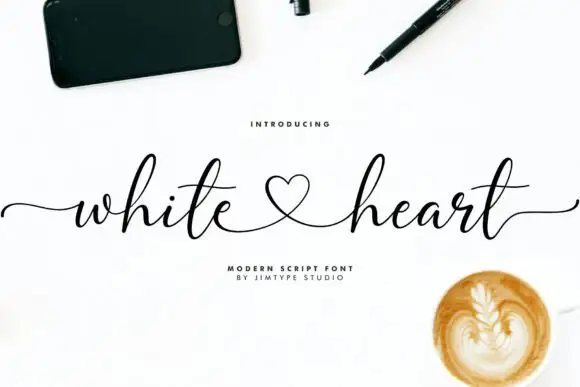
Modern signature script with a heart loop
White Heart is a modern signature script in black on white: a hairline hand with tall loops, long horizontal entry and exit strokes, and a heart drawn into the connection between the two words.
Ideas for this font
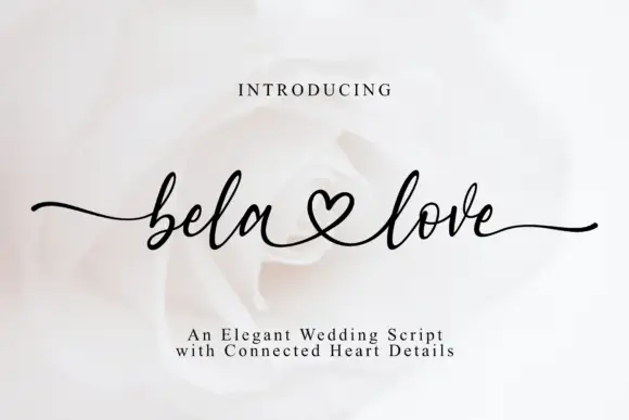
Fine connected script with heart joins and extended entry and exit swashes
Bela Love is a fine connected script whose two words are joined by a heart drawn into the pen line, with long entry and exit swashes that spread the phrase across the full width of the card.
Ideas for this font
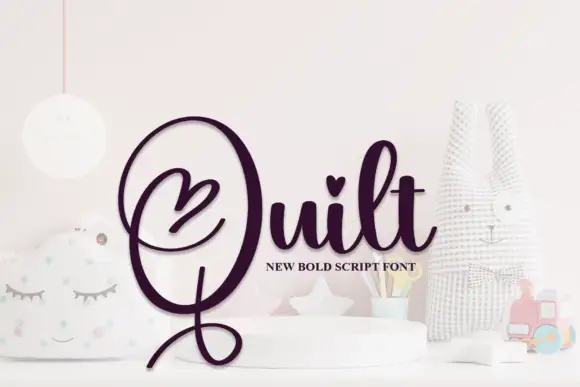
Bold heart-accented looping script
Quilt is a bold looping script in deep plum on a pale nursery set: fat even strokes, a huge open capital Q with a heart drawn inside its bowl, a heart on the t and a long descender that curls back under the word.
Ideas for this font
Same independent foundry
Allow optional Google Analytics to measure visits and catalogue actions. Your search words and notes are not included. Privacy & storage