Neutral Sans Workhorse

Kai Love + Bielchon
Lets Kai Love own the focal silhouette while handling secondary copy, sizing and subheads cleanly.
Inspect Bielchon specimenDisclosure: MakerFileHub may earn a commission from qualifying purchases via paid links on this page. How our links work.
Chunky curled serif forms with heart-shaped accents and counters
Kai Love shows thick white and pink lettering over a floral photograph, where large rolled terminals extend from the K and L, a heart sits above the i, another fills the counter of the a and the o of the lower word is drawn as an open heart rather than a conventional oval.
Paid link
Get this fontProject & layout blueprintsAt-a-glance maker compatibility
Sturdy stroke walls and open counters weed cleanly on adhesive vinyl, HTV apparel film, and cut cardstock.
Visual anatomy & craft review
The strokes stay heavy, the terminals roll into tight curls, the counters round out and three letters carry heart shapes instead of standard forms. Those hearts are the character: the face reads romantic because of one substitution repeated at three scales, which is why the sample relies on colour separation rather than ornament. The cover notes extra alternates, so check how the heart forms are reached in your app. Keep 34 pt so the hearts stay recognisable and never set a long phrase where the substitution repeats too often.
Chunky curled serif forms with heart-shaped accents and counters
Two-font hierarchy recipes
Tested contrast partners — pairing Kai Love with grounded secondary typography.
Kai Love + Bielchon
Lets Kai Love own the focal silhouette while handling secondary copy, sizing and subheads cleanly.
Inspect Bielchon specimen
Kai Love + Cervelique
Grounds bold display lettering with classic typographic authority on posters, badges and apparel.
Inspect Cervelique specimenPractical applications
Concrete hierarchy, scale and production guidance tailored to Kai Love’s stroke geometry.
The heart counters give a small card its whole message, and the heavy serif keeps the lettering readable where a fine script would disappear.
Hierarchy & layout recipe
Print a 105 by 148 mm card: set the line at 34 pt on one row, keep 18 mm of clear ground beneath before the message at 10 pt, and keep 15 mm of margin at each side.
Pre-production check
The heart counters vanish under 26 pt; check the printed card and keep the line at 30 pt or above.
The romantic weight suits a pastry box and the rolled terminals give a small brand a hand-finished look at label size on a shelf.
Hierarchy & layout recipe
Print a 70 by 70 mm box label: set the bakery name at 22 pt on one row, keep 9 mm of clear ground beneath before the weight at 6 pt, and keep 6 mm to the die edge for the curls.
Pre-production check
The alternates may be a separate set; check the file before promising a heart in the logo.
The soft serif suits a sweet favour tag, and the single heart substitution marks the occasion without a printed motif above it.
Hierarchy & layout recipe
Print a 45 by 70 mm tag: set the first names at 16 pt across two rows, keep 8 mm of clear ground beneath before the date at 8 pt, and keep 7 mm to the punch hole.
Pre-production check
Two names with several hearts look busy; check the tag and keep the hearts to one word only.
Technical & licence verification
Confirm included OTF/TTF/WOFF formats, full glyph tables and licence coverage on the live store page before batch production.
Closest visual alternatives
Matched across letterform anatomy, stroke behaviour and craft applications.
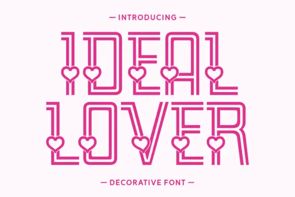
Tall double-line capitals interrupted by small open hearts near the lower stems
Ideal Lover is a decorative line face in which each tall capital is drawn as an inline outline and a small heart sits inside the base of the stroke, so a word marches along a row of little hearts.
Ideas for this font
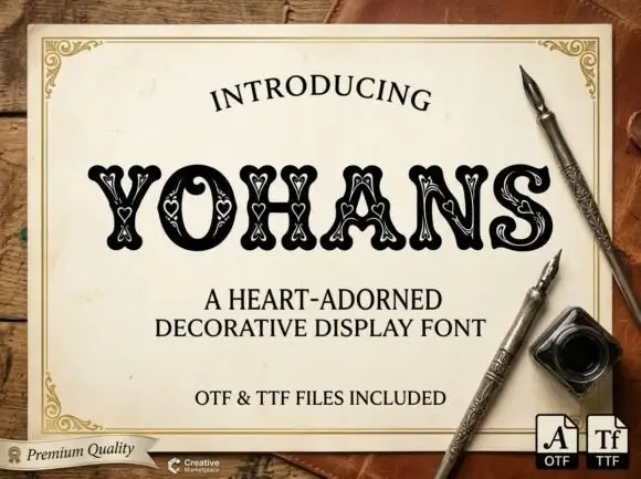
Heart-nested soft display
Yohans is a soft heavy display in black on an aged paper card: rounded capitals with small pale heart outlines nested along the strokes, a fine inner outline and slight serifs, set as one word between a curved introducing line and two plain lines naming the style and the formats, with a maker badge at the lower left.
Ideas for this font
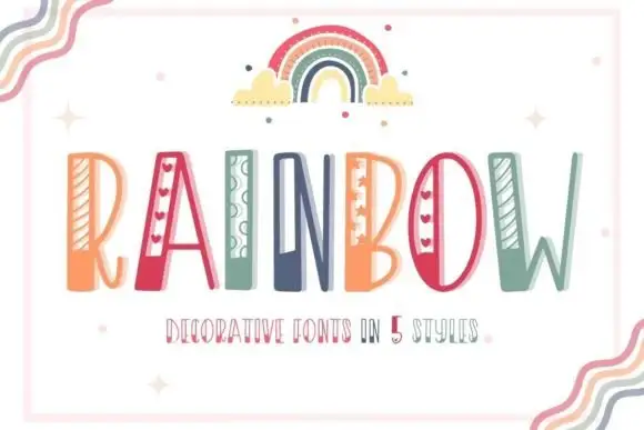
Striped narrow novelty capitals
Rainbow is a tall narrow novelty display on a white sheet inside a pale frame: capitals carrying different side details — diagonal stripes, hearts, loops, dots — in a palette of coral, teal and green, with a drawn rainbow above and a small line beneath naming five styles.
Ideas for this font
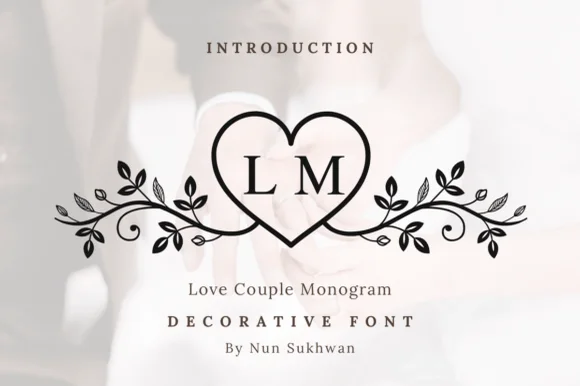
Line-art heart monogram with vine flourishes
Love Couple Monogram is a line-art monogram in black on a blurred wedding photograph: a heart drawn as a single outline, two serif initials set inside it, and vines with leaves and berries curling out to both sides.
Ideas for this font
Same independent foundry
Allow optional Google Analytics to measure visits and catalogue actions. Your search words and notes are not included. Privacy & storage