Neutral Sans Workhorse

Just Keep Going + Nyxar
Lets Just Keep Going own the focal silhouette while handling secondary copy, sizing and subheads cleanly.
Inspect Nyxar specimenDisclosure: MakerFileHub may earn a commission from qualifying purchases via paid links on this page. How our links work.
Rounded mixed-case forms containing small star and sparkle-shaped openings
Just Keep Going stacks three short words in pastel rounded letters, sprinkles a scatter of tiny white stars and dots through every stroke, and rings the whole block with drawn sparkles.
Paid link
Get this fontProject & layout blueprintsAt-a-glance maker compatibility
Sturdy stroke walls and open counters weed cleanly on adhesive vinyl, HTV apparel film, and cut cardstock.
Visual anatomy & craft review
The three rows step in and out of alignment, each letter filled with one of four soft colours and outlined in white, and the interior speckle is dense enough to read as glitter rather than as damage. Terminals are fully rounded and the strokes chunky, so the word stays friendly at small sizes, and the sparkles outside the block are drawn in the same pastel range. There is no caption, no ground and no photograph; the design is the lettering plus its stars. Because the speckle is inside the glyph, the face prints as a soft shape from a distance and as a stippled texture up close, which means size decides which of the two you get.
Rounded mixed-case forms containing small star and sparkle-shaped openings
Two-font hierarchy recipes
Tested contrast partners — pairing Just Keep Going with grounded secondary typography.
Just Keep Going + Nyxar
Lets Just Keep Going own the focal silhouette while handling secondary copy, sizing and subheads cleanly.
Inspect Nyxar specimen
Just Keep Going + Medvilea Editorial
Grounds bold display lettering with classic typographic authority on posters, badges and apparel.
Inspect Medvilea Editorial specimenPractical applications
Concrete hierarchy, scale and production guidance tailored to Just Keep Going’s stroke geometry.
The three short words work as a motto on a wall, and the pastel fills stay soft enough for a room full of small children rather than shouting at them.
Hierarchy & layout recipe
Print a 297 by 420 mm panel: set the three rows at 60 pt with 22 mm between baselines, keep 20 mm of clear ground beneath before the class name at 14 pt, and keep 22 mm of border so the sparkles stay on the sheet.
Pre-production check
Pastel fills wash out on cheap paper; check a printed proof before the classroom run. Print a sample and re-check it at final size.
The phrase suits the end of a challenge, and the playful lettering keeps a congratulations card light rather than ceremonial.
Hierarchy & layout recipe
Print a 105 by 148 mm card: set the greeting at 32 pt across three rows, keep 14 mm of clear ground beneath before the signature at 9 pt, and keep 12 mm of margin so the drawn sparkles sit inside the card edge.
Pre-production check
Tiny interior stars merge below 18 pt; check the printed card before the batch. Ask the printer for a sample at the finished size.
The motto reads as a studio voice rather than a slogan, and the chunky letters survive a small die cut on a laptop lid or a notebook cover.
Hierarchy & layout recipe
Print a 60 mm round sticker: set the three words at 13 pt stacked, keep 5 mm of clear ground beneath before the address at 5 pt, and keep 4 mm from the lettering to the sticker edge.
Pre-production check
Interior dots clog on a small die cut; check the printed sticker before ordering a sheet. Confirm it on a printed sample, not on screen.
Technical & licence verification
Confirm included OTF/TTF/WOFF formats, full glyph tables and licence coverage on the live store page before batch production.
Closest visual alternatives
Matched across letterform anatomy, stroke behaviour and craft applications.
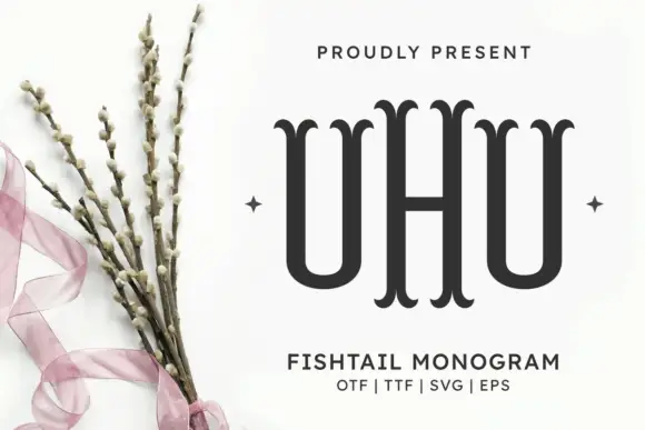
Fishtail initials with a taller central letter
Fishtail Monogram Regular Font is shown as three narrow initials with a taller central H, where the upright stems end in paired curved fishtail tips rather than plain slab feet, and the two U-shaped side letters sit close to the centre without joining it.
Ideas for this font
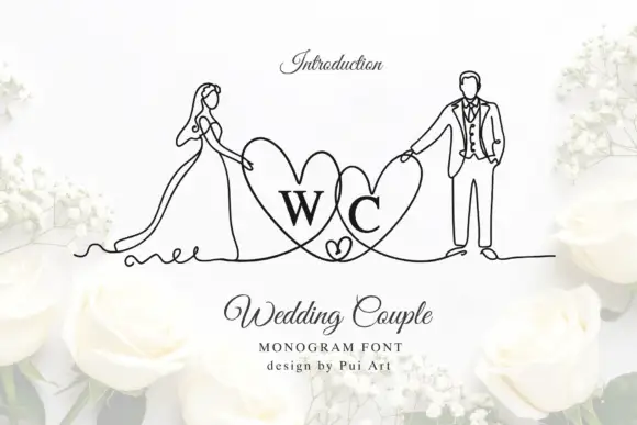
Bride-and-groom heart monogram
Wedding Couple Monogram is a mark on a white ground: two serif initials inside overlapping hearts, flanked by fine continuous line drawings of a bride in a long dress and a groom in a suit, each holding the outer edge of a heart, with a script title and two small credit lines beneath.
Ideas for this font
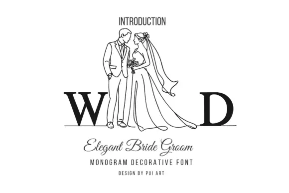
Outlined standing wedding couple flanked by large serif W and D on a fine baseline
Elegant Bride Groom Monogram sets two heavy serif initials apart and puts a line-drawn bride and groom between them, so the couple stands inside the monogram rather than beside it.
Ideas for this font
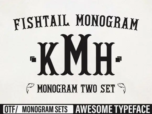
Tall monogram capitals with split fishtail ends
Fishtail Monogram shows a tall central M standing between narrower K and H, where split curved terminals flare at both ends of every upright, small square marks sit beside the outer letters and a fish outline appears at each side of a lower line.
Ideas for this font
Same independent foundry
Allow optional Google Analytics to measure visits and catalogue actions. Your search words and notes are not included. Privacy & storage