Editorial Serif Anchor

Christmas Candy Cane Doodle + The Simple Editorial
Anchors Christmas Candy Cane Doodle's fluid strokes with crisp Roman proportions on wedding suites, headers and packaging.
Inspect The Simple Editorial specimenDisclosure: MakerFileHub may earn a commission from qualifying purchases via paid links on this page. How our links work.
Tall rounded sketch capitals crossed by red-green diagonal candy stripes
Christmas Candy Cane Doodle uses tall rounded capitals crossed by red, green and white diagonal bands, with loose black double outlines wandering just outside the bodies and short extra marks that make the forms look sketched rather than machined.
Paid link
Get this fontProject & layout blueprintsAt-a-glance maker compatibility
Weld or Unite overlapping script joins into one continuous vector path before sending to the blade.
Visual anatomy & craft review
The outline doubles and drifts, the stripes run at one angle across every letter, the numeral row carries the same direction and the short marks sit outside the contours. The flat stripe is the character: the colour does the work of a whole illustration, so the lettering needs no glitter or padding behind it. Because the double outline is thin, keep 30 pt as the floor, and note the bands are flat fills rather than a glossy candy treatment, which means a striped background would only muddy the read.
Sketch outline · Striped · Tall caps
Two-font hierarchy recipes
Tested contrast partners — pairing Christmas Candy Cane Doodle with grounded secondary typography.
Christmas Candy Cane Doodle + The Simple Editorial
Anchors Christmas Candy Cane Doodle's fluid strokes with crisp Roman proportions on wedding suites, headers and packaging.
Inspect The Simple Editorial specimen
Christmas Candy Cane Doodle + Inkora
Keeps small-scale dates, URLs, nutrition facts and care instructions crisp and legible below script titles.
Inspect Inkora specimenPractical applications
Concrete hierarchy, scale and production guidance tailored to Christmas Candy Cane Doodle’s stroke geometry.
The striped capitals make a card festive with colour alone, and the sketch outline still reads at 30 pt on an A6 sheet, so the greeting needs no glitter, no foil and no second graphic.
Hierarchy & layout recipe
Print an A6 card: set the greeting at 30 pt on two rows, keep 14 mm of clear ground between the rows so the loose outlines do not touch, and leave the ground plain white behind the stripes.
Pre-production check
A striped ground behind striped letters cancels the read; check the card and keep the field white or cream.
The stripes echo the contents of a jar, and the rounded capitals stay clear at 22 pt on a 45 mm label, where two flat colours do the work of a whole illustration.
Hierarchy & layout recipe
Print a 45 by 45 mm label: set the word at 22 pt, keep 4 mm of border so the wandering outline is not clipped, and set the weight at 6 pt in a plain sans beneath.
Pre-production check
The red and green bands print muddy at small sizes; check the label on a proof and drop to one colour if the pair vibrates.
The sketch capitals suit a children's fair, and the tall forms hold a short word at 44 pt on a printed board, where the doubled outline still reads as drawn from a few steps away.
Hierarchy & layout recipe
Print a 500 by 250 mm board: set the word at 44 pt, keep 22 mm of border for the loose outline, and set the times at 14 pt in a plain sans on a white band beneath.
Pre-production check
Thin sketch outlines vanish against a coloured wall; check the mounted board and keep a pale field behind the letters.
Technical & licence verification
Confirm included OTF/TTF/WOFF formats, full glyph tables and licence coverage on the live store page before batch production.
Closest visual alternatives
Matched across letterform anatomy, stroke behaviour and craft applications.
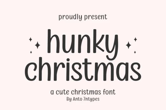
Tall monoline rounded print
Hunky Christmas is a neat upright monoline print face in which the h and k climb tall, the k closes a curled loop inside its arm, the bowls stay open and round, and no letters join, so a short holiday phrase reads as tidy hand printing.
Ideas for this font
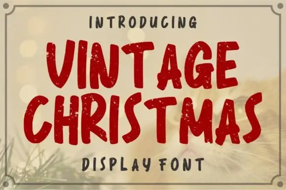
Distressed rounded seasonal display
Vintage Christmas is a distressed rounded display in deep red on a warm bokeh ground: fat rounded caps with an uneven, chipped outline, a slight bounce and a hand-cut edge, framed by a fine double rule with corner notches, and a tracked label above and beneath.
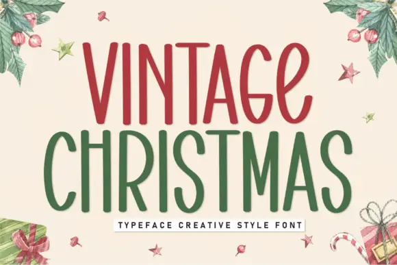
Tall condensed festive display
Vintage Christmas is a tall condensed display in red and green on cream: narrow rounded letters with a hand-drawn edge, uneven stems, small loops on the C and the S, and generous counters, presented inside a watercolour wreath of holly and gifts, so the pair reads as a hand-painted seasonal sign.
Ideas for this font
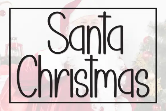
Tall narrow separate Christmas print
Santa Christmas is a tall thin hand-drawn print: narrow rounded letters with long ascenders and a crossbar lifted high on the T, set in a black outline over a faded photograph of Santa and a tree.
Ideas for this font
Same independent foundry
Allow optional Google Analytics to measure visits and catalogue actions. Your search words and notes are not included. Privacy & storage