Editorial Serif Anchor

Honey Notes + Raffined
Anchors Honey Notes's fluid strokes with crisp Roman proportions on wedding suites, headers and packaging.
Inspect Raffined specimenDisclosure: MakerFileHub may earn a commission from qualifying purchases via paid links on this page. How our links work.
Rounded casual connected handwriting with soft arches and a plain baseline
Honey Notes is rounded casual handwriting in which the letters connect without calligraphic contrast, the arches stay soft and round and the baseline remains level across a phrase.
Paid link
Get this fontProject & layout blueprintsAt-a-glance maker compatibility
Weld or Unite overlapping script joins into one continuous vector path before sending to the blade.
Visual anatomy & craft review
The h opens as a tall soft loop that does not close, and the letters after it keep that roundness: the o closes a full circle, the n holds two soft arches, the e loops back through itself and the y drops a curved tail that returns toward the line. Weight is medium and even, joins carry the same weight as the letters, and the ends are rounded rather than cut, which is what gives the phrase its friendly, unhurried tone. The baseline stays level, the spacing is regular and the counters stay open at small sizes, so the face suits notes, planners and labels where a word has to be read quickly. The pale grey ground, the white sticker outline and the two caption lines are presentation; the script is the two words.
Rounded · Casual · Connected
Two-font hierarchy recipes
Tested contrast partners — pairing Honey Notes with grounded secondary typography.
Honey Notes + Raffined
Anchors Honey Notes's fluid strokes with crisp Roman proportions on wedding suites, headers and packaging.
Inspect Raffined specimen
Honey Notes + Helina
Keeps small-scale dates, URLs, nutrition facts and care instructions crisp and legible below script titles.
Inspect Helina specimenPractical applications
Concrete hierarchy, scale and production guidance tailored to Honey Notes’s stroke geometry.
The round casual hand suits a note from a small stationery business, and the even weight and level baseline keep a short message tidy at 16 pt.
Hierarchy & layout recipe
Set the message at 16 pt on a 90 by 55 mm card, keep the order number in a 6 pt sans at the foot, and leave 8 mm below the message for a handwritten signature.
Pre-production check
Cards this small pick up fingerprints; print on a matte stock and check the ink does not offset when the cards are stacked.
The rounded hand works at sticker size where a contrasted script would clot, and the open counters keep a two-word phrase readable at 12 pt.
Hierarchy & layout recipe
Set the phrase at 12 pt on a 40 mm round sticker, keep the shop name in a 5 pt caps sans, and leave 5 mm inside the die so the rounded ends do not follow the cut.
Pre-production check
A round die cuts close to the ends of a word; check the artwork against the die and reduce the phrase rather than the margin.
The casual round hand keeps a favour label light and personal, and the even weight reads at the small size a favour tag allows.
Hierarchy & layout recipe
Set the greeting at 13 pt on a 40 by 60 mm tag, keep both names in a 6 pt sans, and leave 8 mm at the top for the ribbon hole so nothing crosses the punch.
Pre-production check
Favour tags are tied tightly; check the punch position against the artwork and keep the shortest word 6 mm from the hole.
Technical & licence verification
Confirm included OTF/TTF/WOFF formats, full glyph tables and licence coverage on the live store page before batch production.
Closest visual alternatives
Matched across letterform anatomy, stroke behaviour and craft applications.
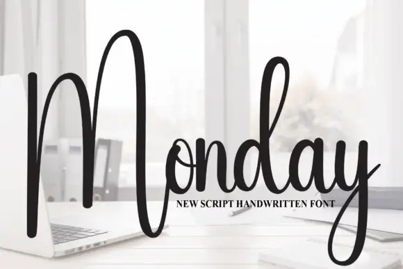
Tall script with an oversized narrow M
Monday is a tall script in black over a photograph of a desk: a very tall narrow capital M drawn as two long strokes with a shallow valley between, a compact connected body and a y whose descender curls below the word.
Ideas for this font
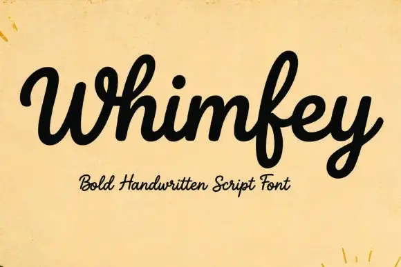
Bold handwritten script
Whimfey is a bold handwritten script in black on aged yellow paper: fat even strokes, a high x-height, short ascenders and a tight rhythm that reads as a confident everyday hand.
Ideas for this font
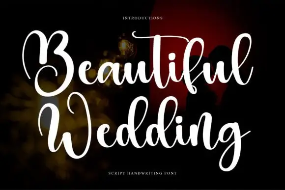
High-contrast looping wedding script
Beautiful Wedding is a formal looping script with a hard split between hairline joins and solid downstrokes, set in two stacked lines that share one wide axis.
Ideas for this font
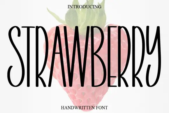
Tall narrow handwritten caps
Strawberry is a tall narrow handwritten face in black over a faded illustration of a strawberry: very condensed capitals with uneven strokes, high ascenders and a light bounce, set as one word with a small serif line above and beneath.
Ideas for this font
Same independent foundry
Allow optional Google Analytics to measure visits and catalogue actions. Your search words and notes are not included. Privacy & storage