Neutral Sans Workhorse

Happy Christmas + Prime Nordic
Lets Happy Christmas own the focal silhouette while handling secondary copy, sizing and subheads cleanly.
Inspect Prime Nordic specimenDisclosure: MakerFileHub may earn a commission from qualifying purchases via paid links on this page. How our links work.
Chunky 1970s groovy cartoon holiday bubble font (NOT a serif!)
Happy Christmas is actually a plump, cheerful 1970s groovy bubble display font (zero serifs!) built for retro holiday tees, stickers, and mugs!
Paid link
Get this fontProject & layout blueprintsAt-a-glance maker compatibility
Sturdy stroke walls and open counters weed cleanly on adhesive vinyl, HTV apparel film, and cut cardstock.
Visual anatomy & craft review
Happy Christmas is a 1970s groovy bubble display with plump burnt-orange caps, a heavy espresso-brown outline and comic drop shadows, deliberately serif-free so it works all year. The outline and the shadow are baked into the glyph, which means the face keeps its depth in one print pass, and the plump strokes stay legible at 24 mm. It needs roughly 26 mm for the shadow to read, and it is best in burnt orange with brown on vintage cream or a single ink on a dark ground.
70s-holiday-groovy · Outlined-bubble · Retro-bell
Two-font hierarchy recipes
Tested contrast partners — pairing Happy Christmas with grounded secondary typography.
Happy Christmas + Prime Nordic
Lets Happy Christmas own the focal silhouette while handling secondary copy, sizing and subheads cleanly.
Inspect Prime Nordic specimen
Happy Christmas + Askinо
Grounds bold display lettering with classic typographic authority on posters, badges and apparel.
Inspect Askinо specimenPractical applications
Concrete hierarchy, scale and production guidance tailored to Happy Christmas’s stroke geometry.
Groovy bubbles with a brown outline read as a retro seasonal merchandise print, which is what a small shop sells in December. The baked shadow gives depth in one pass, and the plump forms hold at 55 mm on a garment.
Hierarchy & layout recipe
Tee print 280 x 160 mm, word 60 mm, 40 mm margins. Mug print 200 x 90 mm, word 25 mm, 12 mm from the rim on a 120 mm band. Sticker 60 mm round, word 10 mm, 3 mm die margin.
Pre-production check
A plastisol print at 60 mm bridges the 1 mm gap inside the outline and the shadow merges into the letter. Keep the gap at 1.5 mm or raise the print to 75 mm, and approve a strike-off.
A groovy retro face reads as a warm café in the quiet weeks, which lets a shop keep selling after Christmas. The plump strokes hold at 200 mm on a poster in one ink, and the shadow gives the poster depth without a photograph.
Hierarchy & layout recipe
Poster A3, word 200 mm, details 20/26 pt, 25 mm margins and 15 mm trim. Board 900 x 600 mm, header 80 mm, rows 22 mm on a 32 mm pitch. Sleeve 180 x 60 mm, word 18 mm, 5 mm die margin.
Pre-production check
A cup sleeve wraps a taper and the shadow slides out of line at the seam, so the word looks doubled. Keep the word inside the flat 120 mm centre band, and check one sleeved cup before the counter opens.
Retro bubbles read as a bakery's own seasonal packaging, which is what a small shop prints on a box. The brown outline holds on kraft in one ink, and the plump forms make a short product name fill a 44 mm lid.
Hierarchy & layout recipe
Carton 200 x 150 x 80 mm, word 44 mm on the lid, 25 mm margins. Label 70 x 95 mm, name 16 mm, 5 mm top arc and 4 mm die margin. Sign 900 x 400 mm, word 160 mm, 60 mm margins.
Pre-production check
A 16 mm label name on kraft lets the brown outline wick and the word loses its edge. Print on a white label applied to the bag, and check one applied label before the run.
Technical & licence verification
Confirm included OTF/TTF/WOFF formats, full glyph tables and licence coverage on the live store page before batch production.
Closest visual alternatives
Matched across letterform anatomy, stroke behaviour and craft applications.
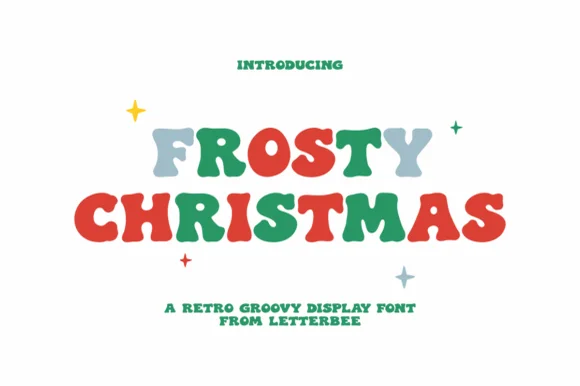
Chunky 1970s retro groovy holiday bubble display (NOT a script!)
Frosty Christmas (by Letterbee) is actually a chunky, solid 1970s retro-groovy bubble display font—zero cursive script despite auto-tagging!
Ideas for this font
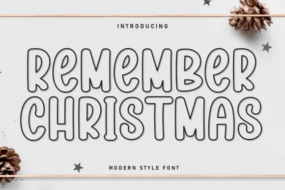
Outline rounded retro display
Remember Christmas is an outline-only rounded display in dark contour on cream: monoline capitals with soft corners, a small inner loop inside each bowl, a tight rhythm and a drop shadow, set in two lines with a star and pinecone still life and a caption in tracked caps beneath.
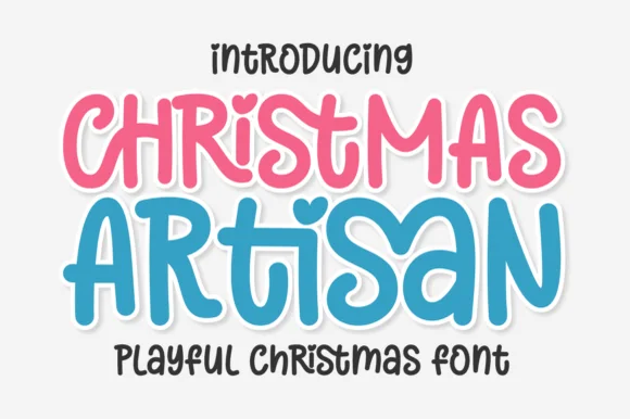
Playful curly-hooked candy-pastel holiday & kids' sans
Christmas Artisan is a cheerful, bouncy cartoon display sans sporting a heart-dotted 'i', curled 'S/R' hooks, and zero locked-in holiday clipart!
Ideas for this font
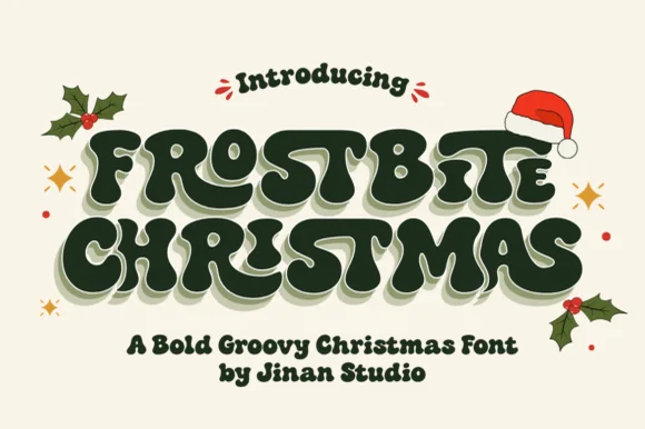
Snow-dusted 1970s groovy bubble Christmas display
Frostbite Christmas drapes creamy white snowdrifts across heavy 1970s groovy bubble capitals for nostalgic retro holiday merch!
Ideas for this font
Same independent foundry
Allow optional Google Analytics to measure visits and catalogue actions. Your search words and notes are not included. Privacy & storage